

Gracie Wade
Hometown: Flower Mound, Texas
Portfolio: Gracie Wade
Hello! I'm Gracie Wade, a designer eager to take my skills to the next level with every opportunity presented to me. I enjoy working with vibrant color palettes that catch the viewer's attention. Over the years, I have had the opportunity to implement my talents in projects ranging from publication design, brand identity, and website development. My passion for hands-on creativity continues to grow with each design and I cannot wait to see where it takes me!
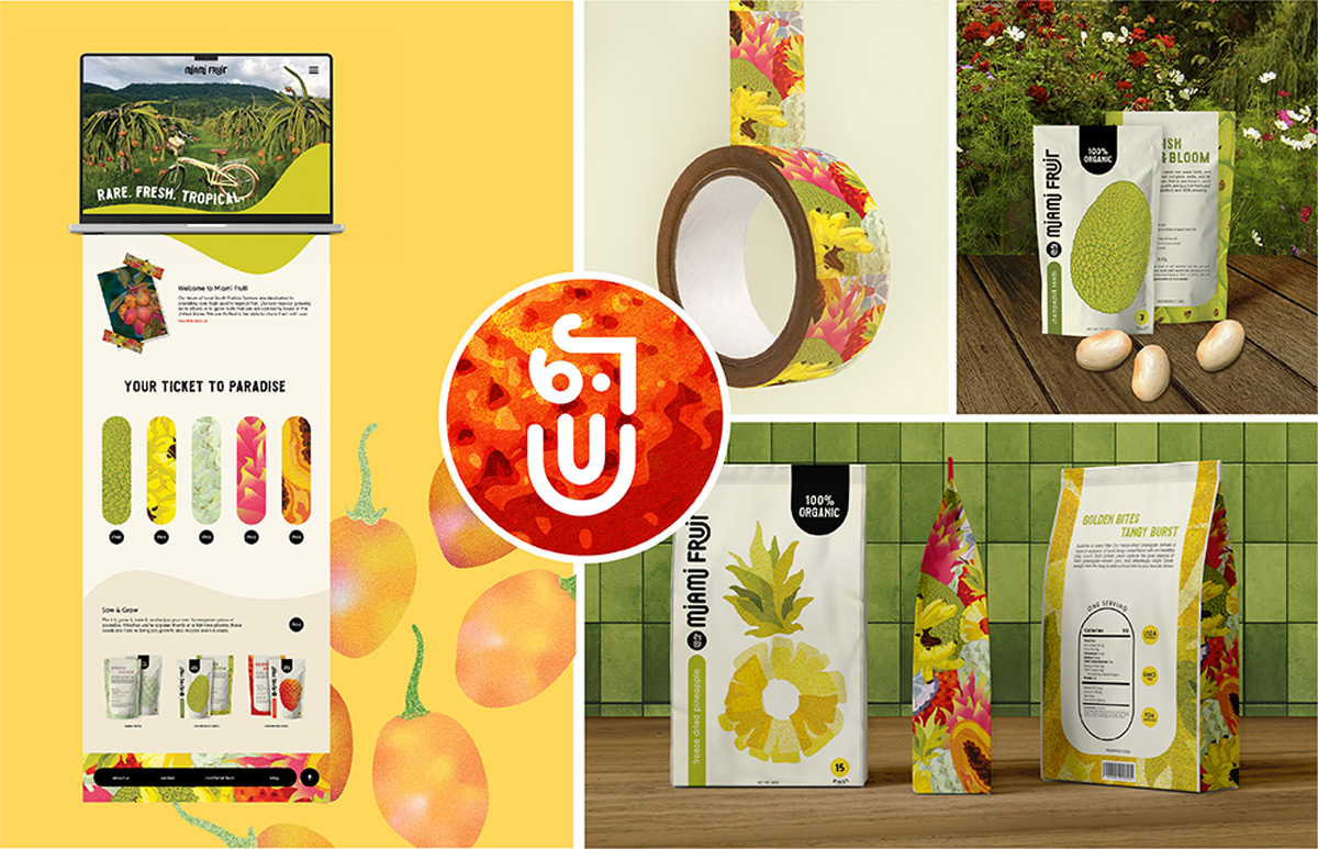 Miami Fruit is a local tropical fruit company that provides the states with rare produce.
Their passion for mouthwatering fruit and commitment to sustainable practices shines
through every shipment. This campaign reimagines the brand's identity through gritty
illustrations of vibrant tropical fruit.
Miami Fruit is a local tropical fruit company that provides the states with rare produce.
Their passion for mouthwatering fruit and commitment to sustainable practices shines
through every shipment. This campaign reimagines the brand's identity through gritty
illustrations of vibrant tropical fruit.
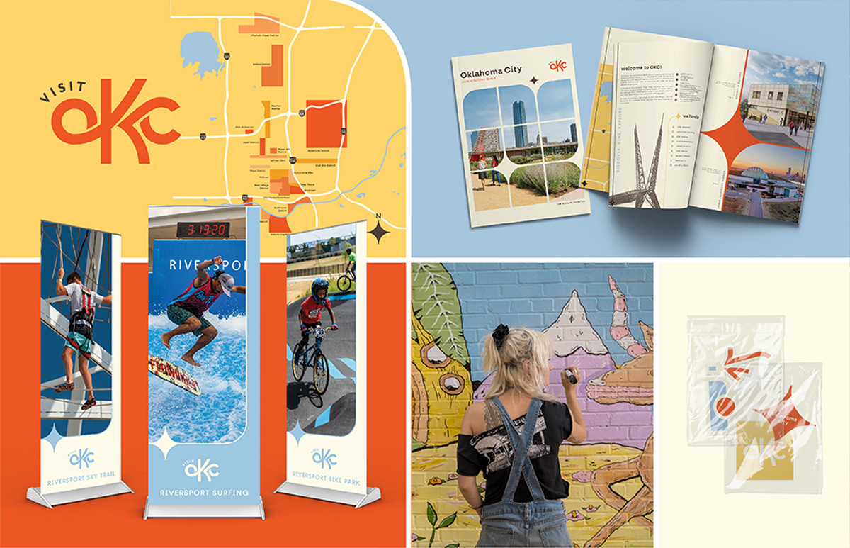
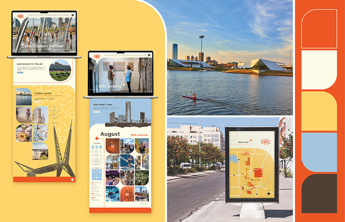 Visit OKC offers a range of services that encourages community engagement and well
being. Although they strive to embrace the future through innovation, keeping their
history alive is essential. This campaign embodies the OKC lifestyle by paying homage
to their indigenous history while simultaneously encouraging future growth as a community.
The long standing culture shines through the application of colors commonly found
in traditional native wear. Traditional accompanied by sky scraper blue, window elements,
and exciting photography. Visit OKC will be recognized as the city to watch!
Visit OKC offers a range of services that encourages community engagement and well
being. Although they strive to embrace the future through innovation, keeping their
history alive is essential. This campaign embodies the OKC lifestyle by paying homage
to their indigenous history while simultaneously encouraging future growth as a community.
The long standing culture shines through the application of colors commonly found
in traditional native wear. Traditional accompanied by sky scraper blue, window elements,
and exciting photography. Visit OKC will be recognized as the city to watch!
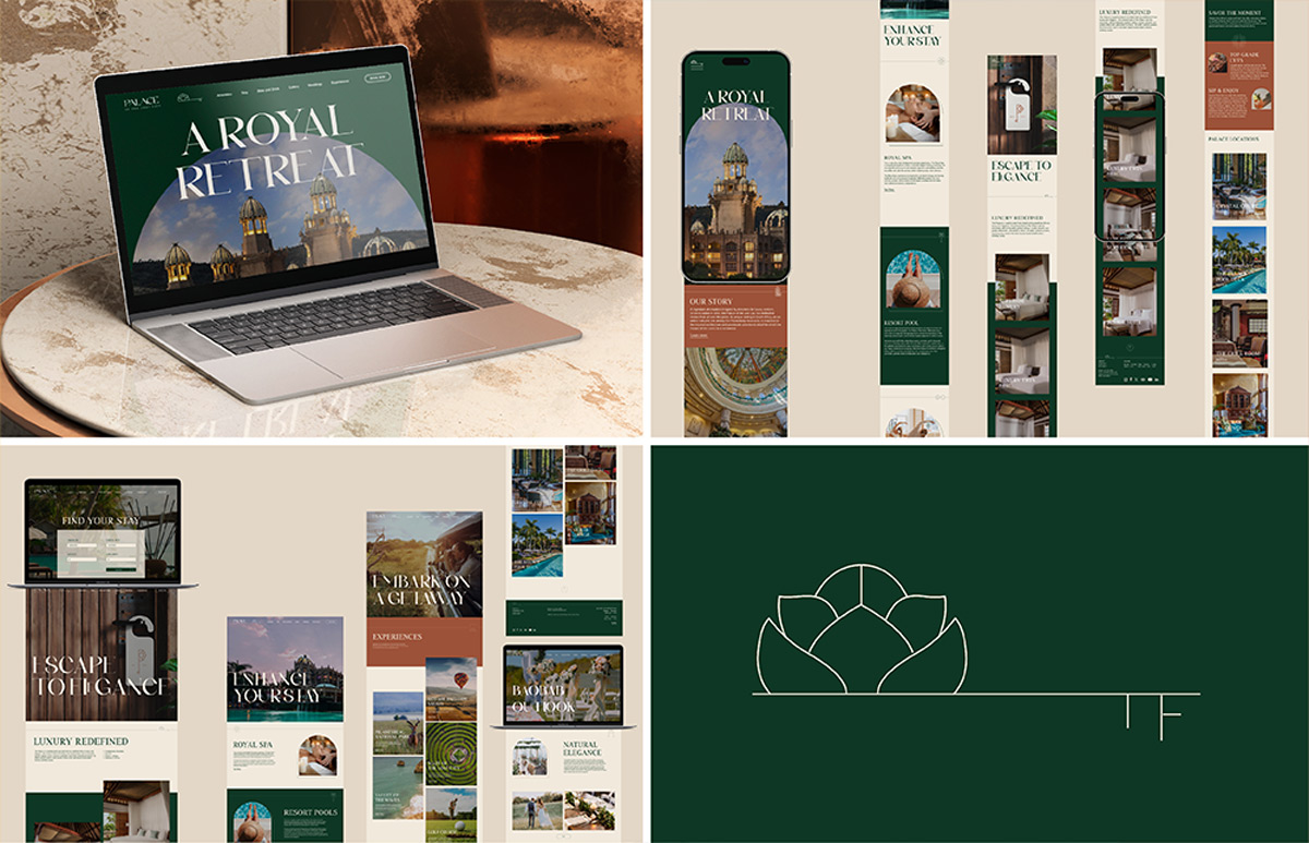 The Palace of The Lost City is a luxurious hotel based in South Africa that invites
travelers from all over the globe. Just like the beautiful architecture inspired by
its surrounding landscapes and wildlife, this website redesign will have you booking
your next stay! I designed the logo in a monoweight fine line style which influenced
all of the illustrations and icons throughout the system. This chic interpretation
promises a stay to remember.
The Palace of The Lost City is a luxurious hotel based in South Africa that invites
travelers from all over the globe. Just like the beautiful architecture inspired by
its surrounding landscapes and wildlife, this website redesign will have you booking
your next stay! I designed the logo in a monoweight fine line style which influenced
all of the illustrations and icons throughout the system. This chic interpretation
promises a stay to remember.
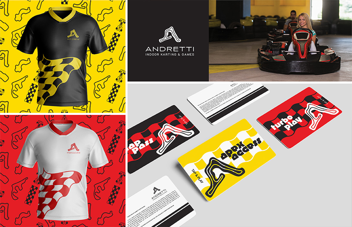 Andretti Indoor Karting & Games is an established world of fun where all ages can
experience new VR gaming, classic arcade games, and racing. The famous Formula One
racing family, the Andretti's, engineered this company in honor of their legacy. This
rebrand is inspired by Formula One racing tracks and iconic bold red look.
Andretti Indoor Karting & Games is an established world of fun where all ages can
experience new VR gaming, classic arcade games, and racing. The famous Formula One
racing family, the Andretti's, engineered this company in honor of their legacy. This
rebrand is inspired by Formula One racing tracks and iconic bold red look.