
Gabrielle Trinidad
Hometown: Lantana, Texas | Visit Me Here: Website | LinkedIn
About: I'm Gabby Trinidad, a graphic designer specializing in branding, campaigns, packaging, and environmental design. During my design process, I often explore both historical designs and contemporary trends. This research often brings a knowledgeable flair to my creative solutions. It also enables me to create diverse solutions; from subtle sophistication to trendy playfulness. As a lifelong creative type, I also create mixed media fine art whenever I have the chance. The mediums I often combine within a piece are pencil, charcoal, marker, ink, and—on a blue moon—acrylic or gouache.
Fun Fact: Back in elementary school, I never thought Joe Exotic would be the one to make my hometown famous.
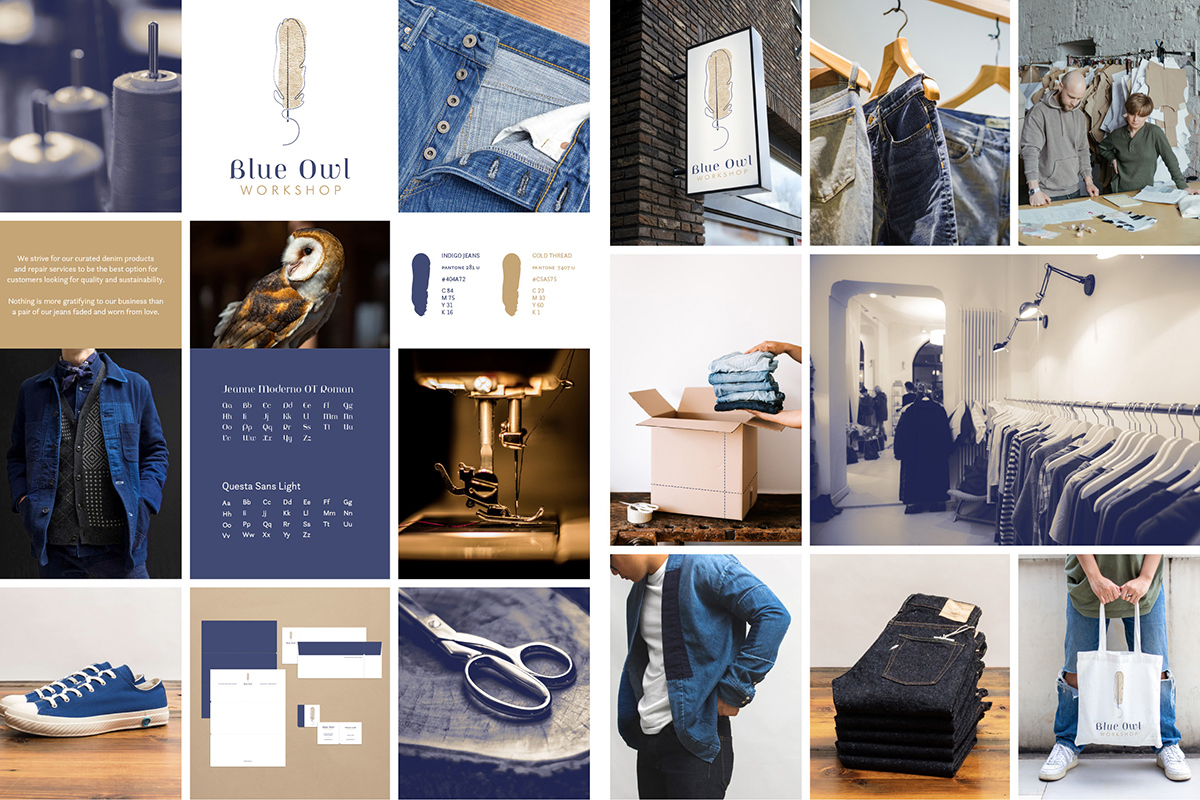
This design project earned Honorable Mention in Branding from the Graphis NewTalent 2024 Show. Blue Owl Workshop is a local retailer in Portland, Oregon which specializes in high-quality men's denim products made domestically and internationally. They needed a logo that better reflected their prices, well-thought stationary for business and customer relations, and photo treatments. I took inspiration from their passion and the local area, as the branding references the area's native barn owl, various aspects of clothes making, and cyanotype photography.
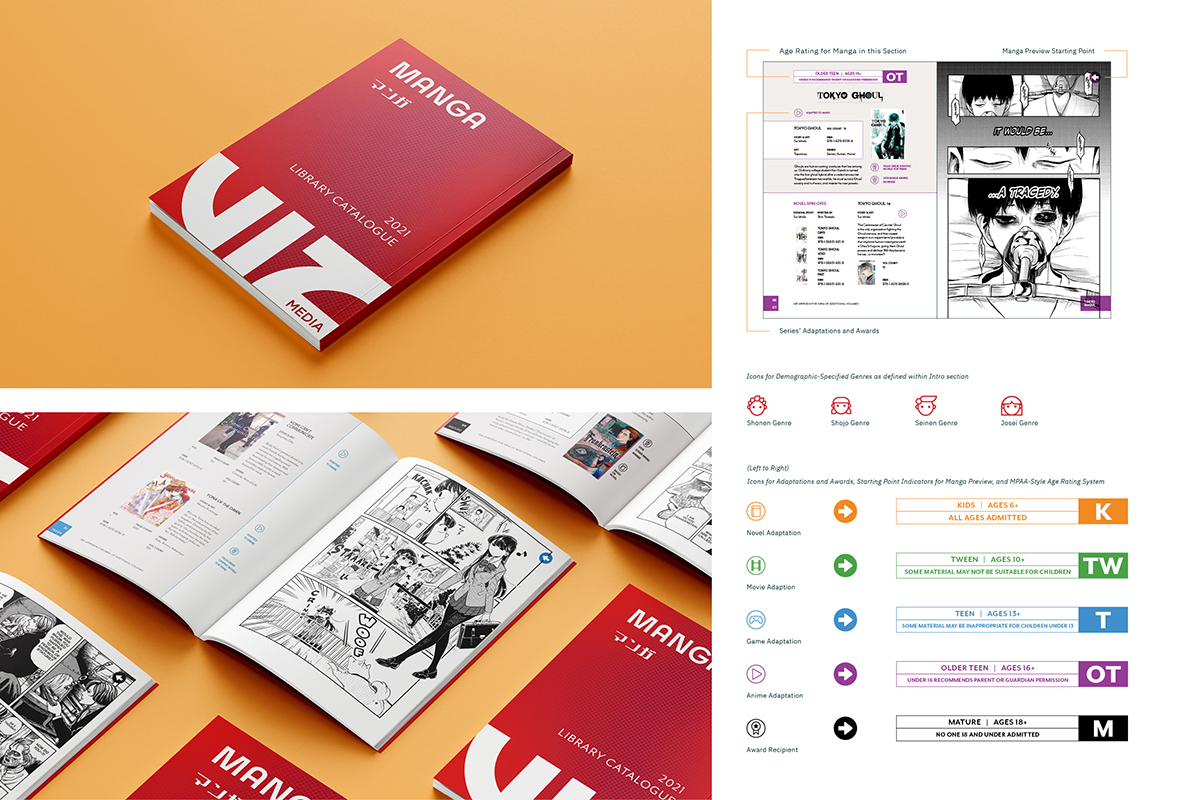
VIZ Media's curated annual manga catalogue informs libraries of which manga series will be the most popular amongst their patrons based on the series' awards, adaptations, and target age groups. Multiple icon systems streamline the reading experience and emphasize the type of content that manga could contain. Additionally, this catalogue is set in manga format, showing any unaccustomed librarians the ease of learning how to read manga.
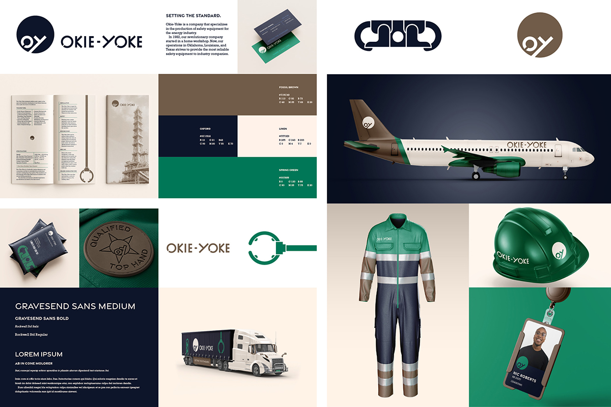
Okie-Yoke Inc. was a company during the 1980s that manufactured hydraulic stabbers for oil casing, and was sold to Exxon after it was discovered the safety equipment worked just as well for off-shore drilling. This project's challenge was designing a brand that balanced the industry's conservative designs, employee demographics, and convey that Okie-Yoke manufactured safety equipment. This is achieved through font choices, a color palette that utilizes two secondary colors, and simple renders of their products for visual texture.
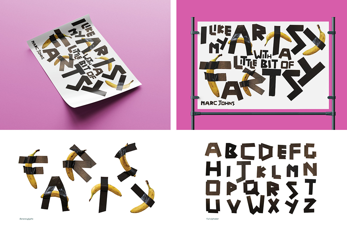
The purpose of this poster is to use evocative typography in order to convey the meaning of a quote from Canadian illustrator, Marc Johns. When I read “artsy fartsy,” I think of someone being cheeky towards another's pretentious interest in fine art. Thus, I created a font inspired from “Comedian,” a controversial banana and duct tape sculpture by Italian artist Murizio Cattelan. As a result, this font is amusing to art know-it-alls and art laymen alike.
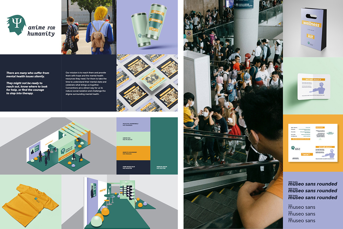
Anime for Humanity is a non-profit charity organization that utilizes anime conventions to help destigmatize mental health and connect the community with specialized mental health resources. Thus, their branding has to strike a fine balance between graphic anime and tranquil mental health. The brand's calm colors combined with bold fonts and thick horizontal lines achieves this delicate balance. It also translates beautifully into their new convention booth, merchandise, and informative pamphlets that help people connect to the resources they need.
