
Paige Sanders
Hometown: Dallas, TX | Visit Me Here: Website | LinkedIn
About: I'm graduating from the University of North Texas in May 2024 with a BFA in Communication Design and a ridiculous amount of minors (specifically in Art History, English, Marketing, and Printmaking). In my design practice, I strive to empower and uplift both artistic projects and communities who need it most.
I find joy in crafting hand-made letters and illustrations, new technology and animation, and seeing how these methods of creating can interact. Outside of my pencil, pixel, and press-pushing, I enjoy writing short fiction pieces and geeking over silly sci-fi shows.
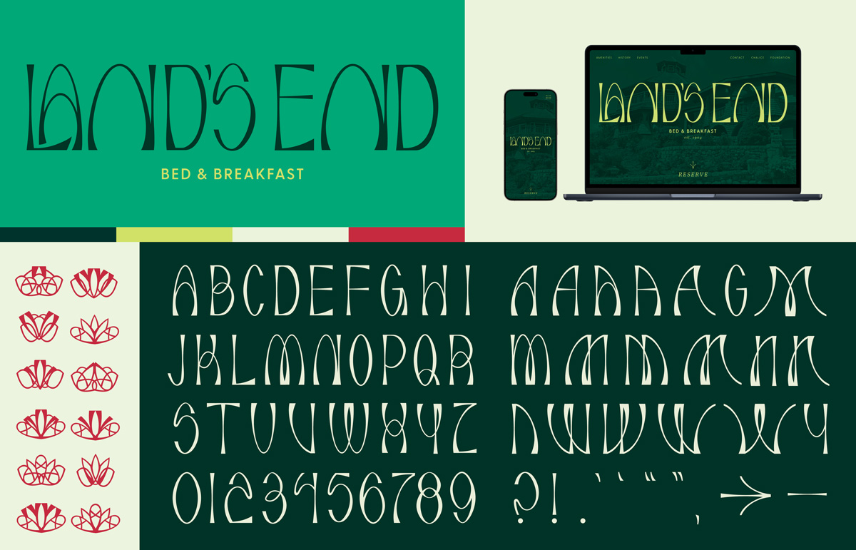
Land's End is a historic landmark in Provincetown, Massachusetts with iconic arches lining the first floor. These arches served as the inspiration for a unique brand typeface that can be used for multiple applications.
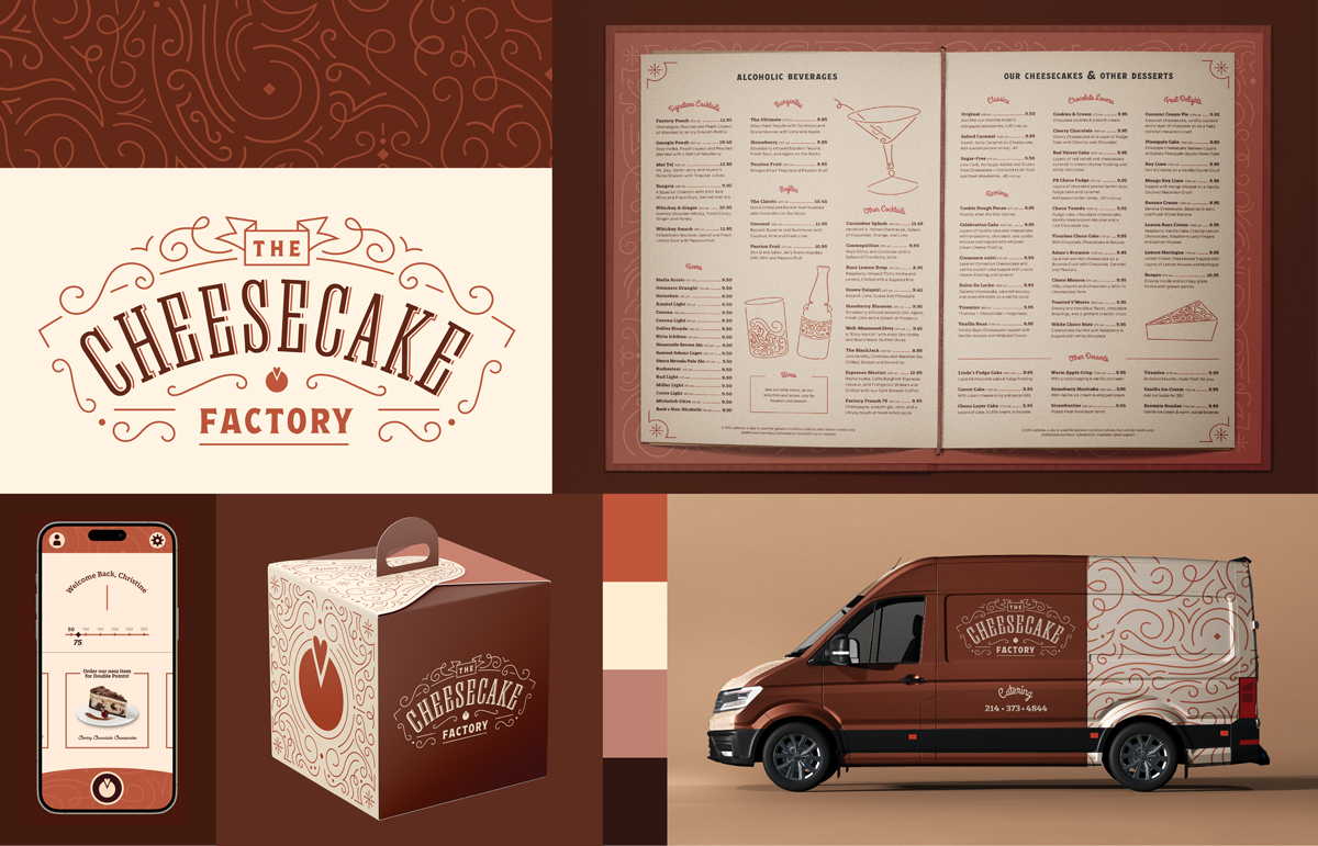
The Cheesecake Factory is infamous for its eclectic design, which, at one time, served its market. However, with declining sales in the past two years, it's time for the restaurant chain to strengthen the brand while still keeping the customer-focused experience that its consumers love. Drawing on nouveau-like curls and slab serif letters, this rebrand is inspired by popular design at the time of the industrial revolution
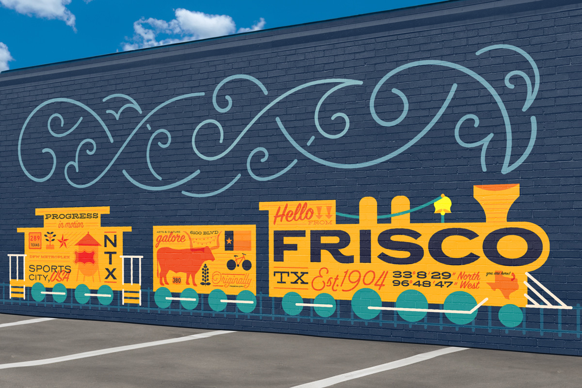
This mural was part of a in-class contest for a business in Frisco. The client asked for a mural that represented the residents or city. This work would have augmented reality capabilities when viewed. It is a finalist in the competition.
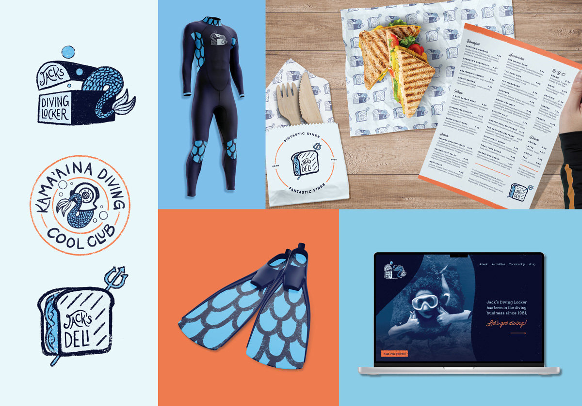
Located in Hawaii, Jack's Diving Locker is a one-stop-shop for all things diving. As a shop, scuba diving/snorkeling hub, and deli for both tourists and residents, Jack's needed a brand refresh to cohere all of their separate ventures.
This rebrand also emphasizes what makes Jack's Diving Locker so special: their lively attitude! The primary mark references their previous logo, based on the mythical Kona Mermaid, while also imbuing the mermaid with a sense of discovery. The overall rugged look is to make the brand match their overall equipment, which is hardy but inevitable becomes roughened in the waves.
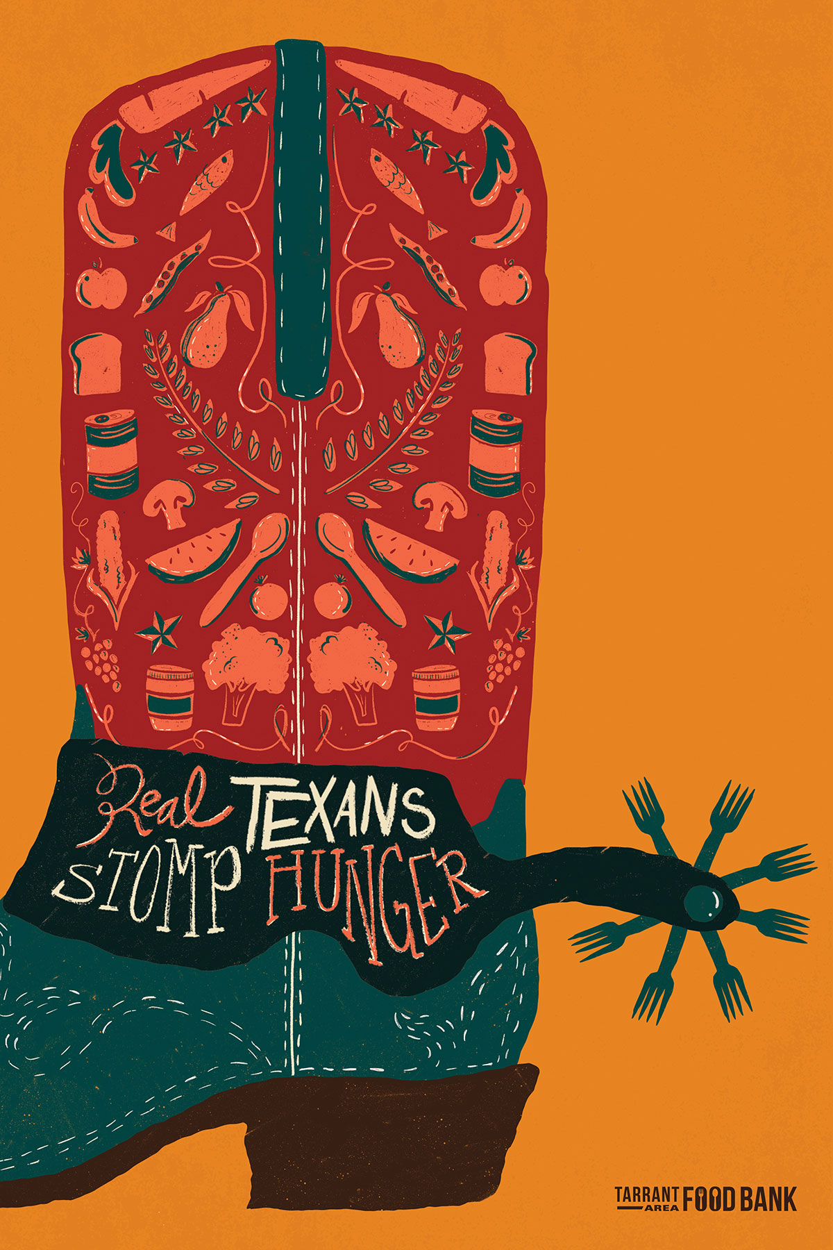
My aim for this advertisement was to showcase the fresh foods that TAFB provides in addition to shelf-stable products. These foods, in addition to the Texana style of illustration, help make this awareness poster at home in Texas.
