

Aurora Schafer
Hometown: Grapevine, Texas
Instagram: Aurora Schafer
LinkedIn: Aurora Schafer
Website: Aurora Schafer
I'm Aurora Schafer, a perceptive creative and graphic designer. My biggest inspiration is the world around me, my experiences, and the stories I’ve been told. I approach design solutions with a sensitivity to the people viewing my work and their experiences, as well as the world my work goes out into. Through design, I hope to communicate messages that connect to people on a human level. I'm always ready for the next adventure, and am excited to see where my design journey will take me in life!
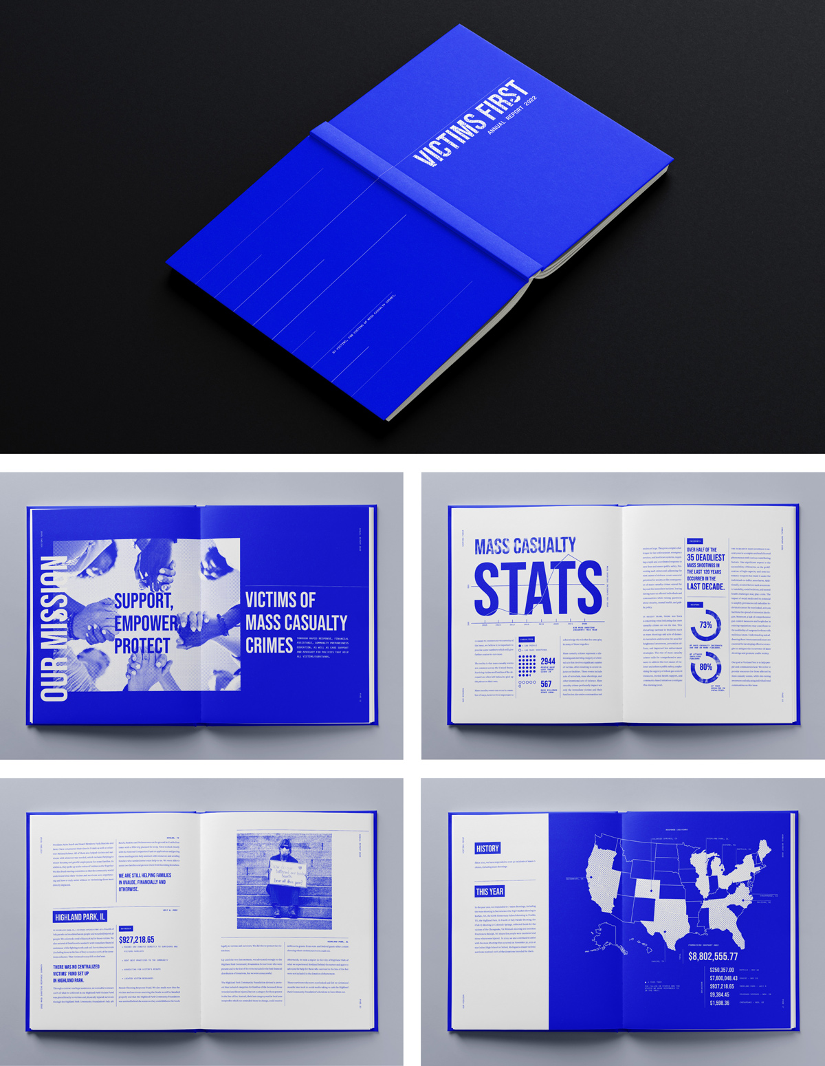 2022 Annual Report design for Victims First, a nonprofit organization that aids victims,
loved ones, and communities in the aftermath of mass casualty events. Through the
use of a high-contrast limited color palette, halftone photos, sturdy typography,
and airy layouts, this annual report is emotionally impactful. A sense of quiet impact
is evoked, allowing for the cause to be the primary focus, rather than the visuals.
2022 Annual Report design for Victims First, a nonprofit organization that aids victims,
loved ones, and communities in the aftermath of mass casualty events. Through the
use of a high-contrast limited color palette, halftone photos, sturdy typography,
and airy layouts, this annual report is emotionally impactful. A sense of quiet impact
is evoked, allowing for the cause to be the primary focus, rather than the visuals.
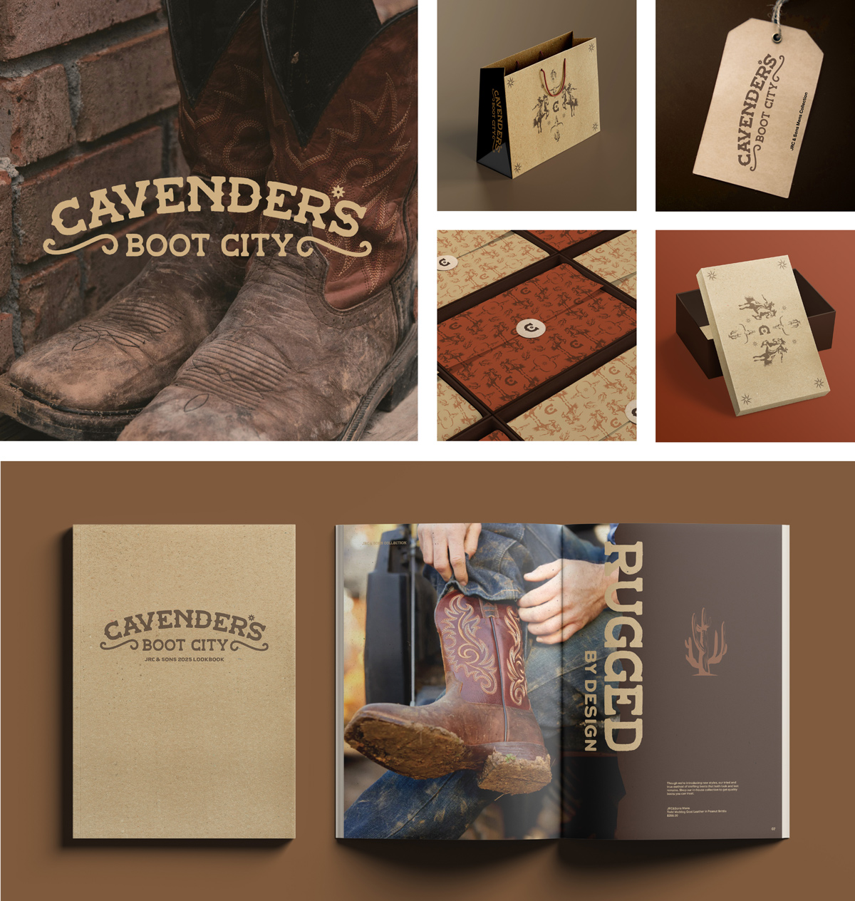 A brand campaign for Cavender's, a retailer and craft boot company specializing in
authentic boots and western wear. Through rugged textures, colors, and imagery paired
with Western-inspired typography, this rebrand elevates Cavender’s image as authentically
Western and modern. Includes a primary and secondary logo, lookbook spreads, packaging
design, custom illustrations, and social media advertisments.
A brand campaign for Cavender's, a retailer and craft boot company specializing in
authentic boots and western wear. Through rugged textures, colors, and imagery paired
with Western-inspired typography, this rebrand elevates Cavender’s image as authentically
Western and modern. Includes a primary and secondary logo, lookbook spreads, packaging
design, custom illustrations, and social media advertisments.
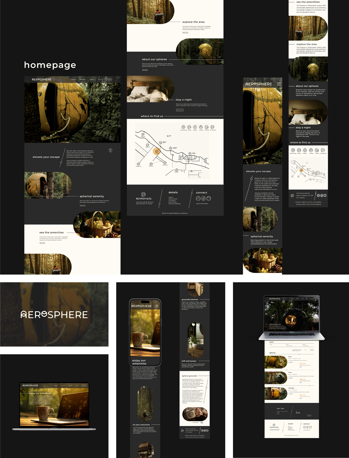 Aerosphere, previously known as Free Spirit Spheres is an elevated treehouse hotel
experience located in the forests of Canada. This web redesign includes a more focused
and easy-to-navigate structure and a showcase of the unique features of this nature
getaway. The use of rounded forms and typography reflects the geometry of the treehouses,
while also creating a sense of calm. The airy layouts and hairline graphic elements
create a serene feel that aligns with the location’s ambiance. Contributed to the
overall visual system and graphic elements, layout of the website, and prototyping.
In collaboration with group members Lauren Hinson, Ylliana Larsen, and Daniel Mejia.
Aerosphere, previously known as Free Spirit Spheres is an elevated treehouse hotel
experience located in the forests of Canada. This web redesign includes a more focused
and easy-to-navigate structure and a showcase of the unique features of this nature
getaway. The use of rounded forms and typography reflects the geometry of the treehouses,
while also creating a sense of calm. The airy layouts and hairline graphic elements
create a serene feel that aligns with the location’s ambiance. Contributed to the
overall visual system and graphic elements, layout of the website, and prototyping.
In collaboration with group members Lauren Hinson, Ylliana Larsen, and Daniel Mejia.
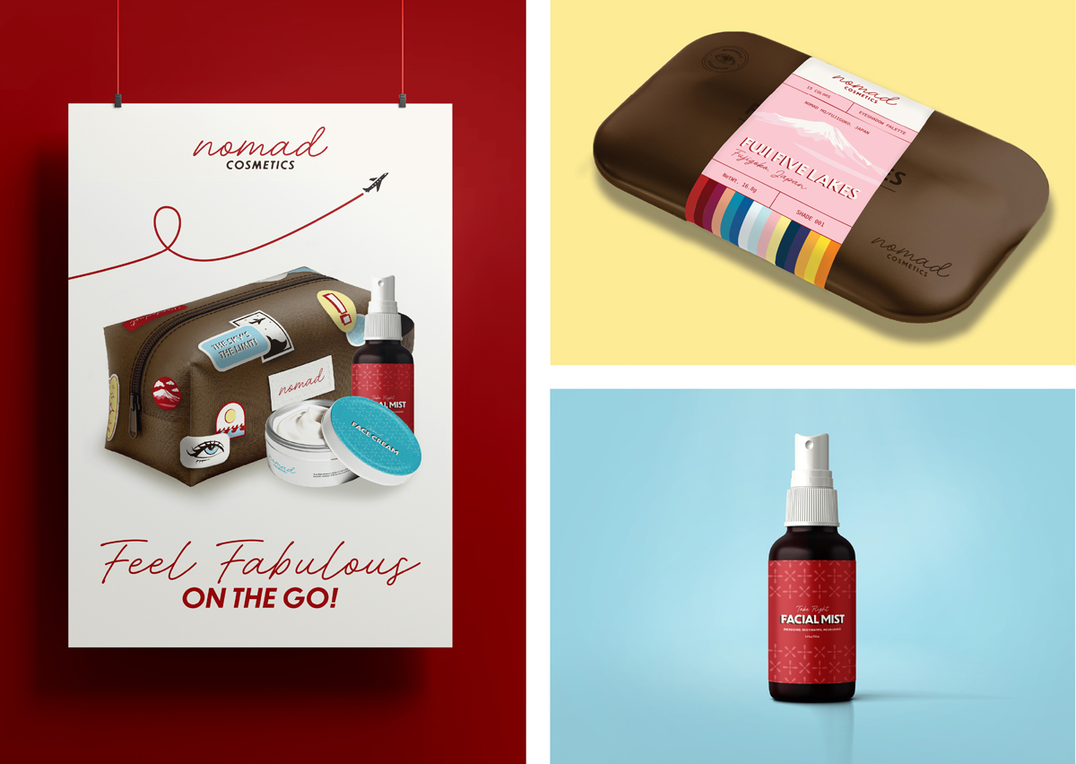 A brand campaign for Nomad Cosmetics, a brand that creates makeup inspired by and
for travelers. This includes makeup palettes inspired by locations around the world
and frequent flyer kits. The rebrand is inspired by 60s airline design. Assets include
packaging, website homepage, and poster advertisment.
A brand campaign for Nomad Cosmetics, a brand that creates makeup inspired by and
for travelers. This includes makeup palettes inspired by locations around the world
and frequent flyer kits. The rebrand is inspired by 60s airline design. Assets include
packaging, website homepage, and poster advertisment.
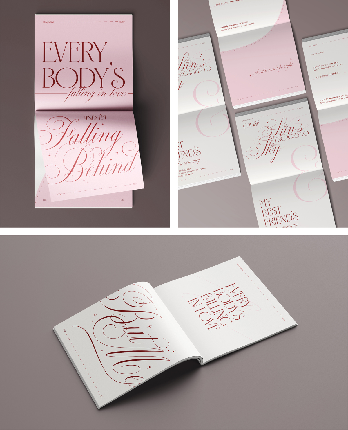 A typographic lyric booklet inspired by the song “Falling Behind” by Laufey. The use
of a romantic script paired with a whimsical sans serif and airy layouts evokes the
feelings of being hopeless romantic and reflects the soft, melodic sound of the song.
A typographic lyric booklet inspired by the song “Falling Behind” by Laufey. The use
of a romantic script paired with a whimsical sans serif and airy layouts evokes the
feelings of being hopeless romantic and reflects the soft, melodic sound of the song.