

Sophia Sardello
Hometown: Keller, Texas
Portfolio: Sophia Sardello
I’m Sophia Sardello, a graphic designer and endlessly curious creative with a passion
for bold, unexpected, and visually driven work that challenges the ordinary. My approach
lives somewhere between gritty and playful, polished and raw, always pushing to make
something that feels alive and unexpected. I’m drawn to projects that feel expressive,
a little offbeat, and deeply human.
At UNT, I’ve explored a wide range of mediums, all while honing a creative process
that’s equal parts experimental and intentional. My work pulls inspiration from music,
subcultures, and everyday absurdities, all filtered through a lens that’s expressive,
curious, and just a bit unconventional.
I’m excited to continue creating work that’s not only visually striking but grounded
in meaning and to keep collaborating, experimenting, and pushing boundaries wherever
I go!
 2022 Annual Report design for Victims First, a nonprofit organization that aids victims,
loved ones, and communities in the aftermath of mass casualty events. Through the
use of a high-contrast limited color palette, halftone photos, sturdy typography,
and airy layouts, this annual report is emotionally impactful. A sense of quiet impact
is evoked, allowing for the cause to be the primary focus, rather than the visuals.
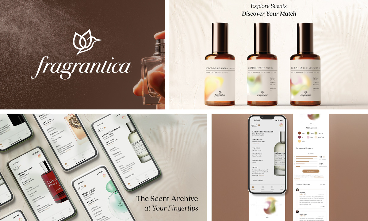 A refined rebrand of Fragrantica, reimagined as a modern, user-friendly app experience
for fragrance enthusiasts. The campaign blends elegant UI design with thoughtful features
like curated discovery sets, personalized scent quizzes, and editorial-inspired layouts.
Clean typography, rich imagery, and sleek packaging mockups elevate the experience.
The end result makes fragrance exploration feel intuitive, immersive, and beautifully
designed.
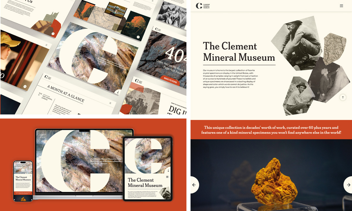
The Clement Mineral Museum website redesign blends modern design with a rich, interactive
exploration of the natural world. With a sleek, intuitive layout, visitors can easily
navigate through detailed mineral collections, educational resources, and upcoming
exhibitions. Bold imagery of minerals contrasts with a clean, minimalist interface,
allowing the vibrant colors and textures of each specimen to take center stage. The
design embraces the history of the museum, incorporating collaged elements and antique
photos to evoke a sense of the museum's storied past. The overall design prioritizes
clarity, with elegant typography and fluid navigation ensuring a seamless browsing
experience that makes learning about geology both engaging and immersive.
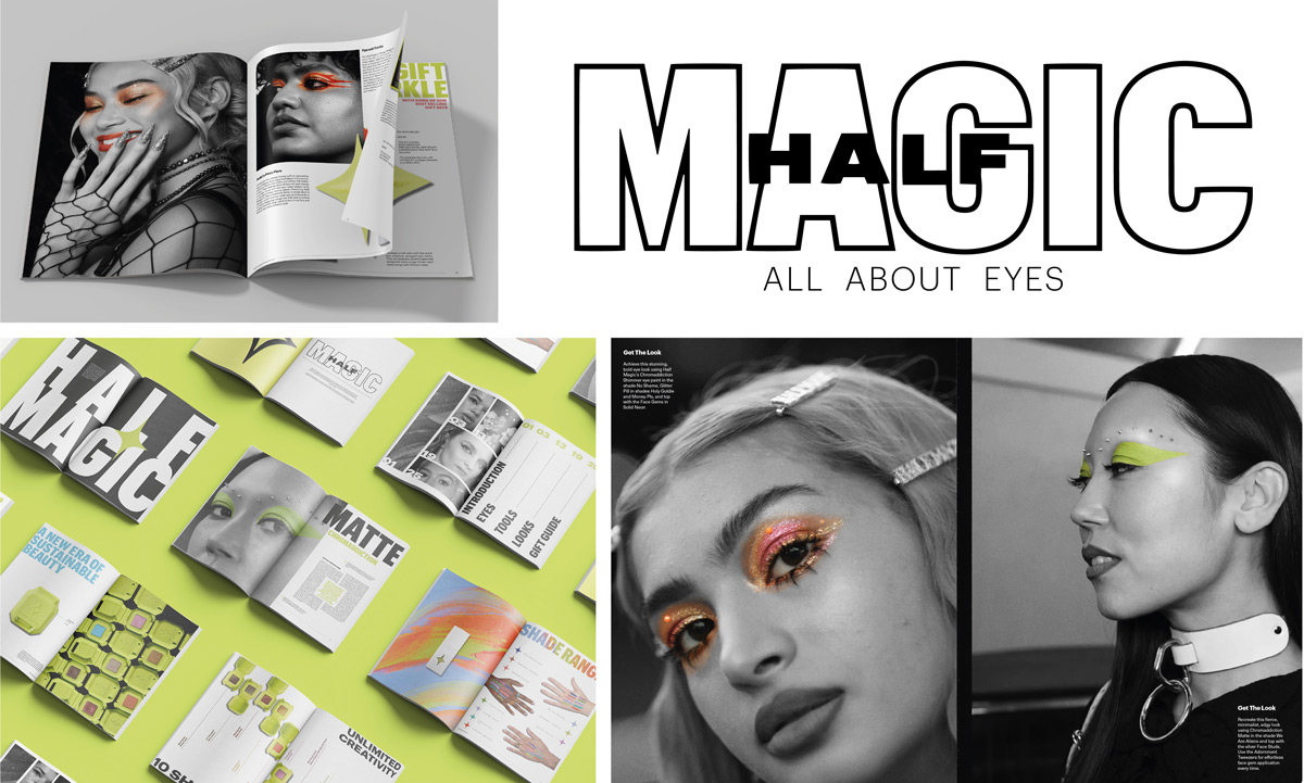 A high-contrast, visually striking lookbook and catalog titled All About Eyes celebrates
Half Magic’s eye products through bold, editorial layouts and photo treatments. Each
page features stylized black-and-white photography with only the makeup left in vibrant
color, drawing full attention to the artistry around the eyes. The layouts are clean
and graphic, with dramatic close-ups, surreal crops, and dynamic compositions that
emphasize emotion and expression. Bold, contemporary typography accents each spread,
reinforcing the brand’s edgy, experimental spirit. The result is a powerful, focused
visual narrative that puts eye makeup and the tools used at the center of every look.
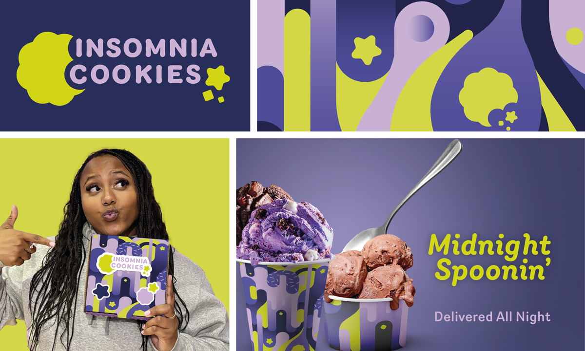 This visual reimagining of Insomnia Cookies introduces a playful, youthful brand system
energized by late-night indulgence. The color palette leans into dreamy purples, electric
chartreuse, and soft lavenders, contrasting with deep navy to echo the mystery and
allure of nighttime cravings. Rounded bubbly forms, drip-like graphics, and playful
typographic choices evoke a dreamlike atmosphere. The result is a campaign that feels
both cosmic and cozy: a place where the stars are out, the cookies are warm, and it’s
always time for dessert.