

Jhan Le
Hometown: Murphy, Texas
Instagram: @JLE_Design
LinkedIn: Jhan Le
Hi! I'm Jhan Le, a graphic designer and proud first-generation graduate. Born and
raised in Texas, my journey into design started with a deep curiosity about how visuals
shape the way we feel, think, and connect. That fascination quickly grew into a full-blown
passion for creating work that’s not just seen but felt.
My design philosophy is all about intentionality and experience. Whether I’m crafting
a bold brand identity, designing an interactive web layout, or creating a poster that
makes someone stop and look twice, I believe great design goes beyond aesthetics.
It tells a story, stirs emotion, and sparks connection. I’m constantly exploring new
ways to push my creativity and grow my skillset, and I approach each project with
the same energy: thoughtful, experimental and all in.
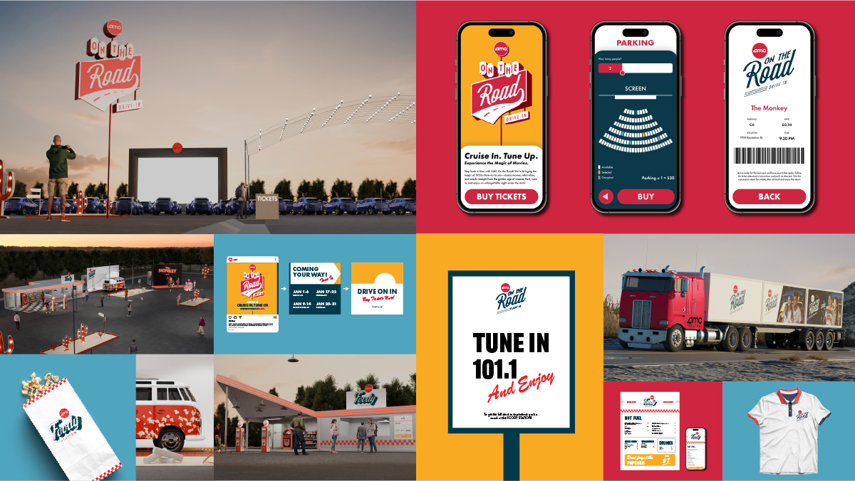 With so many opportunities to connect with new audiences and grow followers, I introduce
“AMC On The Road”—a pop-up drive-in movie theater that travels across America. This
mobile theater will partner with upcoming movie releases to deliver an immersive experience.
It combines the classic charm of drive-in movies with modern cinematic magic, creating
unforgettable moments that leave a lasting impression of the AMC brand.
With so many opportunities to connect with new audiences and grow followers, I introduce
“AMC On The Road”—a pop-up drive-in movie theater that travels across America. This
mobile theater will partner with upcoming movie releases to deliver an immersive experience.
It combines the classic charm of drive-in movies with modern cinematic magic, creating
unforgettable moments that leave a lasting impression of the AMC brand.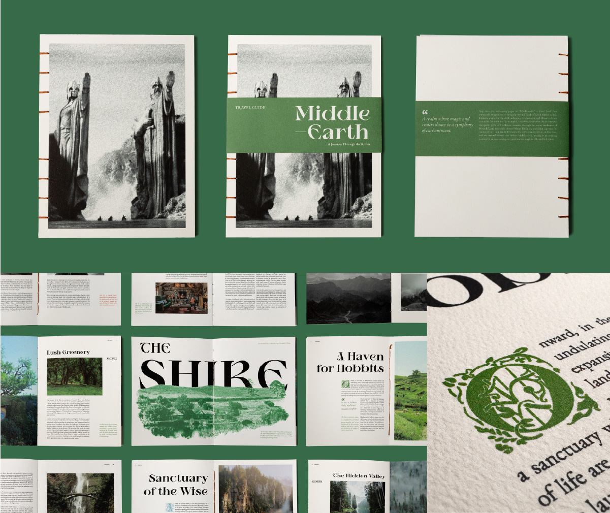 I designed a travel guide for the fictional world of middle-earth, inspired by the
rich lore of author J.R.R. Tolkien. From curating content to crafting the layout,
photo treatments, typography, and handmade details, every element was carefully considered
to create an immersive reading experience. Each location, drawn from the original
texts, captures the landscape, culture, and history of Tolkien’s world. Sketched imagery
in warm, earthy tones evokes the feel of weathered parchment, giving each spread the
look of an ancient manuscript. Handcrafted and Coptic bound, the book offers a tactile,
personal connection to the world it explores. By blending traditional aesthetics with
modern design, the guide blurs the line between fantasy and reality, inviting readers
to step into a realm of medieval wonder.
I designed a travel guide for the fictional world of middle-earth, inspired by the
rich lore of author J.R.R. Tolkien. From curating content to crafting the layout,
photo treatments, typography, and handmade details, every element was carefully considered
to create an immersive reading experience. Each location, drawn from the original
texts, captures the landscape, culture, and history of Tolkien’s world. Sketched imagery
in warm, earthy tones evokes the feel of weathered parchment, giving each spread the
look of an ancient manuscript. Handcrafted and Coptic bound, the book offers a tactile,
personal connection to the world it explores. By blending traditional aesthetics with
modern design, the guide blurs the line between fantasy and reality, inviting readers
to step into a realm of medieval wonder.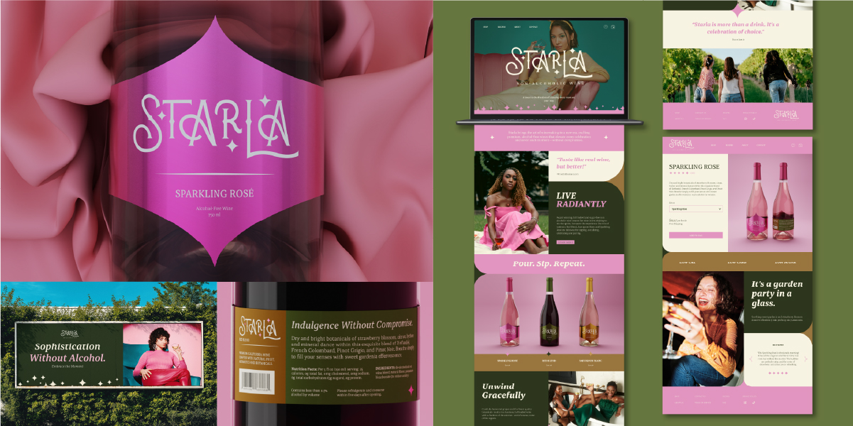 Starla, a non-alcoholic brand, could benefit from a redesign to better align with
the growing demand for sophisticated, health-conscious alternatives. This new, refreshed
look would modernize the brand, attract a wider audience, and create a more premium
feel that resonates with both wellness-focused and social drinkers seeking stylish,
alcohol-free options.
Starla, a non-alcoholic brand, could benefit from a redesign to better align with
the growing demand for sophisticated, health-conscious alternatives. This new, refreshed
look would modernize the brand, attract a wider audience, and create a more premium
feel that resonates with both wellness-focused and social drinkers seeking stylish,
alcohol-free options.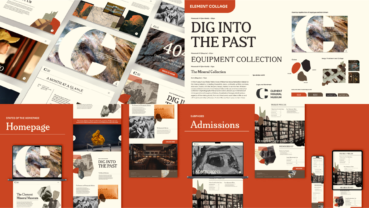 The Clement Mineral Museum stands out as a unique display featuring the diverse collections
of mining magnate Ben E. Clement. Despite its brevity, the original website lacked
the richness and sophistication reflective of their impressive collection. This project
entailed a comprehensive rebranding of both the website and related materials.
The Clement Mineral Museum stands out as a unique display featuring the diverse collections
of mining magnate Ben E. Clement. Despite its brevity, the original website lacked
the richness and sophistication reflective of their impressive collection. This project
entailed a comprehensive rebranding of both the website and related materials.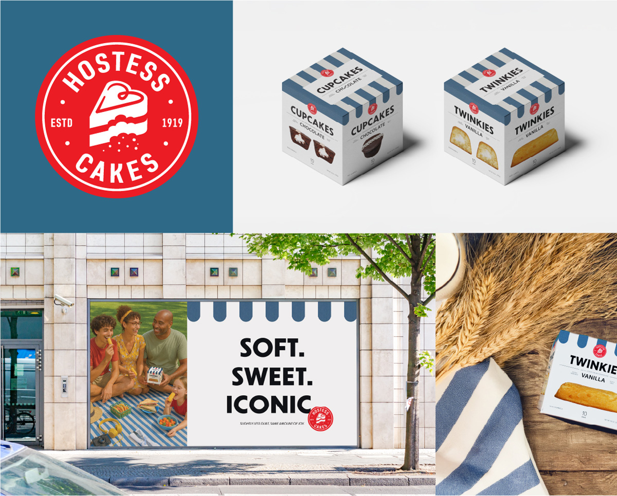 Hostess® Cakes was facing a decline in relevance, with a visual identity that lacked
personality and felt disconnected from today’s design standards. The brand’s appearance
hadn’t evolved meaningfully over time, relying on flat, generic graphics and typography
that no longer resonated. Additionally, Hostess® was often perceived as overly processed
and out of touch with growing consumer interests in health, quality, and sustainability.
This redesign brings a fresh perspective—introducing a more playful and nostalgic
tone while embracing a cleaner, more modern look. By repositioning Hostess® as a more
wholesome, all-natural brand with an Americana-inspired visual style, the goal was
to restore its iconic status while aligning it with today’s values and lifestyles.
Hostess® Cakes was facing a decline in relevance, with a visual identity that lacked
personality and felt disconnected from today’s design standards. The brand’s appearance
hadn’t evolved meaningfully over time, relying on flat, generic graphics and typography
that no longer resonated. Additionally, Hostess® was often perceived as overly processed
and out of touch with growing consumer interests in health, quality, and sustainability.
This redesign brings a fresh perspective—introducing a more playful and nostalgic
tone while embracing a cleaner, more modern look. By repositioning Hostess® as a more
wholesome, all-natural brand with an Americana-inspired visual style, the goal was
to restore its iconic status while aligning it with today’s values and lifestyles.