

Kari Kramer
Hometown: Centennial, Colorado
Portfolio: Kari Kramer
I'm a graphic designer and lifelong creative drawn to collaboration and the dynamic challenges of design. I enjoy working across disciplines in both fine art and graphic design, and I approach each project with enthusiasm for its potential evolution and transformation. Beyond the digital space, I explore a wide range of physical media — including acrylic, oil, watercolor, graphite, charcoal, ink, beadwork, vector and raster design, and more. I consider myself a restless creative, constantly experimenting and recharging through hands-on making. That energy feeds back into my professional work, keeping it fresh, thoughtful and ever-evolving.
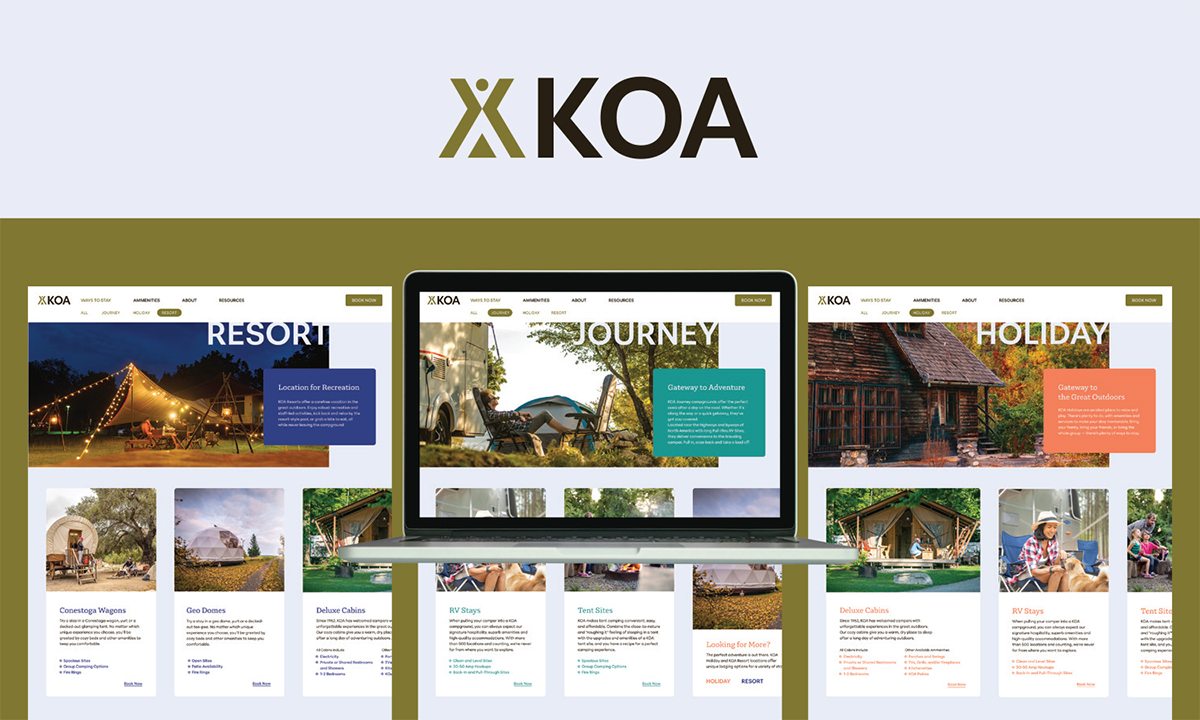 Rebranding Assignment: KOA, also known as Kampgrounds of America, is the oldest privately owned network of
campsites in North America. Creating a more reliable branding system through new signage,
vehicle finishes, and a website communicates their longevity and reinforces their
status as a brand that has perfected the camping experience over 80 years.
Rebranding Assignment: KOA, also known as Kampgrounds of America, is the oldest privately owned network of
campsites in North America. Creating a more reliable branding system through new signage,
vehicle finishes, and a website communicates their longevity and reinforces their
status as a brand that has perfected the camping experience over 80 years.
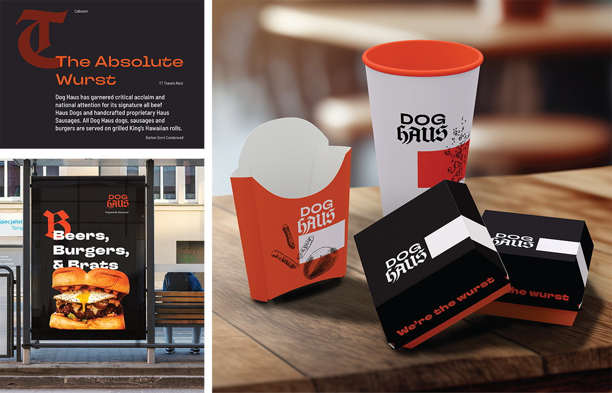 Dog Haus is a fast casual chain that advertises themselves as a craft-casual dining
experience that uses a blend of new American and German flavors mixed with an energetic
environment and cheeky copywriting that has helped them grow into over 100 franchise
locations. This rebrand helps position their brand for the next 100 locations and
communicates the brand's values of community, flavor, and open mindedness enriching
the dining experience.
Dog Haus is a fast casual chain that advertises themselves as a craft-casual dining
experience that uses a blend of new American and German flavors mixed with an energetic
environment and cheeky copywriting that has helped them grow into over 100 franchise
locations. This rebrand helps position their brand for the next 100 locations and
communicates the brand's values of community, flavor, and open mindedness enriching
the dining experience.
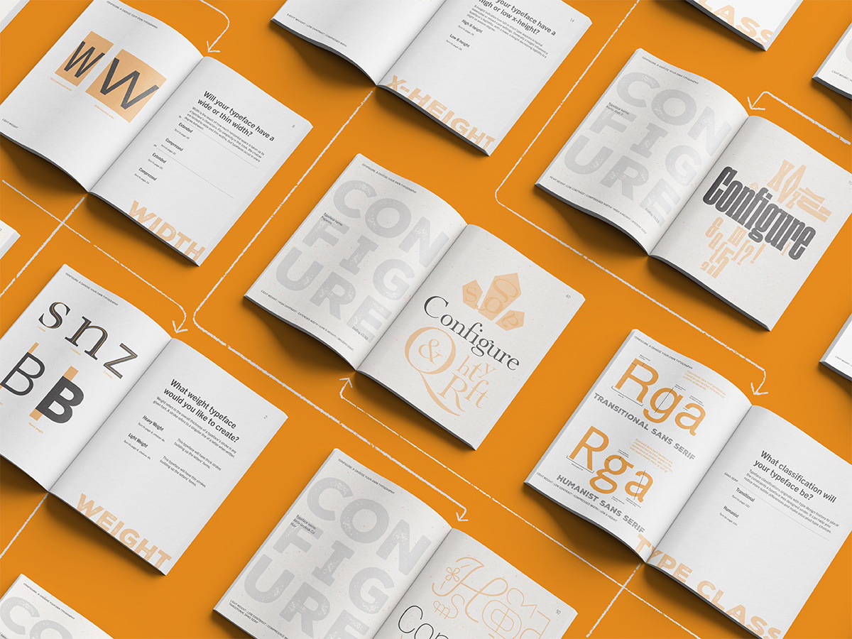 Configure: A Choose Your Own Typography Book is a self-written, conceptualized, and
designed book that introduces curious readers about typography can the process of
choosing and designing type. The book uses a simplified version of the filtering tool
implemented by Adobe Fonts to guide readers with different degrees of experience with
type design and each typeface result features a composition that highlights the personality
of the resulting font with the word 'Configure' in the middle: displaying key anatomical
features that distinguish one typeface from another.
Configure: A Choose Your Own Typography Book is a self-written, conceptualized, and
designed book that introduces curious readers about typography can the process of
choosing and designing type. The book uses a simplified version of the filtering tool
implemented by Adobe Fonts to guide readers with different degrees of experience with
type design and each typeface result features a composition that highlights the personality
of the resulting font with the word 'Configure' in the middle: displaying key anatomical
features that distinguish one typeface from another.
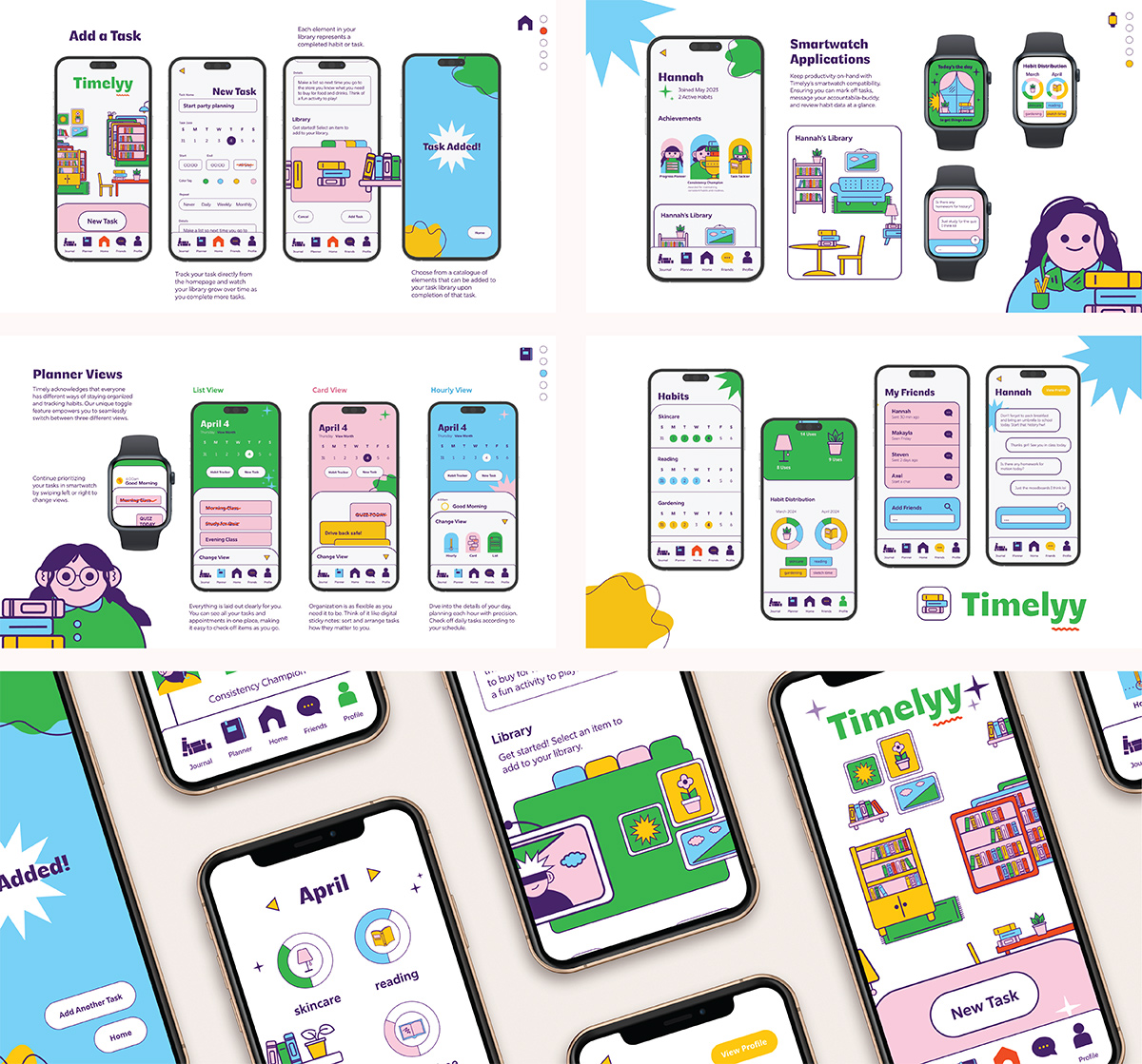 Timelyy is a habit tracking app designed to help future college students habit track
and plan their days in a fun and accessible way. Bright colors and illustrations make
the app less intimidating and easy to use with a clean interface that allows users
to schedule tasks, organize their days, and visualize their progress with a customisable
'library'. Users assign each task an item that decorates their library and accumulates
over time. I had the opportunity to work with the awesome Jazmine Garcia on this project.
Timelyy is a habit tracking app designed to help future college students habit track
and plan their days in a fun and accessible way. Bright colors and illustrations make
the app less intimidating and easy to use with a clean interface that allows users
to schedule tasks, organize their days, and visualize their progress with a customisable
'library'. Users assign each task an item that decorates their library and accumulates
over time. I had the opportunity to work with the awesome Jazmine Garcia on this project.
 Sani Lodge is an ecotourism site located in the Yasuni Nature Reserve within the Amazon
Rainforest area. The location provides 'glamping' style lodging, immersive cuisine,
and local cultural connection. The new branding features a native Roseate Spoonbill
and the new modular website design reduces friction with interested users and distinguishes
the brand from nearby competition. I had the opportunity to work with the talented
designers Katheryn Cheung and Brennah Wagner to design this project.
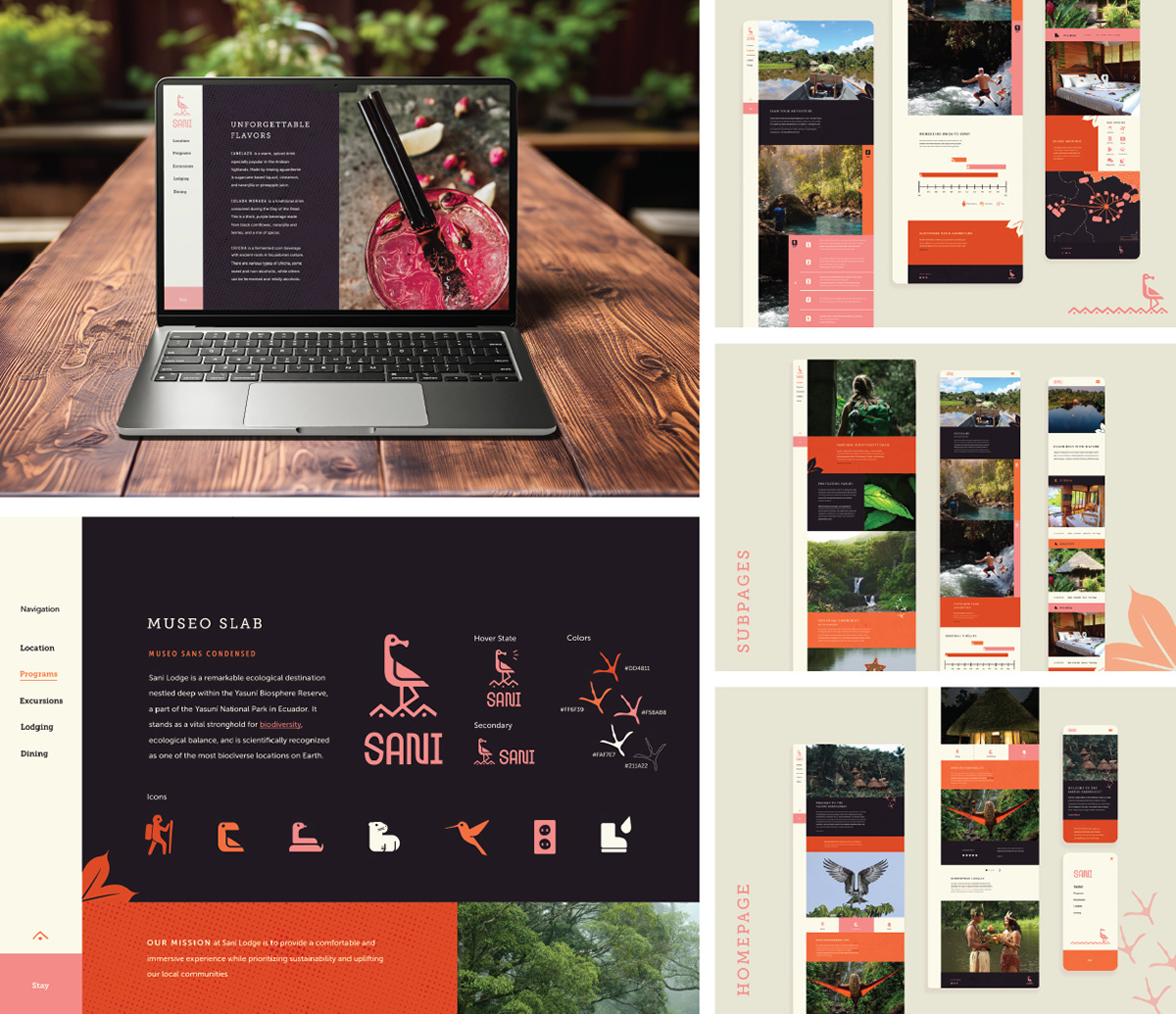
Sani Lodge is an ecotourism site located in the Yasuni Nature Reserve within the Amazon
Rainforest area. The location provides 'glamping' style lodging, immersive cuisine,
and local cultural connection. The new branding features a native Roseate Spoonbill
and the new modular website design reduces friction with interested users and distinguishes
the brand from nearby competition. I had the opportunity to work with the talented
designers Katheryn Cheung and Brennah Wagner to design this project.