

Lauryn Green
Instagram: Lauryn Green
LinkedIn: Lauryn Green
Website: Lauryn Green
Hello I'm Lauryn Green, an enthusiastic and dedicated graphic design professional with five years of experience
in the field. My journey in design has been enriched by my hands-on experience, coupled
with academic rigor. At UNT, I've had the privilege of being part of a vibrant community
that fosters creativity and innovation.
During my time in the design field, I've honed my skills in branding, typography,
web development, app development, etc. While working on diverse projects, I have pushed
the boundaries of my creativity. Combining my academic knowledge with practical experience,
I bring a unique perspective to every project I undertake. I am passionate about using
design to solve problems, evoke emotions, and create memorable experiences. Whether
it's through crafting compelling visual identities or designing user-centric interfaces,
I thrive on the opportunity to make a meaningful impact through design.
I am constantly seeking new challenges and opportunities for growth, and I believe
in the power of collaboration to drive innovation. Let's connect and explore how my
skills and experience can contribute to your projects and initiatives.
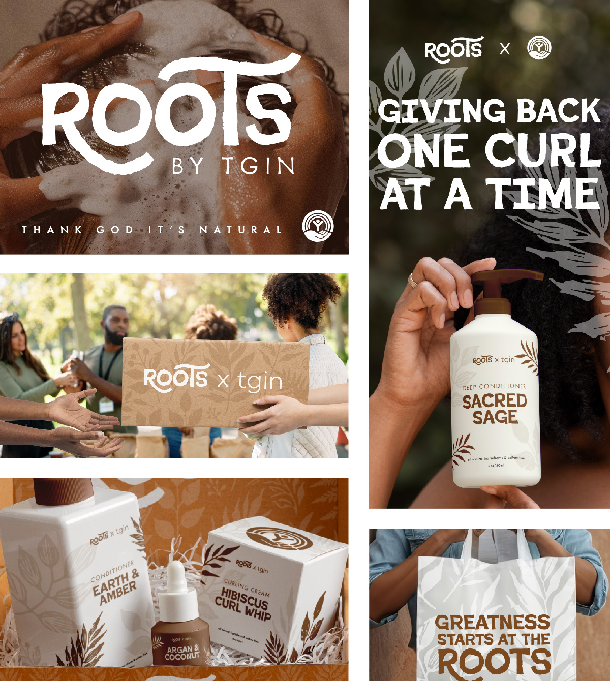 Rebranding of Roots x TGIN — thank god it's natural — hair care products. Roots by
TGIN is a socially conscious hair care line developed in partnership with the United
Way to support people of color experiencing homelessness. The brand provides high-quality,
textured-hair essentials to those often overlooked by generic donations in shelters.
With packaging rooted in warmth and empowerment, each product reflects dignity, representation,
and self-care. Proceeds from every purchase go directly back to the community, helping
restore confidence — one curl at a time.
Rebranding of Roots x TGIN — thank god it's natural — hair care products. Roots by
TGIN is a socially conscious hair care line developed in partnership with the United
Way to support people of color experiencing homelessness. The brand provides high-quality,
textured-hair essentials to those often overlooked by generic donations in shelters.
With packaging rooted in warmth and empowerment, each product reflects dignity, representation,
and self-care. Proceeds from every purchase go directly back to the community, helping
restore confidence — one curl at a time.
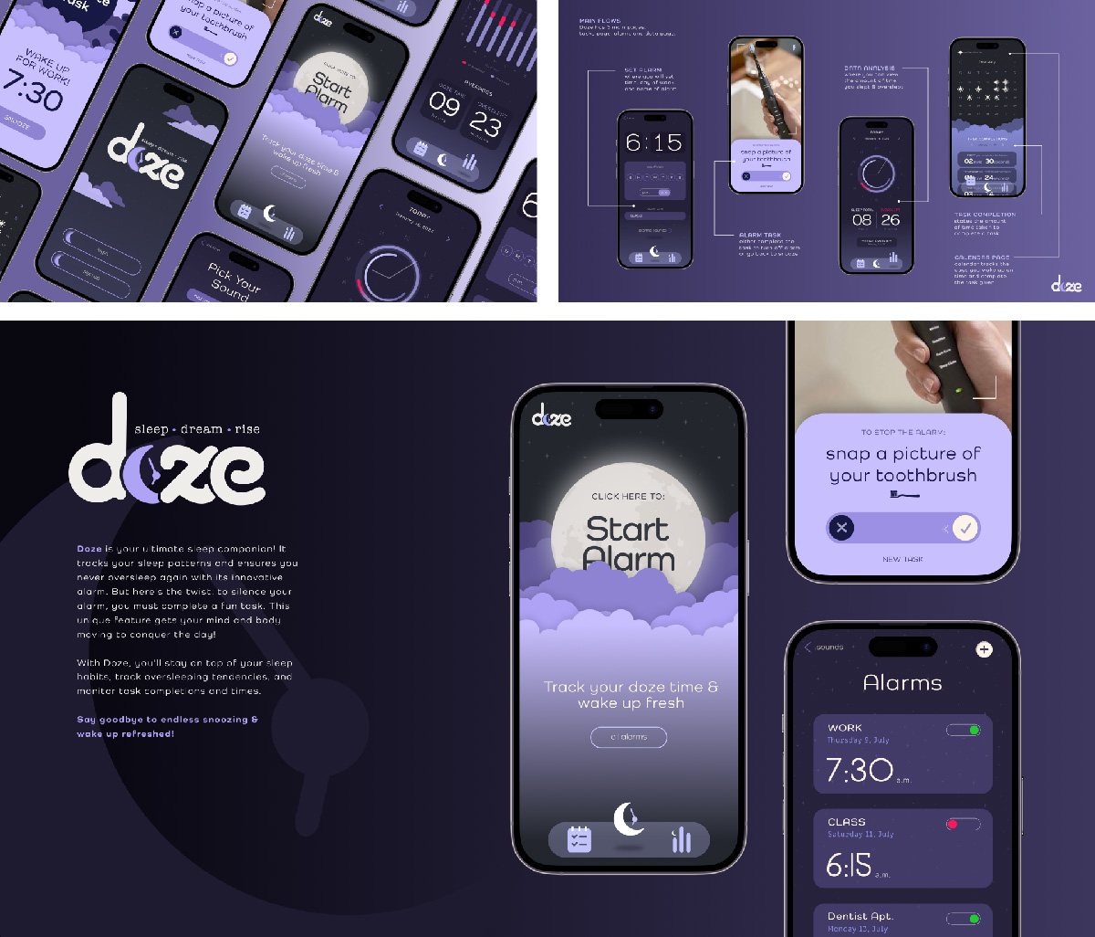
This sleep-focused application pairs calming functionality with a monochromatic palette of purples to create a soothing, immersive user experience. Users can track sleep patterns, set personalized goals, and wake up with purpose through interactive alarms that require task completion to turn off. The interface is minimal yet engaging, designed to reduce cognitive friction while maintaining visual depth and cohesion. Every detail — from soft gradients to intuitive motion — supports better rest and more mindful mornings.
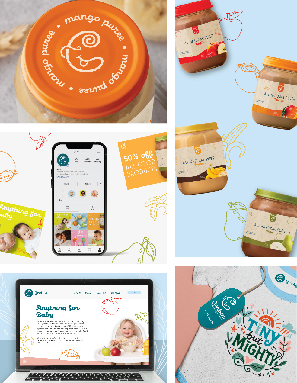
This Gerber Baby rebrand brings a fresh, playful identity to the trusted baby food brand while emphasizing organic, all-natural ingredients. The new logo replaces the classic Gerber baby illustration with a modern, inclusive mark that reflects the diversity of today’s families. Vibrant colors, hand-drawn illustrations, and friendly typography help capture the joy and messiness of early childhood. The rebrand reinforces Gerber’s mission to nourish all little ones with products that are as wholesome as they are delightful.
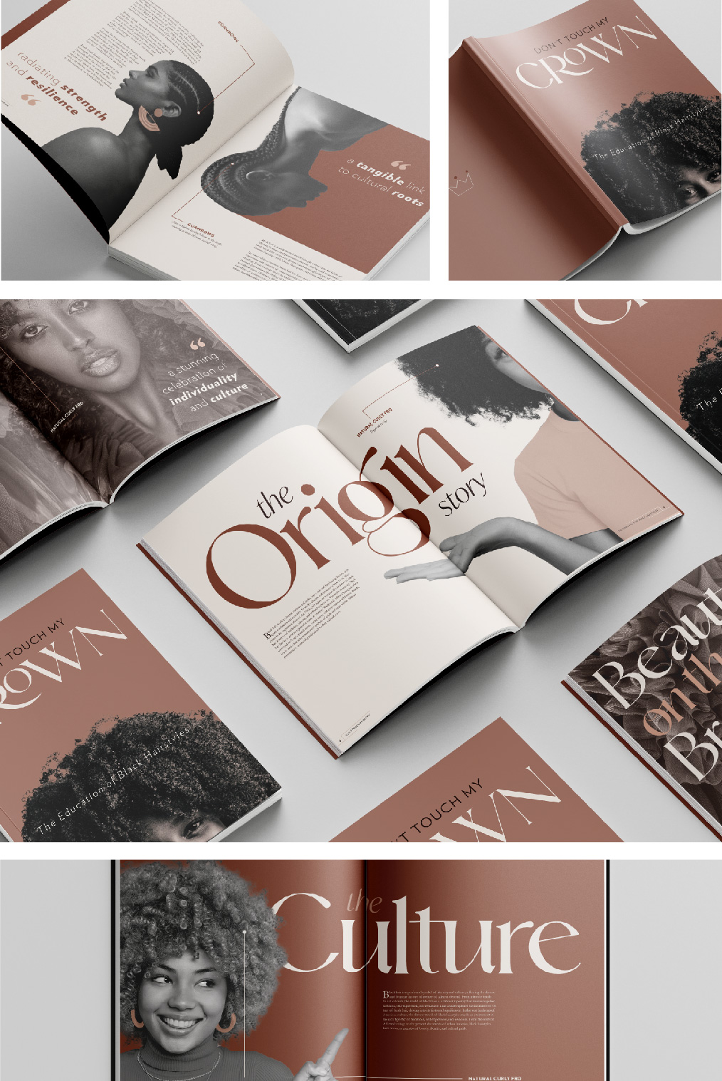
Don't Touch My Crown is a thoughtfully curated publication that explores the cultural,
historical, and political significance of Black hairstyles. With a soft, muted pink
palette juxtaposed against striking black-and-white imagery, the design sets a reflective
tone — elevating the visual narrative as much as the written one. Each page honors
the artistry and legacy of Black hair, tracing styles from ancestral traditions to
contemporary expressions, while confronting stigmas and celebrating identity.
Don't Touch My Crown is a thoughtfully curated publication that explores the cultural, historical, and political significance of Black hairstyles. With a soft, muted pink palette juxtaposed against striking black-and-white imagery, the design sets a reflective tone — elevating the visual narrative as much as the written one. Each page honors the artistry and legacy of Black hair, tracing styles from ancestral traditions to contemporary expressions, while confronting stigmas and celebrating identity.