
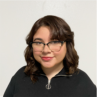
Jazmine Garcia
Hometown: Wylie, Texas
Website: Jazmine Garcia
I’m a graphic designer and illustrator who loves creating work that tells stories,
sparks connection, and empowers individuals. I blend thoughtful design with expressive,
playful visuals, inviting audiences to see the world through a more imaginative lens.
Outside of design, you can usually find me reading or playing cozy games. I’m always
inspired by the little things that make life feel warm and meaningful.
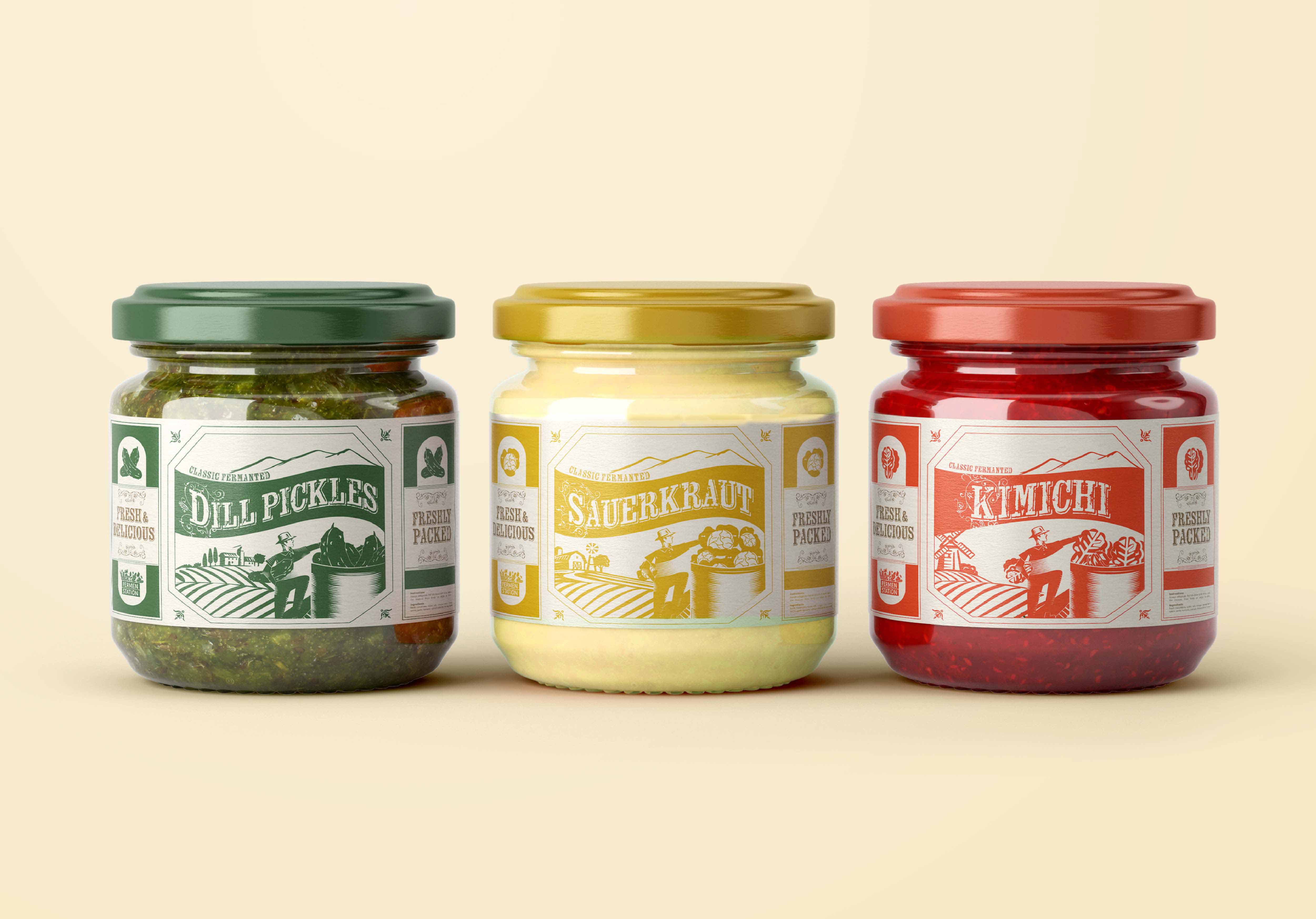
Fermanstation: Recognizing the gap between the charm of local markets and the convenience of grocery
shopping, the brand sets to bring the authenticity and freshness of farmers’ markets
directly to supermarkets.
Fermanstation’s design system emphasizes local, fresh ingredients sourced from nearby
farms, that celebrate freshness, accessibility, and responsible consumption. The packaging
integrates natural textures, earthy tones, and rustic typography to convey the brand’s
dedication to sustainability, health, and community.
The result is a visually compelling identity that celebrates freshness, accessibility,
and responsible consumption. Fermanstation invites customers to be part of a movement
to make healthy, locally-sourced foods available to everyone.
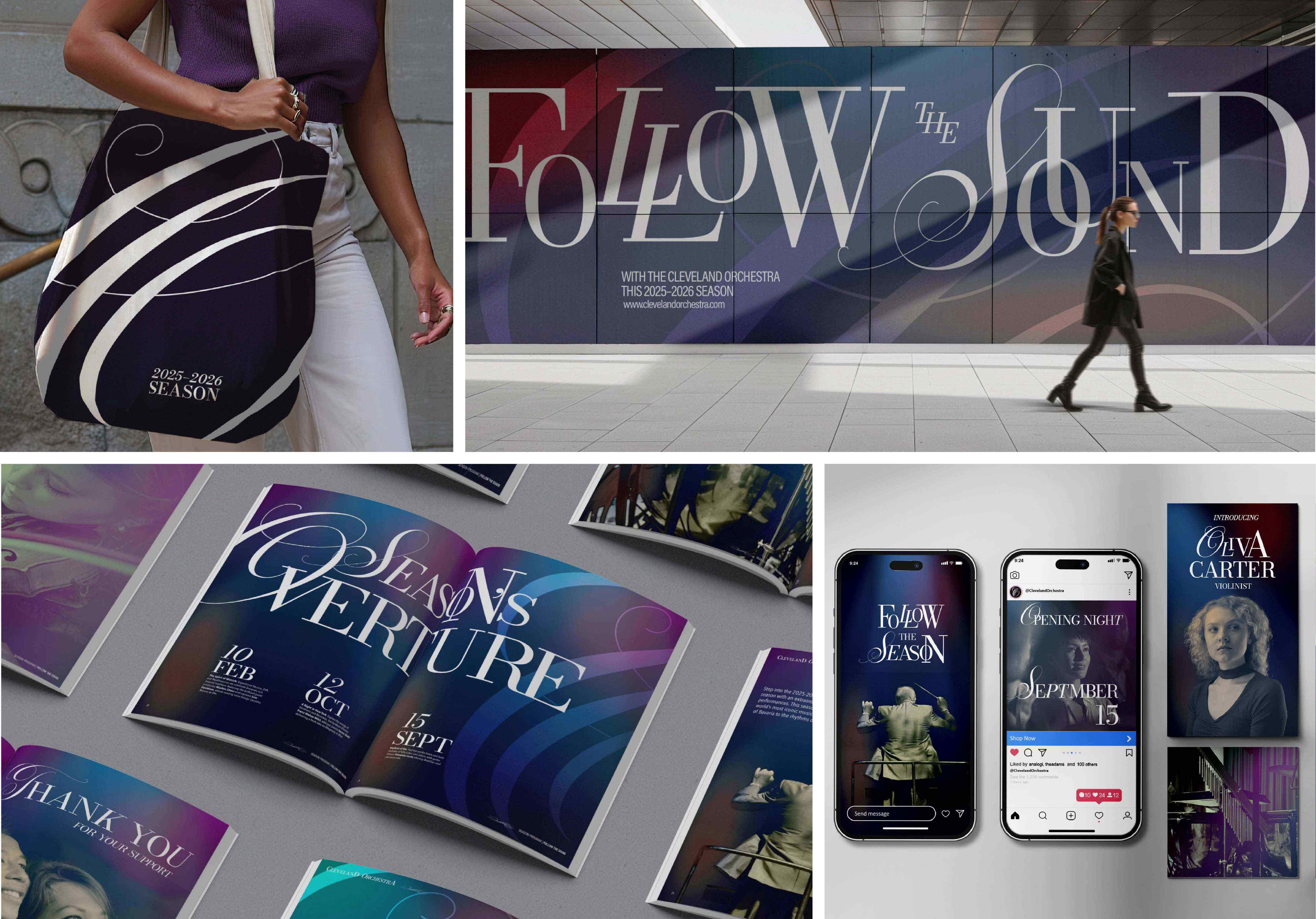 The Cleveland Orchestra’s rebrand honors its timeless legacy while connecting with
contemporary audiences. Elegant typography and a dynamic visual system blend tradition
with modernity to engage a diverse crowd.
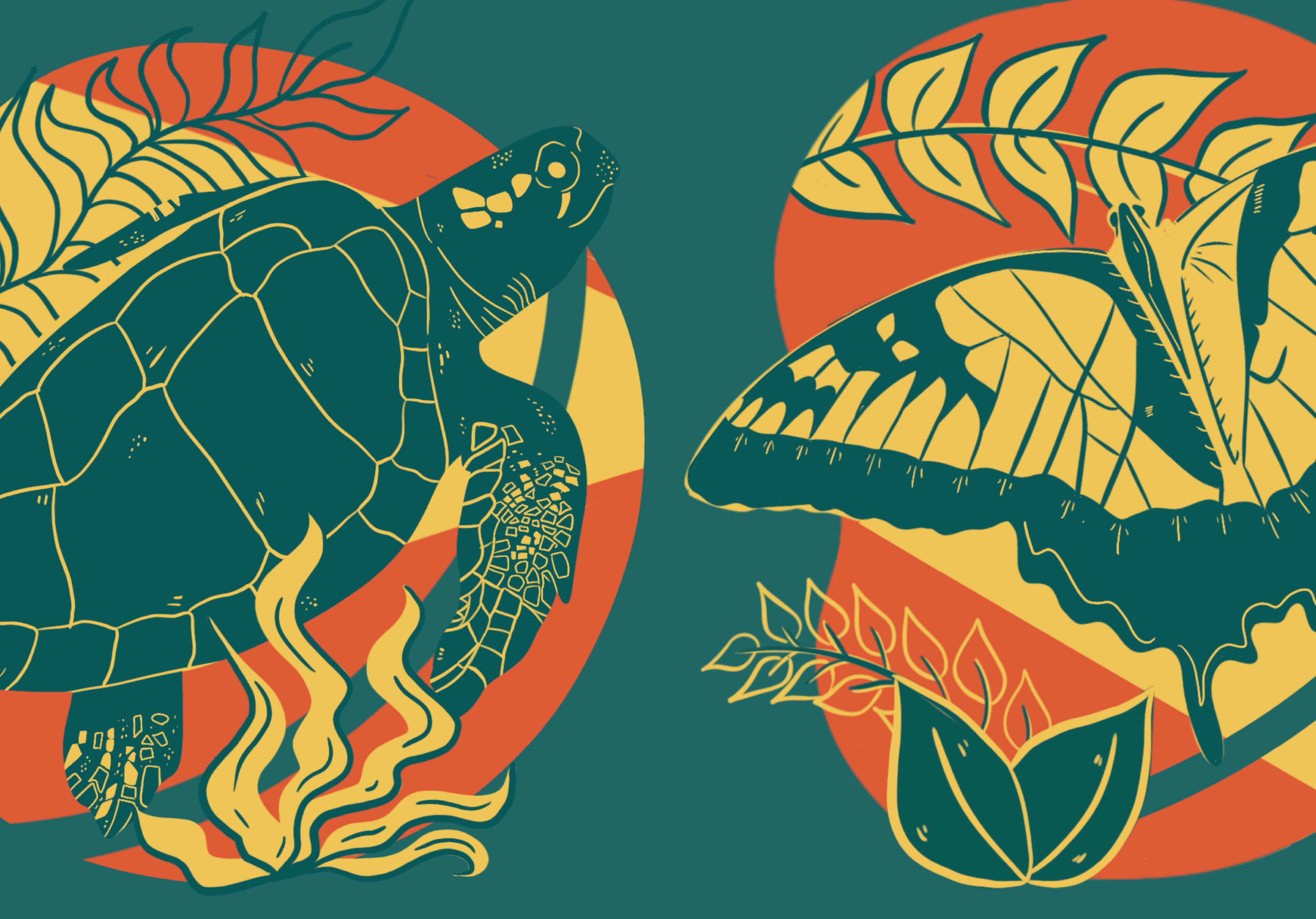 This series showcases the Gulf States' biodiversity, featuring flowers, animals, and
a butterfly with a cohesive, lively illustration style. It celebrates the region’s
natural beauty and wildlife through vibrant visuals for a dedicated website.
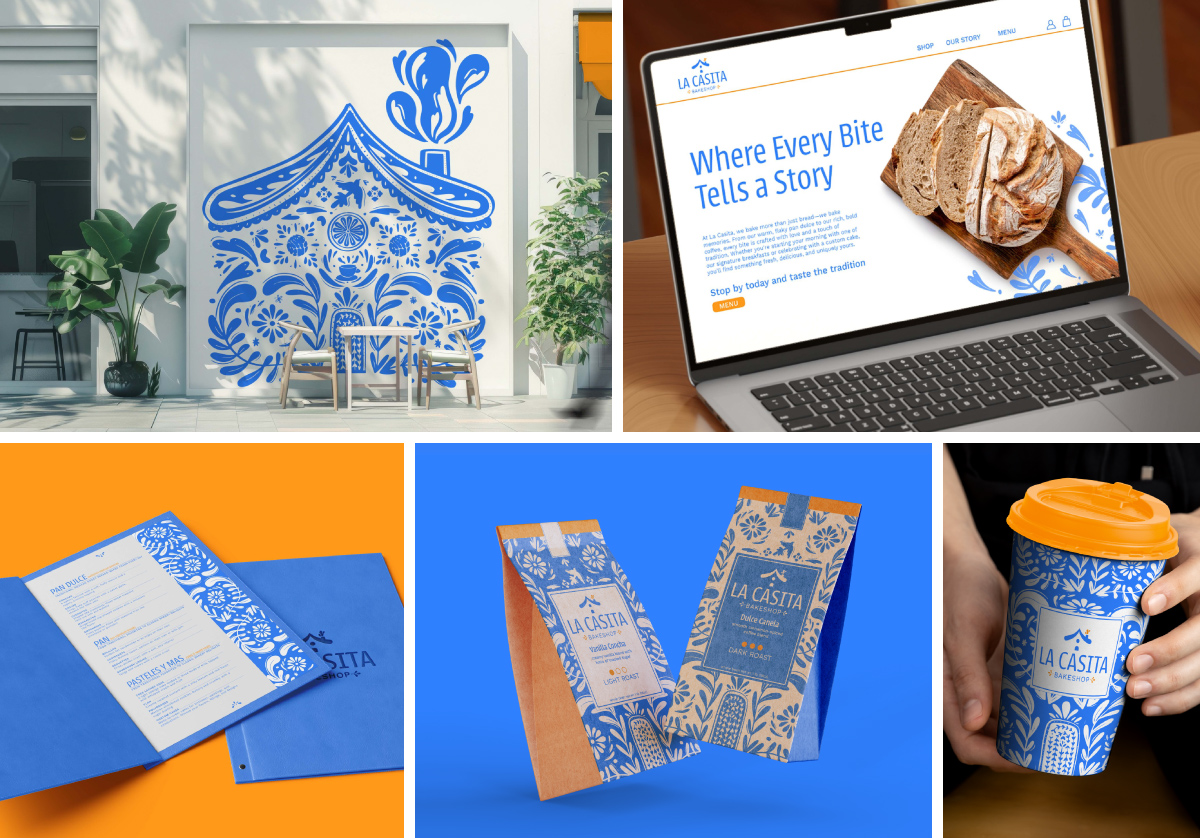 La Casita Bakery’s rebrand honors its Mexican heritage while introducing a modern
visual identity. Bold patterns and inviting typography to capture the warmth, authenticity,
and vibrant flavors of the bakery.
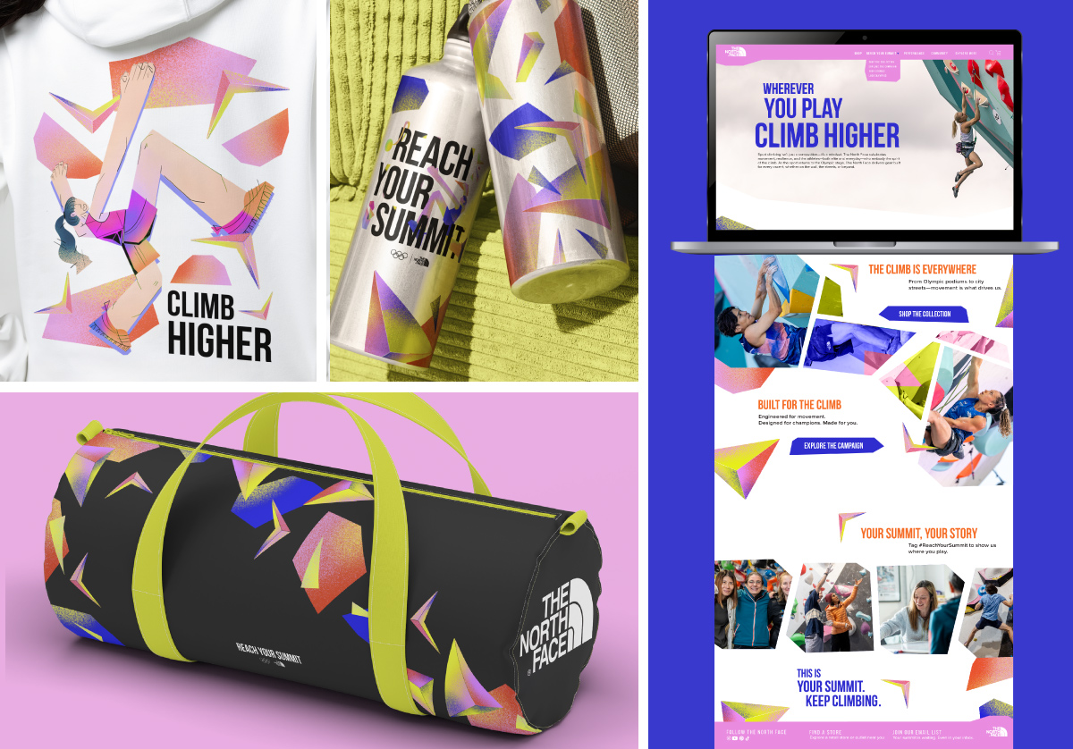 "Reach Your Summit" is a global campaign for The North Face’s collaboration with the
2028 Olympic Games, celebrating movement, resilience, and personal summits. Bold typography,
dynamic photography, and vibrant colors highlight sport climbing’s energy while reinforcing
the brand’s commitment to performance and innovation.