

Rachel Blow
Hometown: Denton, Texas
LinkedIn: Rachel Blow
Website: RachelBlow.com
Hi, I’m Rachel! I’m a designer who believes that good design starts with asking the
right questions. I spend a lot of time in the research phase, gathering references,
following threads, and listening closely so that every project I make is grounded
in intention and care. I love creating work that is both thoughtful and expressive,
whether it’s a visual identity, publication, or campaign with heart.
At UNT, I’ve grown through collaboration — as a student, teammate, and secretary of
our AIGA chapter, where I help organize events that bring designers together to learn,
connect, and share ideas. My favorite projects are the ones that highlight underrepresented
voices, bring people together, or offer a fresh way of seeing something familiar.
When I’m not designing, I’m probably browsing a design archive, testing out a new
metalsmithing idea, or collecting little phrases that spark something. I’m always
looking, always learning, and always trying to make work that feels honest and human.
I own over 200 design books. My library has officially outgrown my shelves… and possibly
my bedroom.
Awards
National Student Show 2025 • Senior Portfolio: Gold
National Student Show 2025 • Senior Portfolio: Best of Show
GDUSA Packaging Competition 2025 • Package Design Award
GDUSA Students to Watch 2025
Featured 7X in Graphis New Talent 2024 & 2025
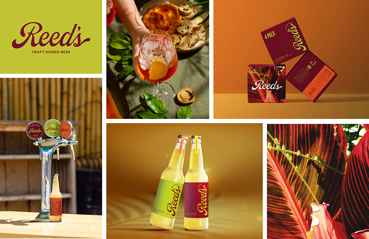 Reed’s Ginger Beer is a bold, Caribbean-inspired soft drink traditionally seen as
a cocktail mixer. This rebrand positions it as a standalone beverage for spice lovers,
using playful product names, a vibrant visual identity, and natural textures to communicate
its heat and authenticity.
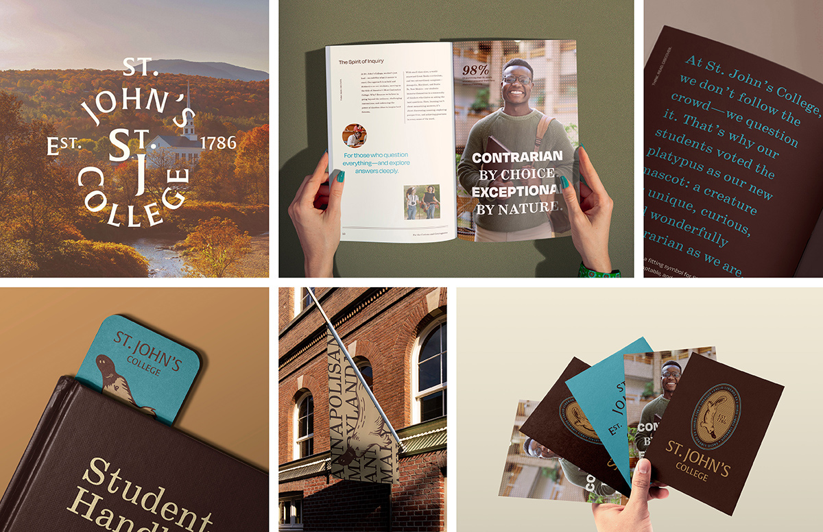 St. John’s College in Washington, D.C. is the third-oldest university in the United
States and is known for its Great Books reading list and curriculum. This rebrand
embraces the school’s unconventional and intellectual spirit through a bold identity
system centered on the platypus, a symbol of contradiction and adaptability.
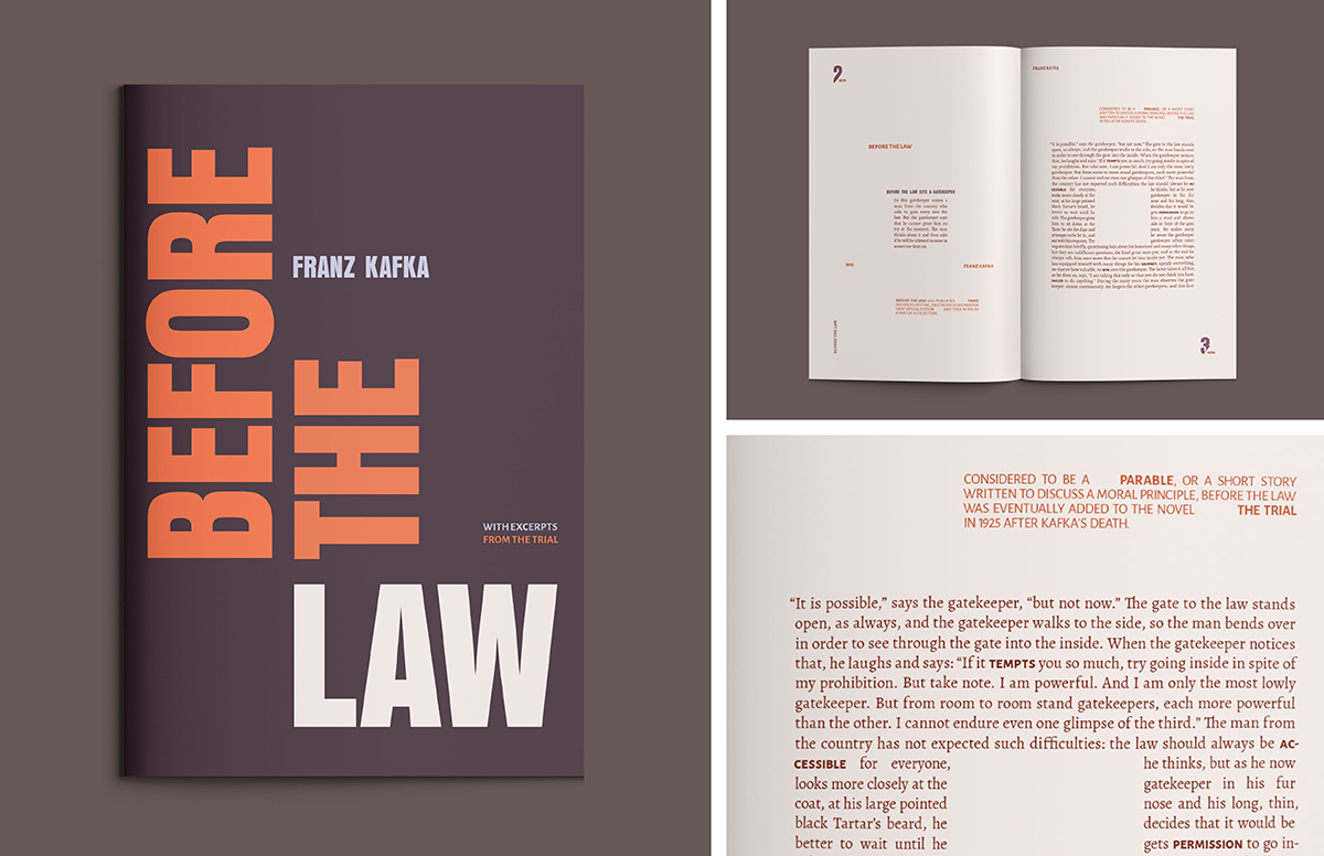 "Before the Law" is a typographic brochure that visually interprets Franz Kafka’s
parable of the same name. Through layered type, structured grids, and negative space,
the design reflects the story’s themes of bureaucracy, existential struggle, and inevitable
ambiguity.
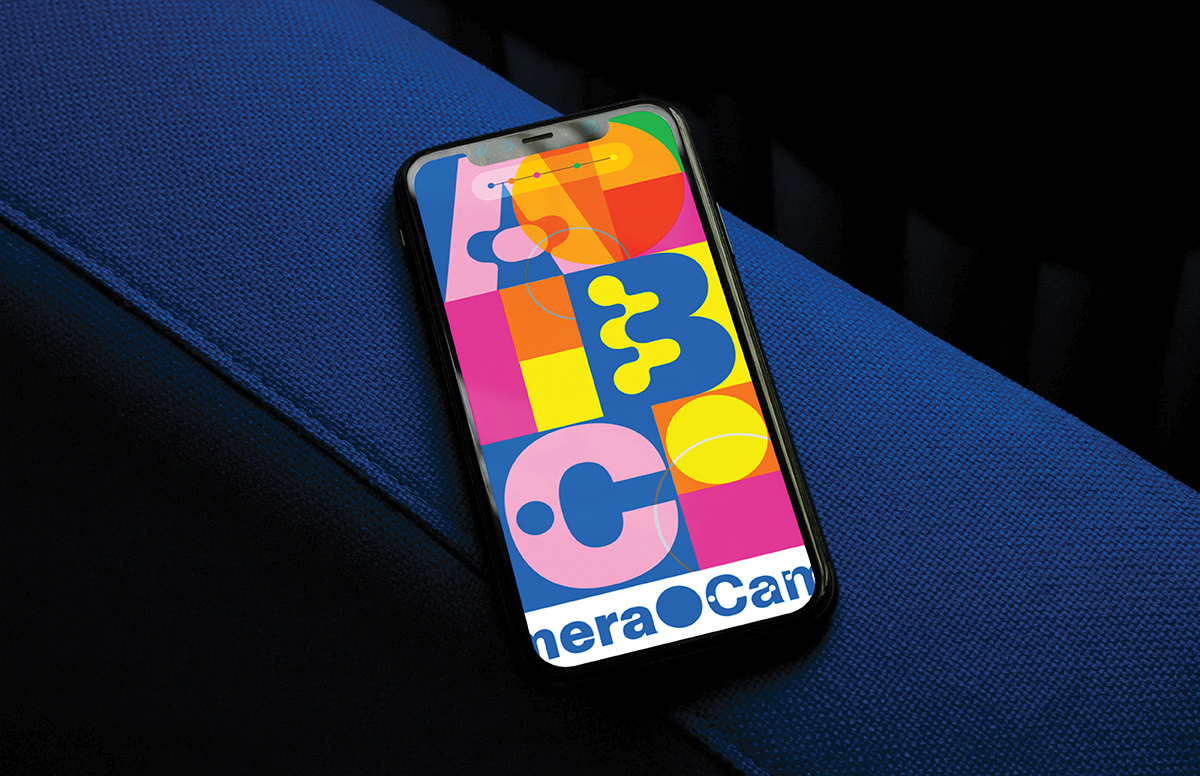 ABC Camera is a display typeface by Dinamo that reinterprets light traps from mid-century
television screens. This microsite showcases the typeface’s personality through geometric
compositions, a Swiss-inspired layout, and a digital environment rooted in both function
and play.
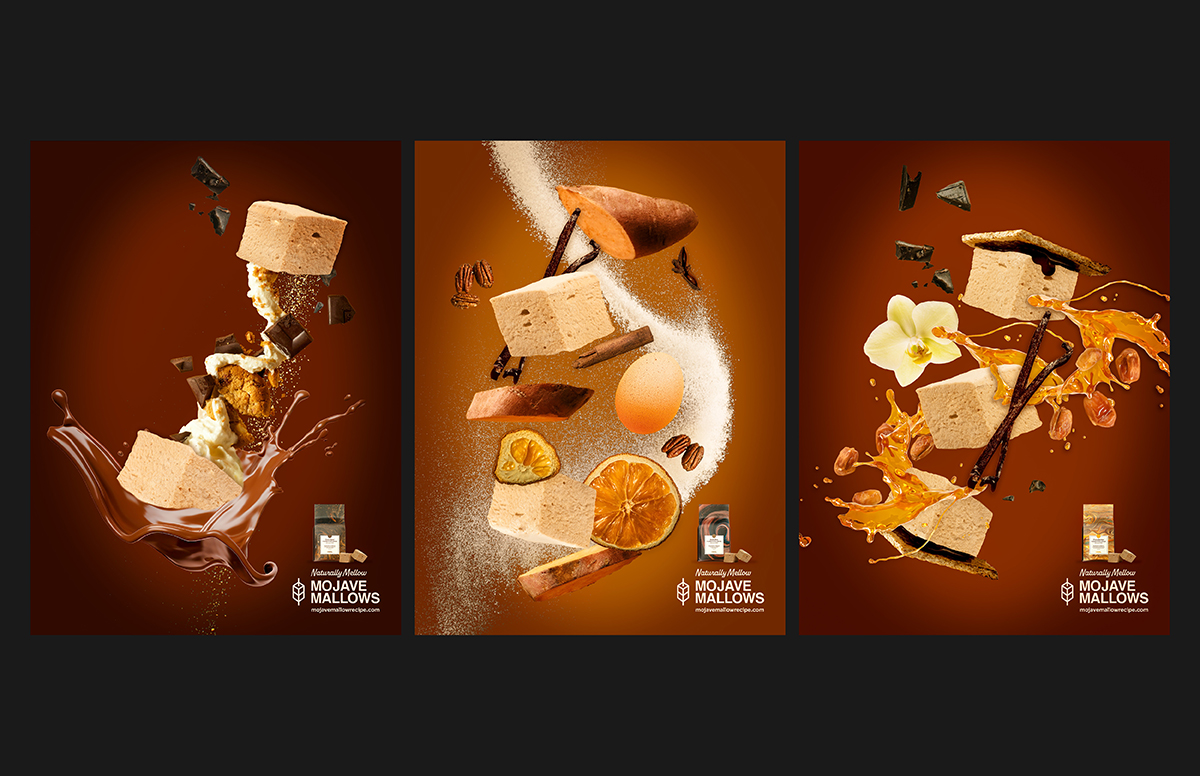 Mojave Mallows is a small-batch s’mores brand created by former Girl Scouts. This
print campaign communicates the brand’s nostalgic yet premium positioning through
rich textures, warm photography, and headlines that blend handcrafted charm with elevated
indulgence.