

Isabella Bivona
LinkedIn: Isabella Bivona
Portfolio: Isabella Bivona
A graphic designer with experience in branding, publication, and social media marketing, Isabella Bivona is an active member of the Dallas-Fort Worth AIGA Chapter. Design is more than a solution to a problem, she says, it’s a pathway for creating dynamic, impactful outcomes that resonate with people and the world around us. Her approach to design is rooted in a thoughtful consideration of audience and user experience, resulting in purposeful and effective outcomes.
Beyond design, Bivona has a passion for bookbinding, reading, and comics. During time off, she can often be found hiking and camping in Big Bend National Park or exploring the local library.
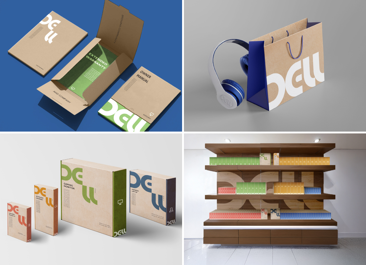 A rebranding project for Dell, this focuses on enhancing their existing sustainable
packaging while bringing an engaging visual system to their company. The new cohesive
brand style aims at bringing in consumers and empowering prior brand-loyal users with
a needed update across their physical and web design.
A rebranding project for Dell, this focuses on enhancing their existing sustainable
packaging while bringing an engaging visual system to their company. The new cohesive
brand style aims at bringing in consumers and empowering prior brand-loyal users with
a needed update across their physical and web design.
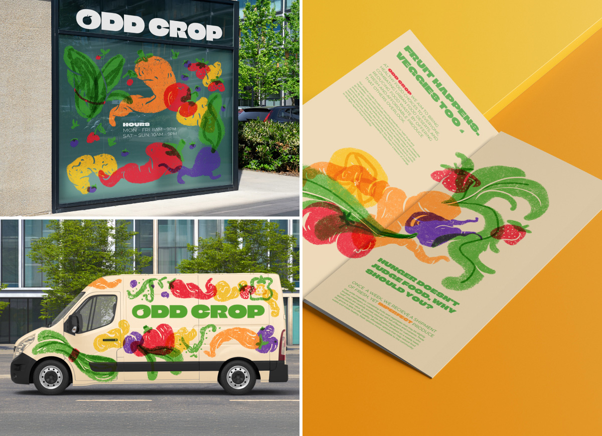 One of the goals of this company was to change people’s perception of visually imperfect
produce by taking a lighter, engaging, and fun spin on how that produce isn’t perfect,
but still good. By using an organic and down to earth illustration style inspired
by risographs and texture, Odd Crop’s branding serves to make these imperfections
of their product a defining positively viewed feature rather than a negative one.
The ability for the company to be seen as bright and inviting is important too since
one of its goals is to bridge community gaps and provide for those who live locally
by addressing nutritional issues caused by food deserts.
One of the goals of this company was to change people’s perception of visually imperfect
produce by taking a lighter, engaging, and fun spin on how that produce isn’t perfect,
but still good. By using an organic and down to earth illustration style inspired
by risographs and texture, Odd Crop’s branding serves to make these imperfections
of their product a defining positively viewed feature rather than a negative one.
The ability for the company to be seen as bright and inviting is important too since
one of its goals is to bridge community gaps and provide for those who live locally
by addressing nutritional issues caused by food deserts.
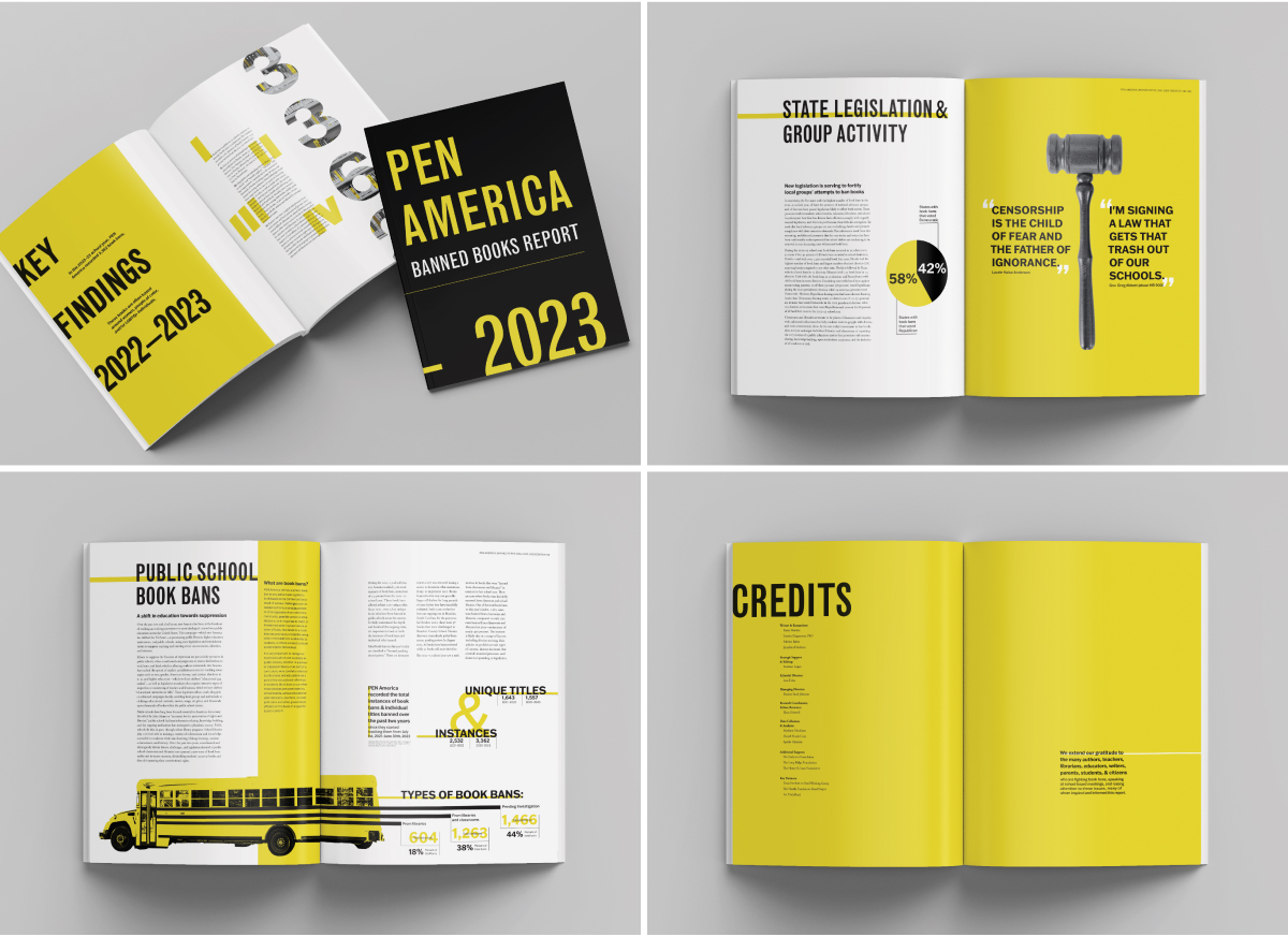 In adapting PEN America’s 2022–2023 book ban statistics for public schools in the
USA, this project aims to condense over 55 pages of information into a digestible,
informative annual publication style issue. By utilizing a limited color palette with
a focus on legibility in the typefaces used, the goals of conveying information to
a wide audience of school aged tweens to adults and parents of whom this issue may
concern or interest is accomplished. After a survey of individuals ranging from ages
11 to 78, I found an overwhelmingly positive response back about how the book was
easy to navigate, legible, and had infographics that were memorable.
In adapting PEN America’s 2022–2023 book ban statistics for public schools in the
USA, this project aims to condense over 55 pages of information into a digestible,
informative annual publication style issue. By utilizing a limited color palette with
a focus on legibility in the typefaces used, the goals of conveying information to
a wide audience of school aged tweens to adults and parents of whom this issue may
concern or interest is accomplished. After a survey of individuals ranging from ages
11 to 78, I found an overwhelmingly positive response back about how the book was
easy to navigate, legible, and had infographics that were memorable.
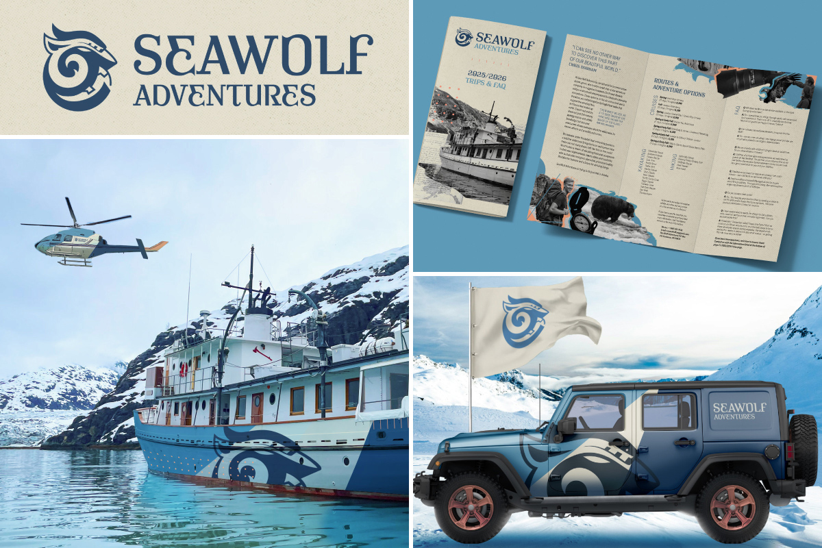 A rebranding project, SeaWolf Adventures is an updated and cohesive rebrand project
that would work as an organized system across their web, merchandise, and vehicular
applications. By basing the primary color palette around colors found in the environment,
this brand embraces the sustainability and environmental direction that the company
values. The logo is a combination of the namesake (a wolf), the sea for the cruises,
as well as mountains for the hiking and land exploration aspect of the company. Pamphlet
brochure layout design were important aspects of conveying the company’s exploration
options, accommodations and prices.
A rebranding project, SeaWolf Adventures is an updated and cohesive rebrand project
that would work as an organized system across their web, merchandise, and vehicular
applications. By basing the primary color palette around colors found in the environment,
this brand embraces the sustainability and environmental direction that the company
values. The logo is a combination of the namesake (a wolf), the sea for the cruises,
as well as mountains for the hiking and land exploration aspect of the company. Pamphlet
brochure layout design were important aspects of conveying the company’s exploration
options, accommodations and prices.