
Maxwell Pius
Hometown: Frisco, Texas
About: In my free time, I enjoy printmaking, visiting used bookstores, collecting knickknacks, and going to Clampitt Paper to stockpile as many paper samples as possible. I have a deep passion for print and packaging. I am constantly inspired by the power of design and its ability to create memorable experiences that forge a strong connection between a product and its audience. Above all, at the core of my values, I cherish the creative process. I enjoy the research, the piles of sticky notes, and the long romantic walks to the scanner and back to my computer.
My love for process, print, and production drives me and influences my practice. I love feeling like I'm behind the scenes working on a movie set, making sure that every detail is just right. Even if no one sees all the different takes and all the time it took to create the final product, I am most proud of it and find it the most rewarding.
Fun Fact: I want to live in a lighthouse.
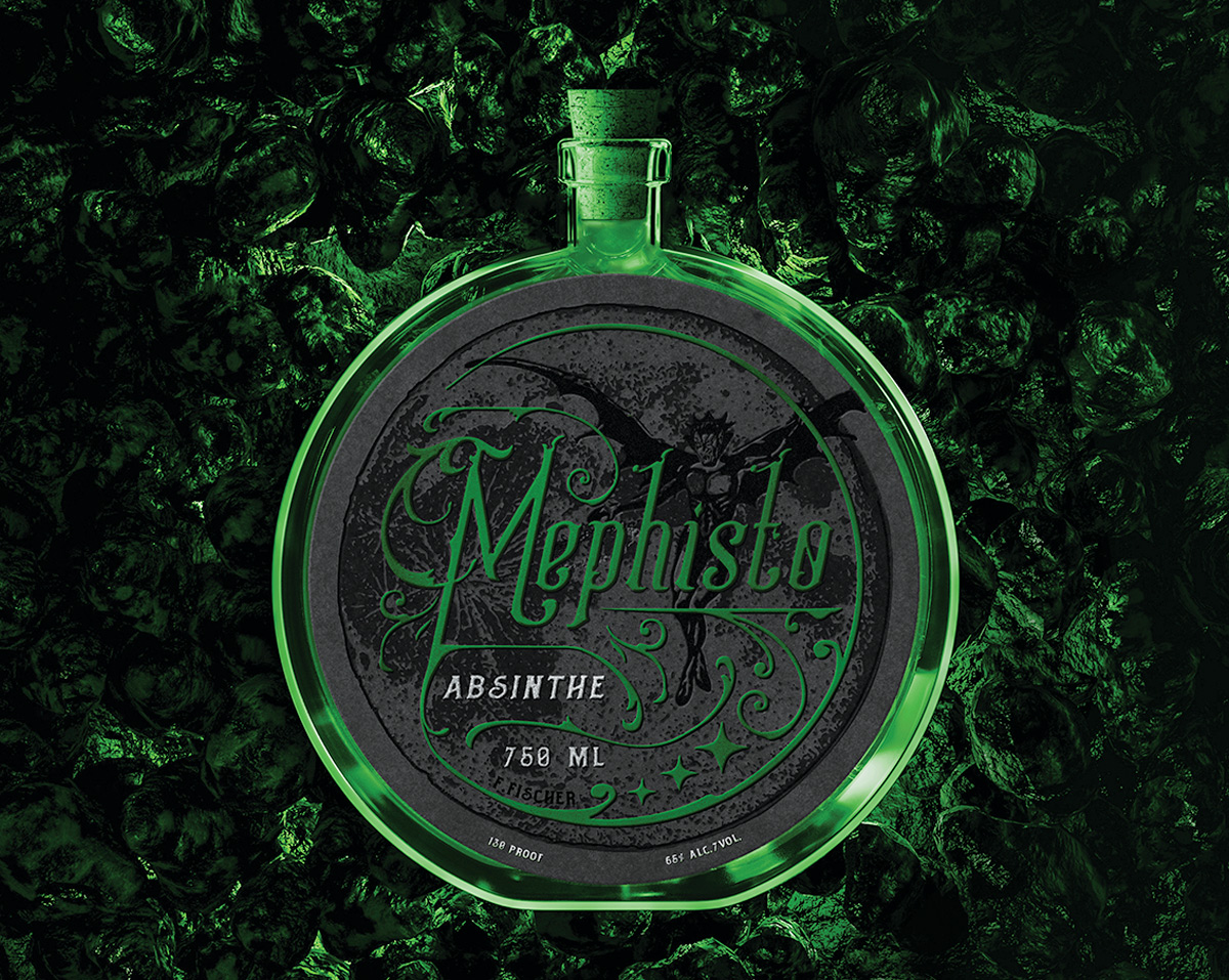
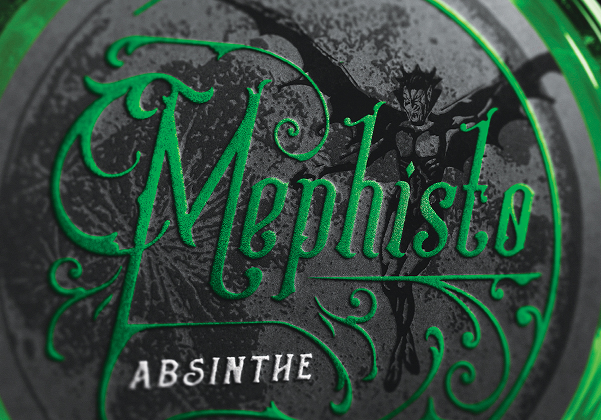
This project was more than just rebottling an absinthe, it was about creating a brand identity and the story of Mephisto. The original brand lacked any recognizable characteristics, relegating the company as untraceable. The name “Mephisto” is the name of a German folklore demon associated with the mischievous and promiscuous. With fine liquors having their own ritual when drinking and absinthe having imagery associated with it, I decided to use this visual language to create a mystic atmosphere and occult ritual around the elixir. By playing off the concept of “The Green Fairy,” which is a traditional absinthe, I brought the mythical Mephisto to life and made him the brand's symbol. I chose a round bottle to contain the potion as it will be a unique shape to the absinthe aisle in-store and further communicate the mystical language.
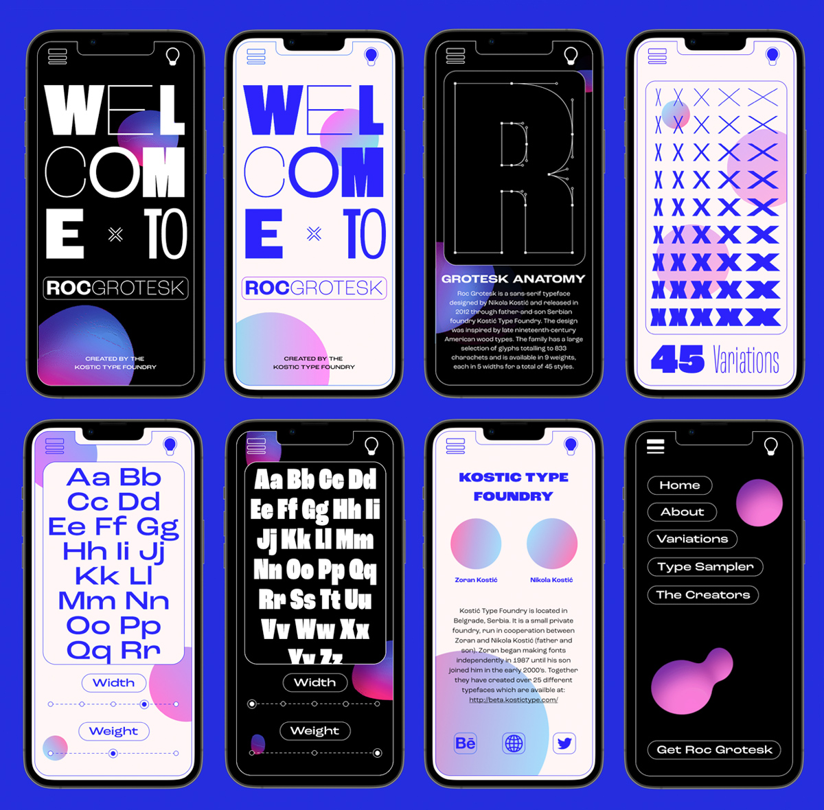
This project was my first step in interaction design using Figma. I was able to create a microsite for the pre-existing typeface Roc Grotesk. This typeface was created by the Kostic Type Foundry and was originally inspired by letterpress woodblocks as well as sign making. My goal for this project was to give the user a new experience with a product they may already be familiar with while trying my hand at a new program. I wanted to set the type in a new contemporary setting that would allow the audience to visualize the product in a new environment that gives new life to Roc Grotesk. To create a contemporary setting, I created looped animations in After Effects and provided users with a light mode and a dark mode to see the different moods the typeface can convey. Overall, I had a great time experimenting with new programs and designing for an interaction beyond print.
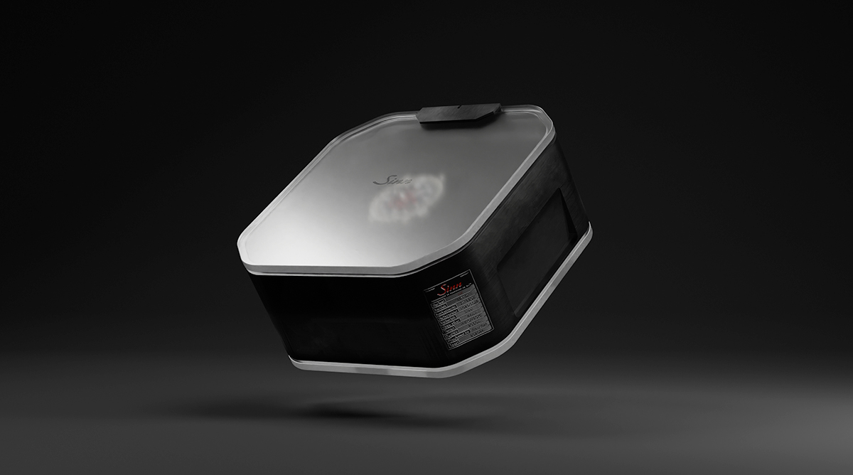
Sinn has been producing meticulously crafted watches since 1961 and has a reputation for being one of the most reliable and rigorous watch manufacturers. They do not create watches; they create tools. Using this unique angle, I repositioned the brand as a tool company that makes uncompromised timepieces and created specialty packaging using Blender to launch their U2 watch collection.
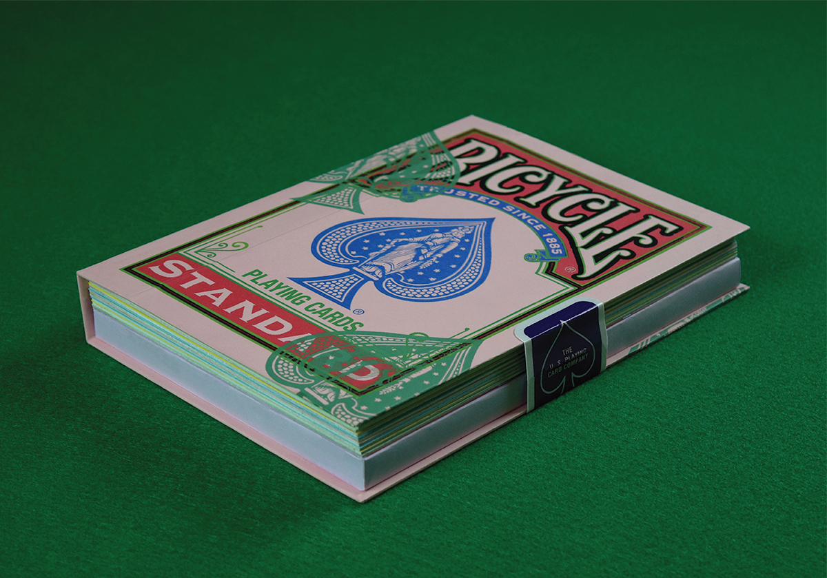

This project aimed to create a brand capability book for The United States Playing Card Company and center it around their most iconic brand and deck of cards: The Rider Deck made by Bicycle. I wanted to show the significance and influence of a single deck of cards while designing the information in a new and unique way that departs from the traditional visual language typically associated with a deck of cards. To accomplish this goal I created a publication that presents the brand's history and influence as a fun facts booklet, with each page being risograph printed to lend a new visual style to the brand. Utilizing the iconic red and blue from the Rider Deck, each spread features a red and blue pigment risograph printed onto Pop-Tone French Paper to give each page its unique feel. With this unique style of printing and accessible delivery of information, I was able to give the Bicycle brand a new look while educating its newfound audience on the importance and capability of the Rider Deck.
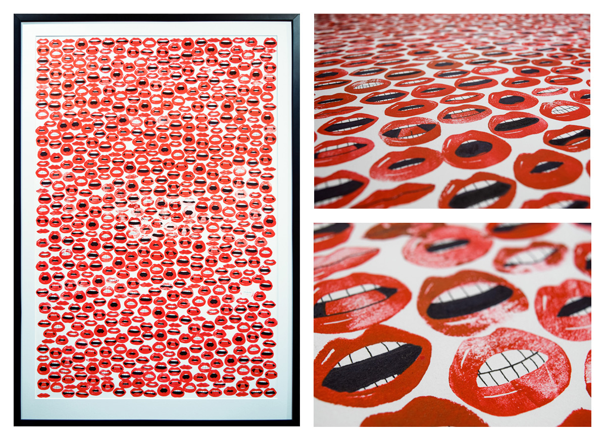
This work is from a series revolving around repetition, where I used hand-carved linoleum stamps to show how much things repeat themselves in our world. This piece revolves around speech, in the English language and most languages, there are twelve shapes that your mouth makes when talking and pronouncing letters. “Five” and “Oh no” require your mouth to create different, distinctive shapes. It is these shapes that are repeated over and over to create our vocabulary. In an average day, a person will speak 7,000-10,000 words. From those 7,000-10,000 words, the same 600-900 words are repeated repeatedly to create our daily total, and we do this by repeating the same sounds and shapes that our mouth makes. I made this work by creating twelve stamps of a mouth, each making one of the twelve shapes. I created them in a graphic style to be recognizable with their bold red lips and bright white teeth. I then hand-stamped 648 mouths to represent the number of words we say in a given day. These were then stamped onto a 26" x 40" piece of paper while returning and drawing teeth when necessary. The order of these stamps is random, just like your entire day's speech is not planned. Some of these lips overlap, some are opaque and bold, and some are light and soft. This relates to speech as sometimes we stutter, repeat ourselves, shout, or whisper. This piece also applies to most languages, as they use the same 12 mouth profiles to create sounds and their speech. The only difference between speaking another language and your current language is the order that these sounds are in; we are all making the same shapes and sounds, but the order is incredibly crucial to create speech. Whether we realize it or not, we constantly repeat ourselves, one sound at a time.
