
Macy Kanekkeberk
Hometown: Lantana, TX
Visit Me Here: LinkedIn
About: I am a graphic designer, illustrator, and University of North Texas Communication
Design Program alumni. With a prevailing interest in packaging design and branding
identity, my ability to combine illustration and design lends a unique perspective.
I enjoy work that goes against the norm, and I am always searching for new and inventive
ways to tackle my challenges.
As an artist, I have a particular affinity for color and exploring their relationships,
as color defines a large part of a brand's character. I strive to find the right answers
in new and tasteful ways that create bridges between design and art worlds. I am excited
to enter the world of graphic design, and I look forward to taking on any new opportunities
that come my way.
Fun Fact: I love drawing mythical creatures.
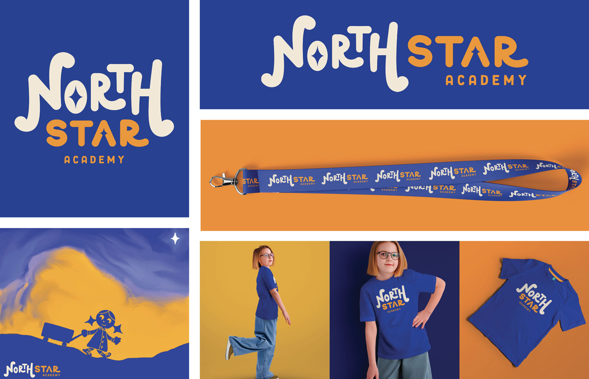
This is a rebrand of North Star Academy in Lantana, Texas, a daycare that I frequently
attended as a child. North Star Academy is Lantana's faith-driven center for early
learning and nature-based play since 2006.
This rebrand helps the brand show its customers how it engages with children and entertains
them whilst their parents are away. It also feels more inviting to children who might
be afraid to go to a daycare without their parent's guidance. The fun and bouncy letterforms
of the logo reflects this idea, as well as the soft color palette and mascot.
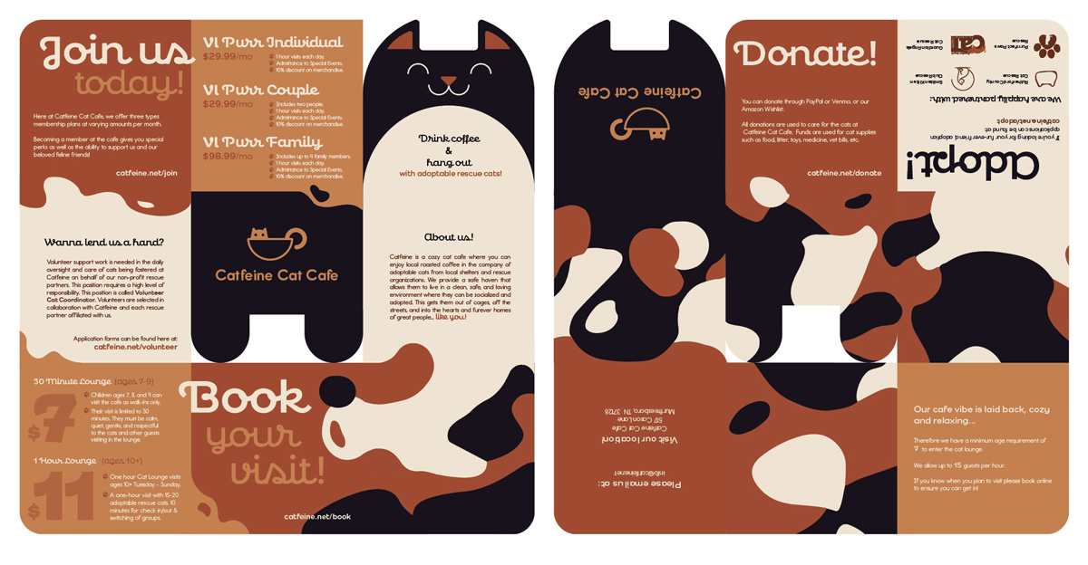
Catfeine Cat Café in Murfreesboro, TN is a place where customers can drink coffee and play with adoptable cats in their cat lounge.
The Catfeine Cat Café promotional brochure aims to captivate an audience with an unconventional folding style and joyful visuals in order to draw in a large audience to its location. This brochure tells the user a story about Catfeine as it's unfolded in a snake-like fashion. When folded, it is small and compact, allowing for easy distribution. The final brochure for Catfeine Cat Café is a snake-fold brochure depicting a calico cat. It is divided into 18 strategically placed sections that tell the potential customer a story as the brochure is unfolded.
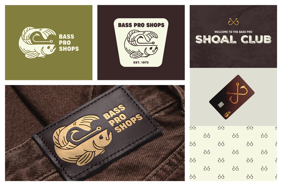
The final logos for Bass Pro Shops are an illustrative approach to a Bass Pro rebrand. This logo gives a much more pleasing visual to the consumer, with a fish & hook lockup to emphasize what the brand is known for. The bold typeface outlines the strong, brawny tone of the Bass Pro company. Since the logo is horizontal, the icon variant helps the logo fit into vertical compositions. Lastly, the revised colors of the brand pair well with the nature-loving personalities of its customers. Instead of detracting from the hues of the natural world, they respect it, as do those who truly enjoy the outdoors.
Formerly called the Bass Pro CLUB, the Bass Pro Shoal Club offers its members exclusive discounts and perks, such as a special events, free gear, points that never expire, and even a Shoal Club Card, which allows you to gain points from purchases that never expire. These points can be redeemed for free gear and discounts. The Shoal Club's branding is polished, luxurious, and personal. Customers will feel significant as a part of this club. The name derives from the term for a school of bass fish, which is called a shoal.
Bass Pro Shops has many products that can be used to spread its brand identity. Some of the most popular items sold at Bass Pro Shops locations are its clothing items, such as jeans and caps. With the versatility of its redesigned identity, Bass Pro's new logo can be fashionable rather than tacky.
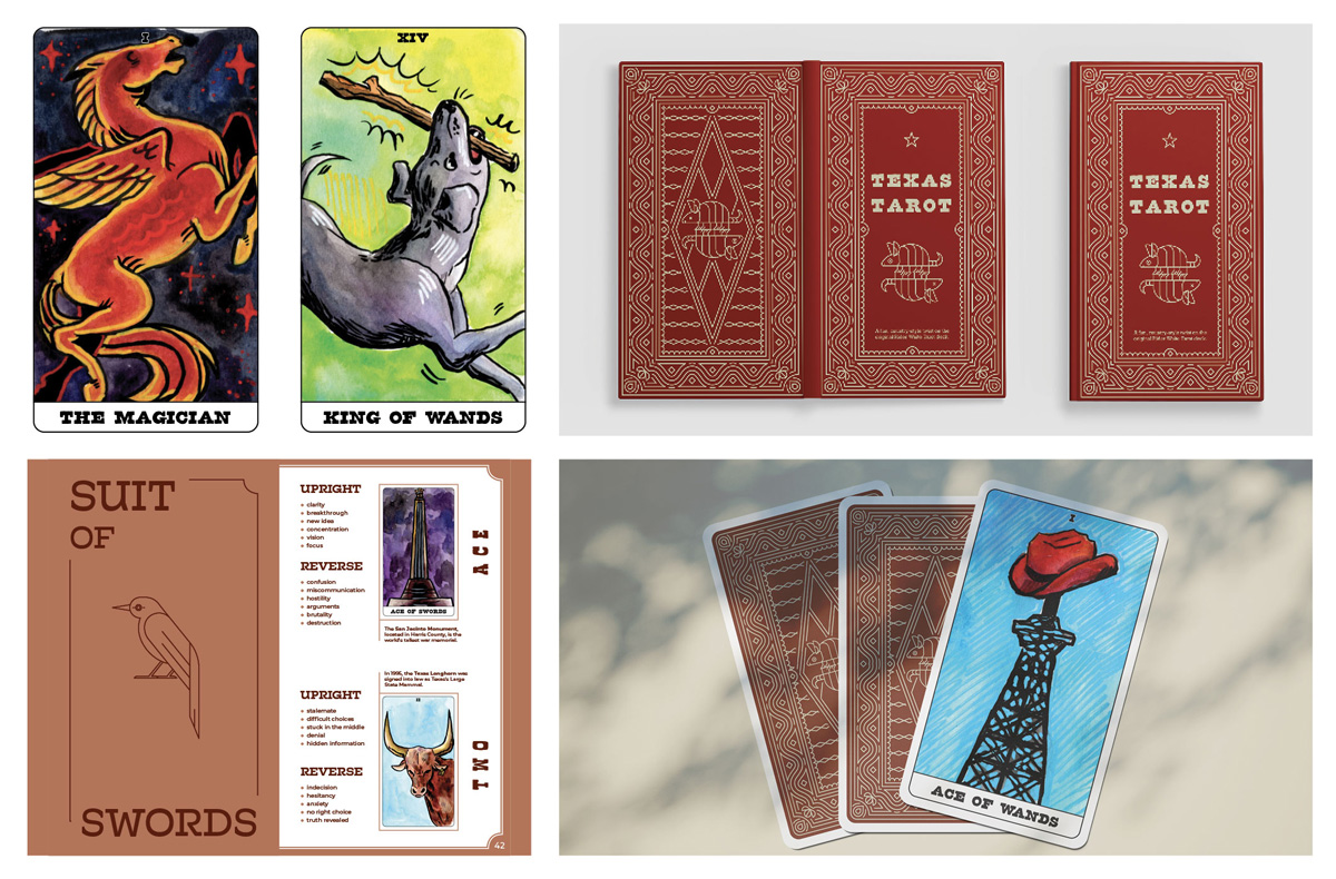
Texas Tarot is a fun way to learn about the great state of Texas using the mystical
world of tarot. Each Tarot Card features an illustration associated with a certain
concept exclusive to Texas, such as locations, cities, towns, events, monuments, facts,
and symbols. The handbook is a helpful guide that contains each card's spiritual meaning
along with a description of its illustration.
The Texas Tarot deck has a total of 78 cards. Each of these cards has a hand-painted
illustration associated with a certain part of Texas, which is explained in the handbook.
These paintings add to Texas Tarot's charm, as many who purchase Tarot decks collect
them for their artwork alongside their practicality.
Tarot cards are traditionally much longer and larger than a typical playing card. This allows for more emphasis on the deck's artwork. On the reverse of every card, the pattern found on the handbook fills the space, tying them together.
The Texas Tarot Handbook is a helpful guide for customers interested in learning about their fortunes and the great state of Texas. When closed, it is the same size as a typical Tarot card, allowing it to fit snugly within its package. Every card in the Texas Tarot deck has its own spiritual and Texas-themed meaning. Drawing a card upside-down or in conjunction with other cards can alter the interpretation of a reading; however, all of the information users need is within the Texas Tarot Handbook. The handbook is split into two categories: the Major Arcana and Minor Arcana. The 22 Major Arcana are the most important cards in a Tarot deck, representing life's virtues and vices. The 56 Minor Arcana are similar to playing cards in which there are four suits: wands, cups, swords, and pentacles. Each of these suits has 14 cards numbered from 1 to 10, with the page, knight, queen, and king coming after. In the handbook, users can find each card in the deck partnered with a description of the illustration and its upright and reversed meaning.
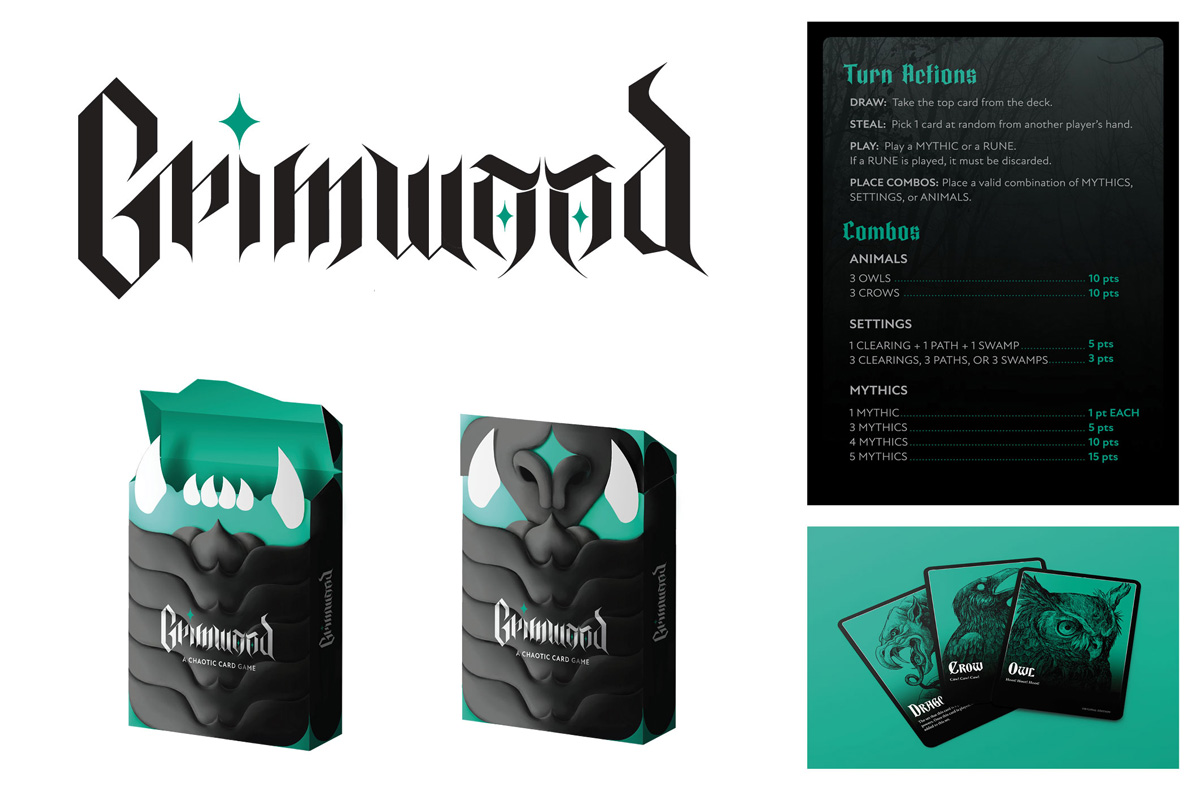
The Grimwood is a strategic card game where players collect settings, animals, and “mythics”, various legendary creatures in order to escape the The Grimwood, a terribly dangerous forest. The brand's original packaging does not harness the true potential of its concept in its outward appearance. In rebranding this card game, The Grimwood will gain a thrilling allure to those viewing its outer packaging. Those who purchase The Grimwood will only be more fascinated by its enchanting illustrations and easy-to-understand gameplay, making it a novelty in one's card game collection.
Emulating a gothic style, the Grimwood logo hopes to encapsulate the dangers of the mysterious forest the player must walk through on their creature-collecting journey. The eyes, which make up the o's, reference these supernatural beings, whose eyes might shine brightly in the darkness like stars. The package design for the Grimwood is akin to the body of a supernatural creature. The opening of the box acts as a mouth, which tucks away into the flap on its chin as it closes. The star symbol in the logo is visible as the corner embellishments. The scales, which take up the “torso” of the package, are raised, giving the package texture, as if it were a living thing.
The instruction card, of which there are four copies, accompanies the players as they
take their turns. It acts as a quick reference guide for how to play the game, as
well as how to count points at the end to determine a winner.
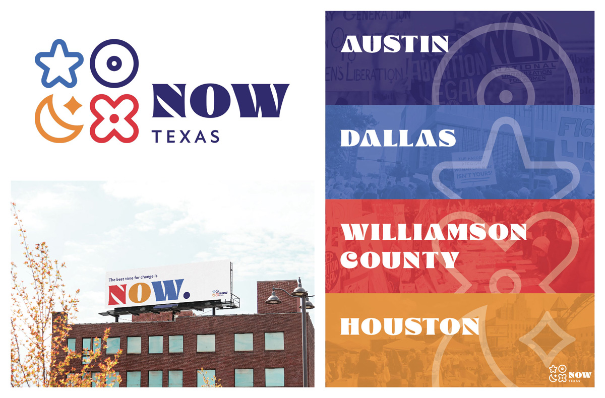
The National Organization for Women is the largest organization of grassroots feminist
activists in the United States of America. The Texas Chapter aims at helping to free
women in Texas from discrimination and harassment. This rebrand is aimed at bringing
professionalism to the NOW Texas Chapter
The logo is meant to convey the strength of the women's organization, as well as inform
viewers that the NOW Texas chapter is made up of four sub-chapters. The icons, which
represent Dallas, Austin, Houston, and Williamson County respectively, bind these
chapters together as one. Their colors represent their specific attributes (such as
the blue star representing the iconic Dallas Cowboys Logo), as well as the colors
of the Texas flag. The NOW title font was chosen to communicate femininity, and its
inherent power. The sloped terminals in the TEXAS subtitle mirror its counterpart,
but the thinner weights keep it secondary.
The poster for the NOW Texas organization showcases its subchapters and their symbols. This poster shows that people can and do gather in these areas and take action to better society for women.
