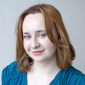
Cuinn Cornwell
Hometown: Farmers Branch, Texas | Visit Me Here: Website | LinkedIn | Instagram
About: I'm ready to embark on an exciting journey in the world of design! My passion lies in using creativity to solve real-world problems, and I thrive on inspiring and leading my team whenever the opportunity arises. I am committed to making a positive impact through design, creating visually captivating content or finding innovative solutions to challenges. I believe in the power of collaboration and continuous learning. I'm eager to connect with fellow designers, professionals, and visionaries who share my passion for creativity and making a difference. I'm excited to bring fresh perspectives to the design industry and contribute to projects that have a lasting impact.
Fun fact: I was a traditional artist before pursuing graphic design! I still like to dabble with different media in my free time, but watercolors are my favorite.
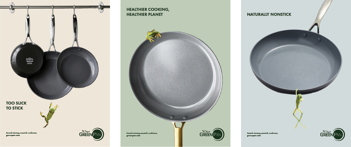
The objective was to create a consumer ad campaign with strong visuals and headline appeal. I chose GreenPan, a line of cookware with non-toxic ceramic nonstick technology. My solution differentiates this product in the marketplace using playful frog imagery - showing how even one of nature's stickiest creatures will slide off the surface. The project scope includes design and copywriting.

The objective was to design a series of headline-dominant magazine ads featuring a small, stand-alone business. I chose Sunbasil Soaps, a boutique company that specializes in soaps that look like realistic objects such as food and plants. I used this campaign to emphasize the fun and giftability of the products. The project scope includes design and copywriting.
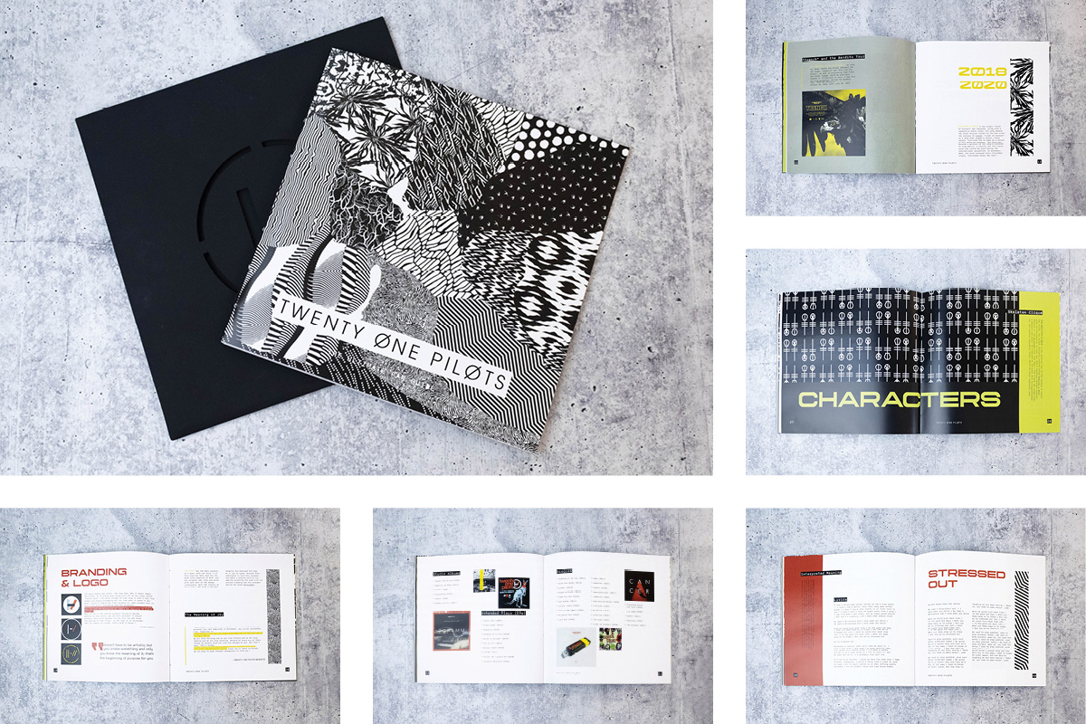
The objective was to create a visually rich book with a minimum of 12 pages. I chose to design a 48-page “Fan Guide” for the band Twenty One Pilots, featuring history, lore, characters and song lyrics custom to the musicians. The square design slides into a cover sleeve that evokes a vinyl album, and all images, patterns and typography are designed to correspond with the client's overall brand. The project scope includes layout design and image and copy curation.
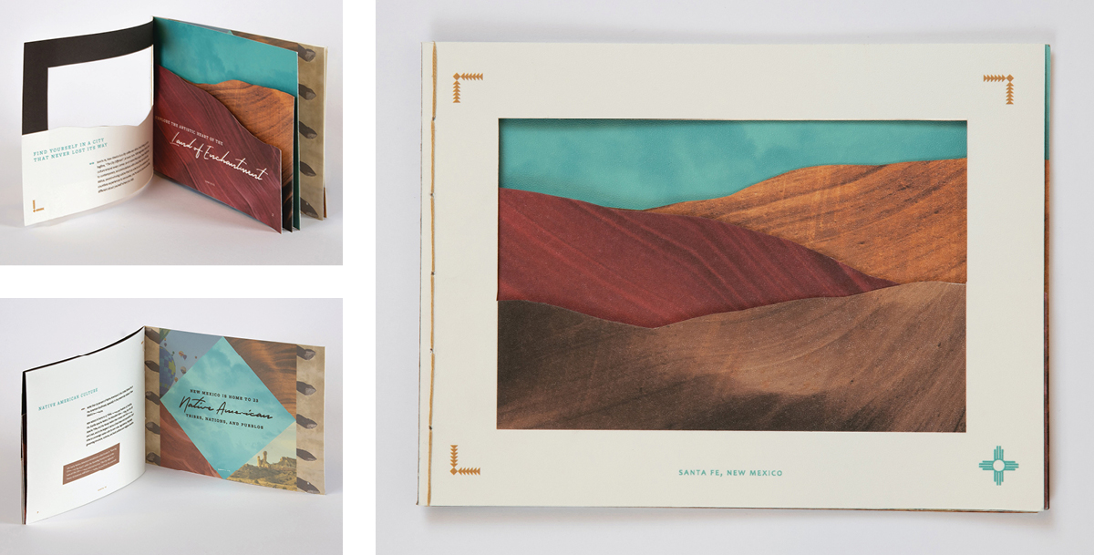
The objective was to design a typography-driven brochure with a unique format to showcase an array of treatments (die cuts, special folds, etc.) I chose to highlight the evocative landscape and art scene of Santa Fe, New Mexico, in a travel brochure using specialty papers, layered die cuts, and hand-sewn binding. The project scope includes design, copywriting, curation, and craftsmanship.
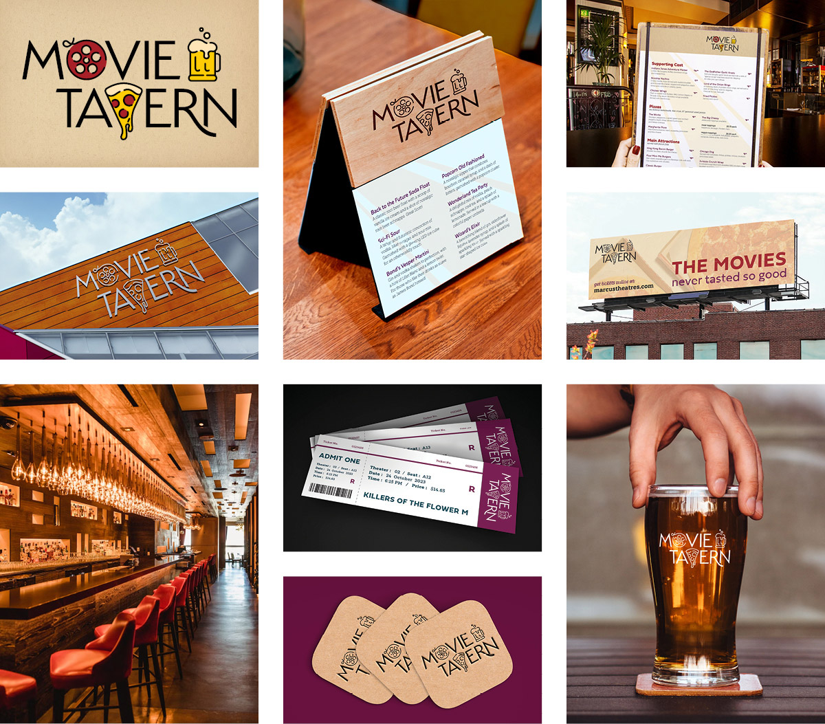
The objective was to rebrand a large company and apply the new identity to various brand extensions and mockups of their applications. I chose to refresh the visual identity of the Movie Tavern dine-in movie theater chain by identifying a target audience and highlighting elements, such as their in-house lounge experience, that appeal to them and set the company apart. The project scope includes creating a client brief to inform design, copywriting, and curation.
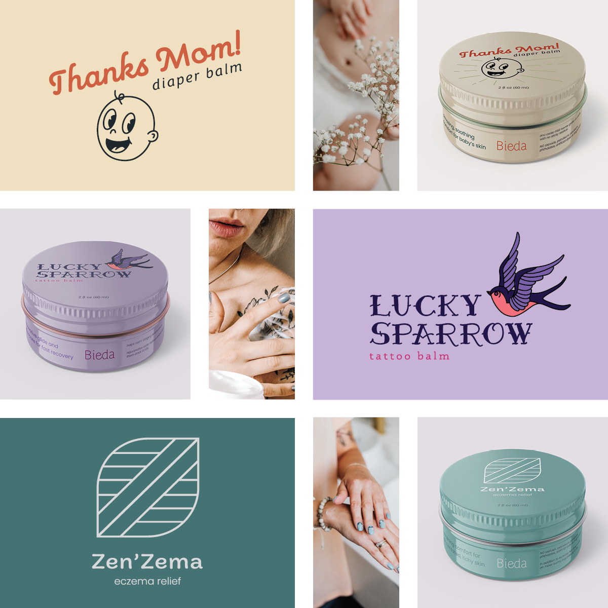
The objective was to rebrand a small company and apply the new identity to various brand extensions and mockups of their applications. My selected client, Bieda, is an innovative skincare company that needs help making a lasting impression in their market. I chose to reimagine Bieda as a house of brands where each product has its own emphasized identity with ample personality while remaining cohesive to the overarching system rather than focusing on the brand name itself. The project scope includes the creation of a client brief to inform design, illustration, copywriting, and curation, with a particular emphasis on brand and packaging design.
