Hannah Burke
Hometown: Mesquite, Texas
Visit me Here: Website
I've always been an artist. Finding joy in painting with my grandfather is one of
my favorite early memories. Approaching college, I knew that I wanted to pursue an
education in fine arts and sort of picked graphic design not really even knowing what
it was. I found it was much more rigid than the art I loved and the transition was
difficult. Drawing and painting were skills that came easily to me, but I had not
even heard the word, "typography," and I struggled with intention.
It was a challenging first couple of years, but I've developed a love for this craft
and look forward to the challenge that awaits. Following graduation from UNT, I intend
to continue my education in New York, as I have been accepted into the Type Design
program at The Cooper Union.

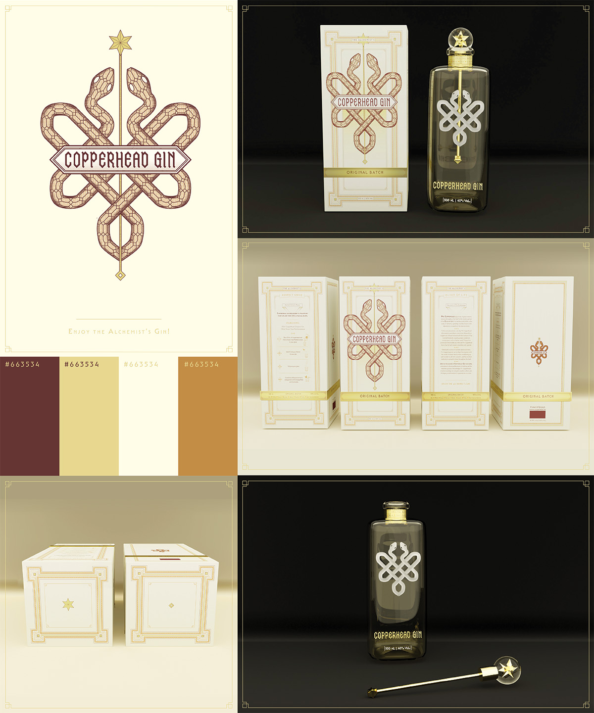
The assignment was to design the visual identity and packaging for Copperhead Gin,
a brand centered around the idea of the alchemist, a person able to create something
new and magical through a process of experimentation and discovery.
Researching the brand's history, I discovered it was founded in 2013 by Yvan Vindevogel,
a pharmacist entrepreneur inspired by the medicinal history of gin. I proceeded with
visual research into early medicine packaging, as well as popular modern liquor brands.
I developed the logo, which references the caduceus and serves as a homage to the
pharmaceutical history and development of the alchemist. The shape of the logo is
also reflective of the shape of the product's bottle, which includes an inside staff
attached to the stopper. The logotype is custom lettering constructed of sharp hexagonal
shapes. The height and rigid angles of the letterforms were selected to evoke the
sharp teeth of the Copperhead. In doing so, another shape created is reminiscent of
the scales of a snake. The bottle, constructed of glass, illustrates the Copperhead
Gin logo. The staff is created through a metal stir stick detachable from the stopper.
The small size of the label at the neck allows the staff to be visible through the
entire bottle. The snakes are illustrated through an emboss in the glass and made
more visible by frost. Including a box in addition to the inside bottle communicates
a level of luxury and adds value to the brand. The box also provides further opportunity
to create a complete and immersive experience for consumers. It holds the space to
provide brand history and personality, and this is especially important when accompanying
a bottle with a minimal label. The two sides of the box provide information about
the brand in order to add appeal for a potential consumer. The front of the box displays
the copperhead logo, large and centered, supported by intricate texture and ornamentation
that appears across the entire box. Below, is a metallic tape, signifying the edition
of gin. One side provides a brief history of the brand, or, “the story of Mr. Copperhead.”
The other side shows a Copperhead Gin cocktail recipe to build excitement and create
an immersive experience for enjoying the gin

This motion typography title sequence design utilizes motion, custom type, and sharp
geometric supporting elements to evoke the same tone of dread and unease that is present
in the iconic psychological horror film.
When assigned the design of a title sequence for our Motion Typography class, I chose
Stanley Kubrick's, The Shining for its abundance of compelling visual motifs and conceptual
themes. I tried to imagine a real-world situation that would necessitate the design
of a film released over 40 years ago. I landed at imagining a reproduction or a re-release
targeted towards film enthusiasts. Because the majority of the target viewers would
already be familiar with the film, the inclusion of notable imagery and scenes would
be appealing.
I chose to focus the design on the hedge maze, as it is a recognizable detail of the
film that is often Overlooked, and evoke other notable scenes using established forms.
To supplement the maze design, I created custom type using the same sharp geometric
forms constructing the maze.

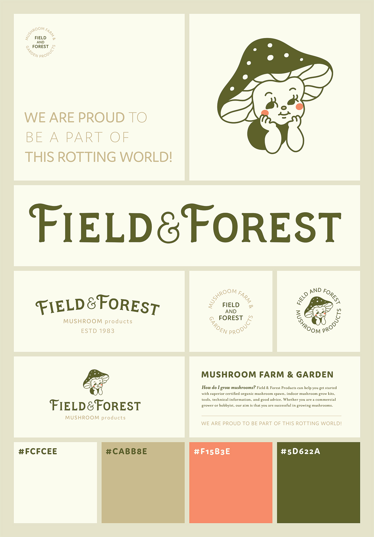
Field and Forest Products is a small business the sells mushroom growing kits and supplies. With a value for sustainability and consumer accessibility, a friendly, earthy visual language was the route to go when designing the identity system for this brand. Combining the product with a face to represent their small family of staff resulted in the mushroom character. To support the primary mark, I designed a custom logotype intended to build on the established trust facilitated by a playful tone and type that was sort of “soft and squishy like a mushroom.”
