Jennifer Mendonca Sobral
Hometown: Aubrey, Texas
Visit Me Here: Website
About Me: I'm Jenn and I am a designer, illustrator, and avid coffee drinker. When it comes to my design and art I work with multiple mediums and digital programs. I'm always looking to expand my design and creation knowledge and am especially interested in prototyping and illustration. I also work as an Artist Instructor and teach people how to let loose when they paint while also implementing some painting techniques.
When I'm not working I enjoy taking care of my house plants, relaxing on the sofa with a big mug of tea, and watching movies with my husband and two cats.
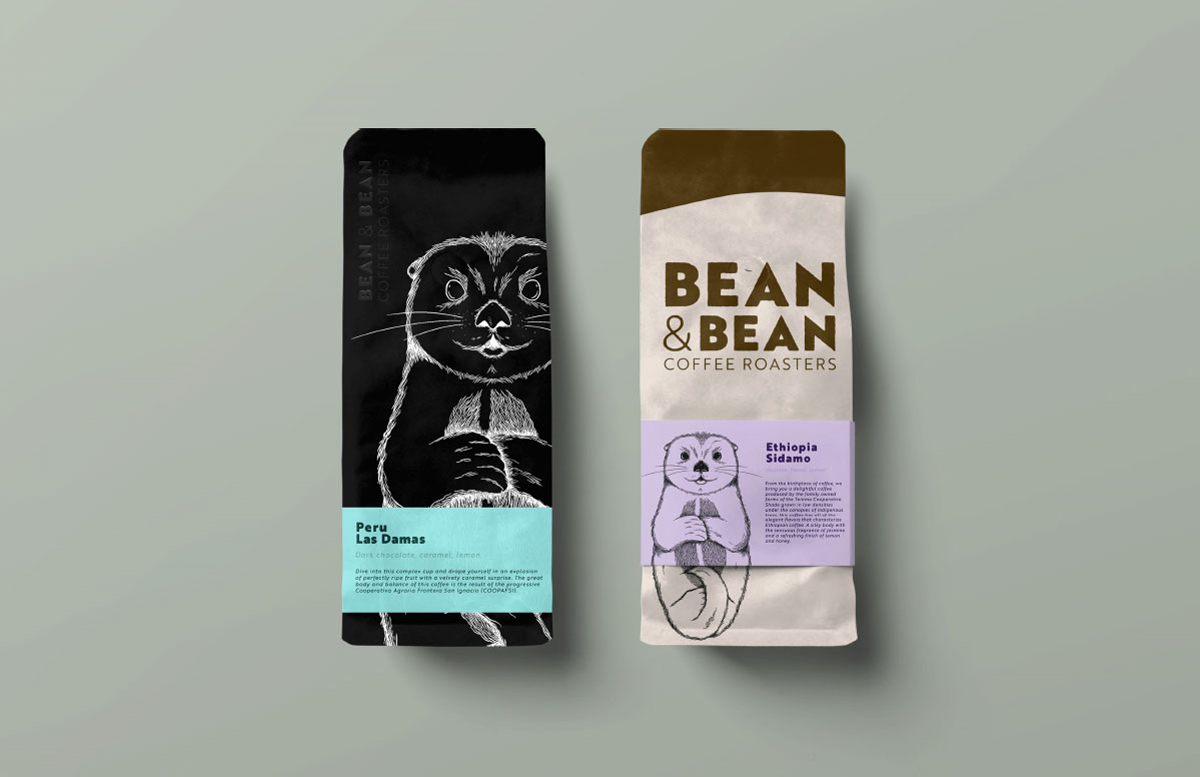
Bean & Bean is a mother-daughter owned coffee shop. Half of their coffee workforce is female-owned and they are strong advocates for female-powered coffee, community, and family. Their current logo is well done, however, it is a sloth which doesn’t best represent their brand. With my logo and brand refresh, it better communicates their energy and family-centered dynamic.
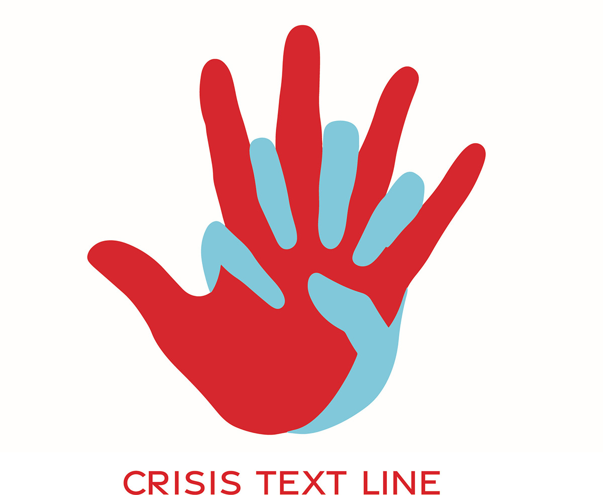
Crisis Text Line is a not for profit that connects individuals to a Crisis Counselor. They provide free, 24/7, high-quality text-based support. With this project I gave their logo a refresh to better connect with the humanistic aspect what they do.
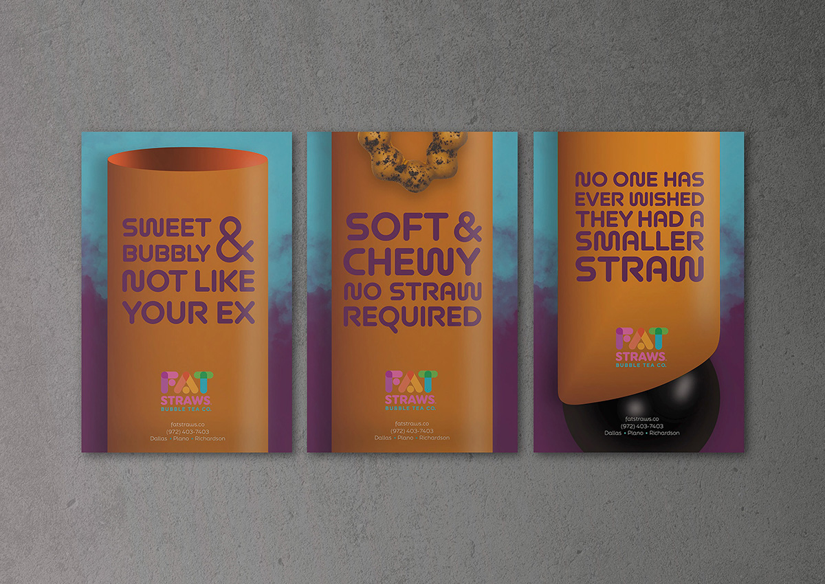
Fat Straws Campaign
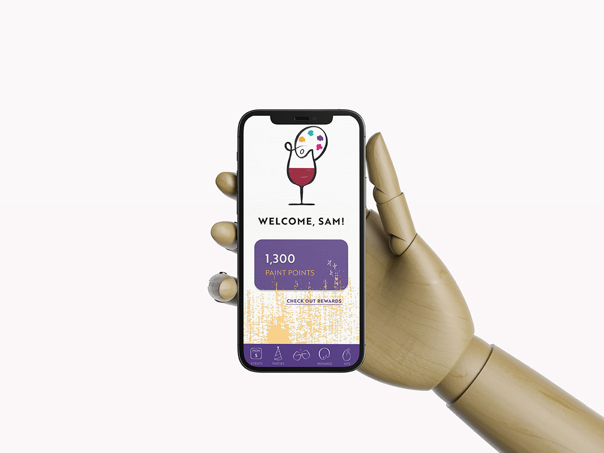
Painting with a Twist is a sip and paint establishment, not exclusive to adults. Currently they have two logos floating around their business although with the opening of new stores, the new one has been the main logo. With this refresh I show both the paint and twist with the illustrative design. The more hand drawn logo better connects with what Twist is about.
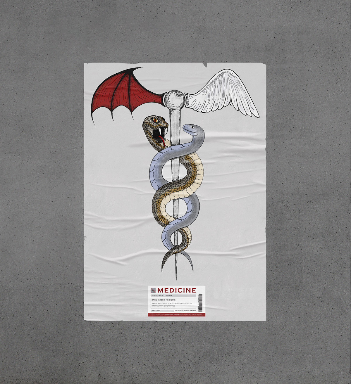
Race-based medicine is an outdated practice that is still used today. This type of medical diagnosis harm individuals of color and ethnicity. Studies show that this type of medical assumption is physically and mentally inaccurate and harmful to patients. This poster encapsulates the dangers of race-based diagnosis in medicine.
