

Adriana Vieraitis
About Me: Ciao! I'm Adriana Vieraitis, a graphic designer with a Texan-born Italian background. Art has always been a peronality for me, but designing has now become my life that I love.
As a designer, I create purpose-driven ideas and conceptual stories behind every visual identity. Tackling any creative opportunity, I enjoy bringing personalities to life in design and further developing my skills as a visual storyteller. My dream is to one day design with a relationship to music. Wether it being in motion, a type of music company, or entertainment.
Fun Fact: When I'm not sketching away ideas you can find me playing piano, jogging around town, wrestling my stretchy dachshund, or thrifting all my home decor.
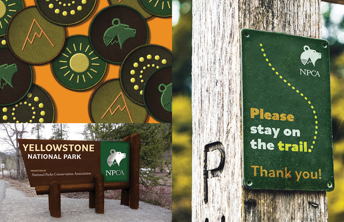
National Parks Conservation Association is a non-profit organization that funds national park employees, safety, and regulations to protect America’s beauty. By hosting volunteer events, advocating nature’s rights, and collecting donations the NPCA is successful. A solid logo impacts the security of the NPCA. The bear symbolizes strength and Yellowstone National Park, the non-profit's first protected park. The ear is the protection of the sky and the use of solar power. The mountain protects the land. The dots combine the protection of water and the connection between community relations.
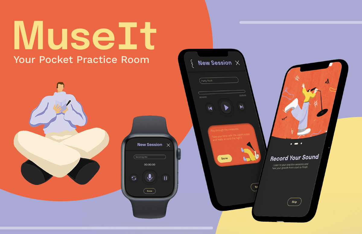
MuseIt is an organized music practice tracker app I developed. Musicians can track their goals, record practices, and take notes. MuseIt allows a musician to keep track of their growth in a central location. This app aims to create a fun experience for musicians to organize their practice logs. The dark mode is trendy and timeless for a relaxing practice. It also allows the illustrations and colors to stand out like the music's beauty.
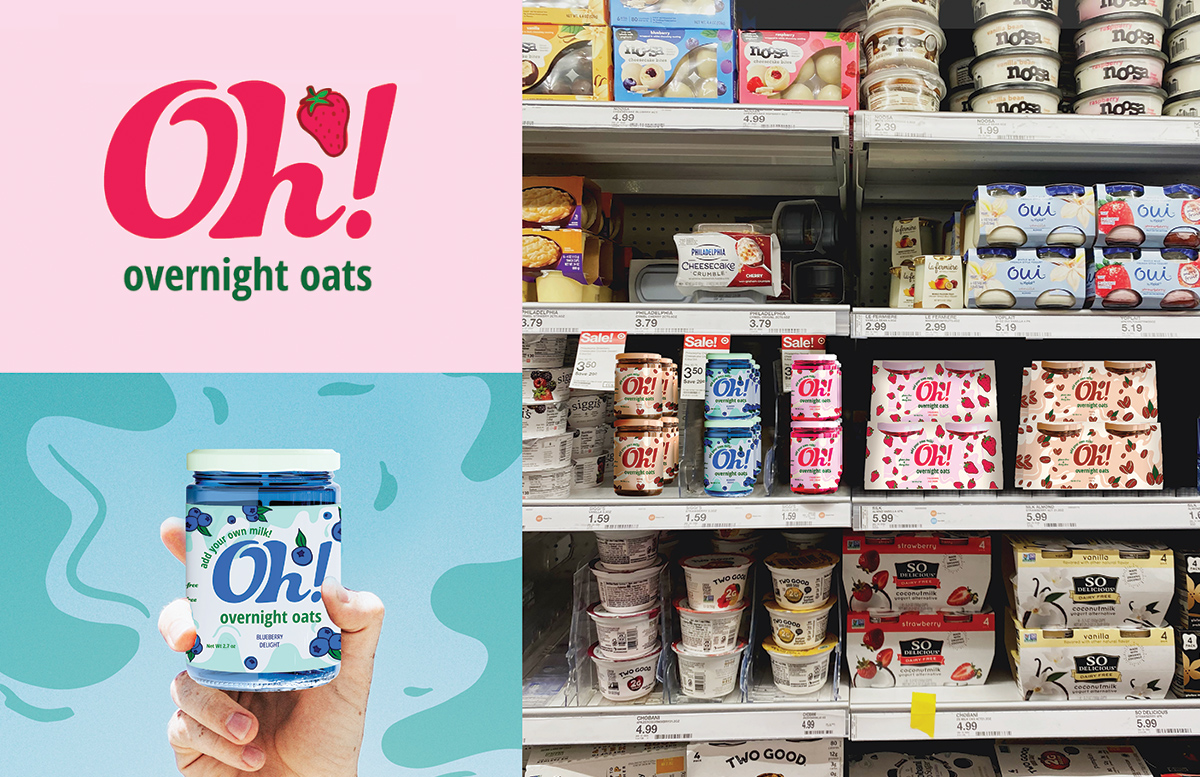
Oh! Overnight Oats is a nutritious, flavorful meal that changes the breakfast game; an entrepreneurial project created by me. Many people skip breakfast but with Oh! you have a quick, fresh meal that's made the night before and ready by morning. An efficient, beneficial breakfast transforms your morning with Oh! Overnight Oats. The fluid, curvaceous movement emphasizes shaking up the ingredients together. Electric colors present a youthful pop-culture relation that contrasts with its duller competitors.
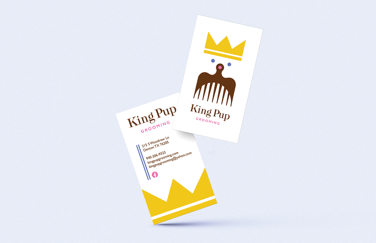
King Pup Grooming is a family ran grooming company for dogs. The environment and employees make the customer feel secure and comfortable, treating them like royalty. The redesign aims to capture security and benevolence while elevating it into a more classy business. A classy geometric logo uses negative space to combine a dog comb and a dog's face. Light colors resemble affection and care for customers.
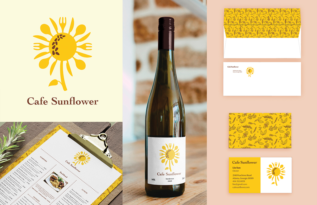
Cafe Sunflower is an upscale all-vegetarian/vegan restaurant based in Atlanta, Georgia. Specializing in turning traditional American meat dishes into vegan meals using organic ingredients. The goal of this redesign was to show meat enthusiasts traditional American meat-made dishes can taste as good made out of plant based-ingredients. Organic shapes and keen typography elevate an amicable design.
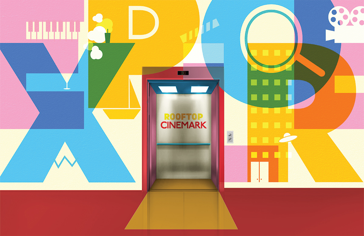
Rooftop Cinemark rejuvenates and transforms the classic experience of movies. A more social and energetic outdoor experience with vibrant colors. Overlapping colors resemble camera filters and transparency of projections. Hidden elements throughout the positive and negative space relate to easter eggs in movies or noticing parts you missed during the first watch. Elements of surprise!
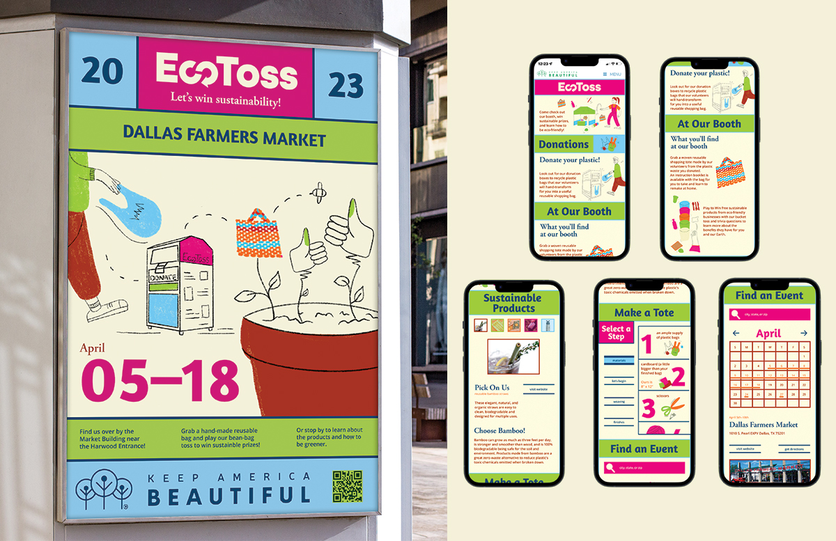
EcoToss was a group, cause-based project for a non-profit. My team focused on the issue of single-use plastics. Our goal was to develop an innovative, community-engaging design to change people's behaviors to be more sustainable. We designed for Keep America Beautiful in this hypothetical project, creating a pop-up booth for various events nationwide. Pastel colors allowed for a friendly approach to the scary issue we're trying to solve. Loose hand-drawn illustrations established a connection to the textures of nature.