

Shadow Trammel
About Me: I'm a 25-year-old graphic designer at UNT, and most of my work is logo creation or branding. I thrive when it comes to animation or color pallets for struggling brands that need a recognizable brand identity. continue my design career with internships at local design companies around Dallas or Fort Worth. When it comes to describing my work, I gravitate toward brands that need help looking more professional or youthful look. I work well with others when it comes to team projects and bouncing ideas off other creatives helps me understand other ways of thinking and solving problems.
Fun Fact: I also know computer programming.
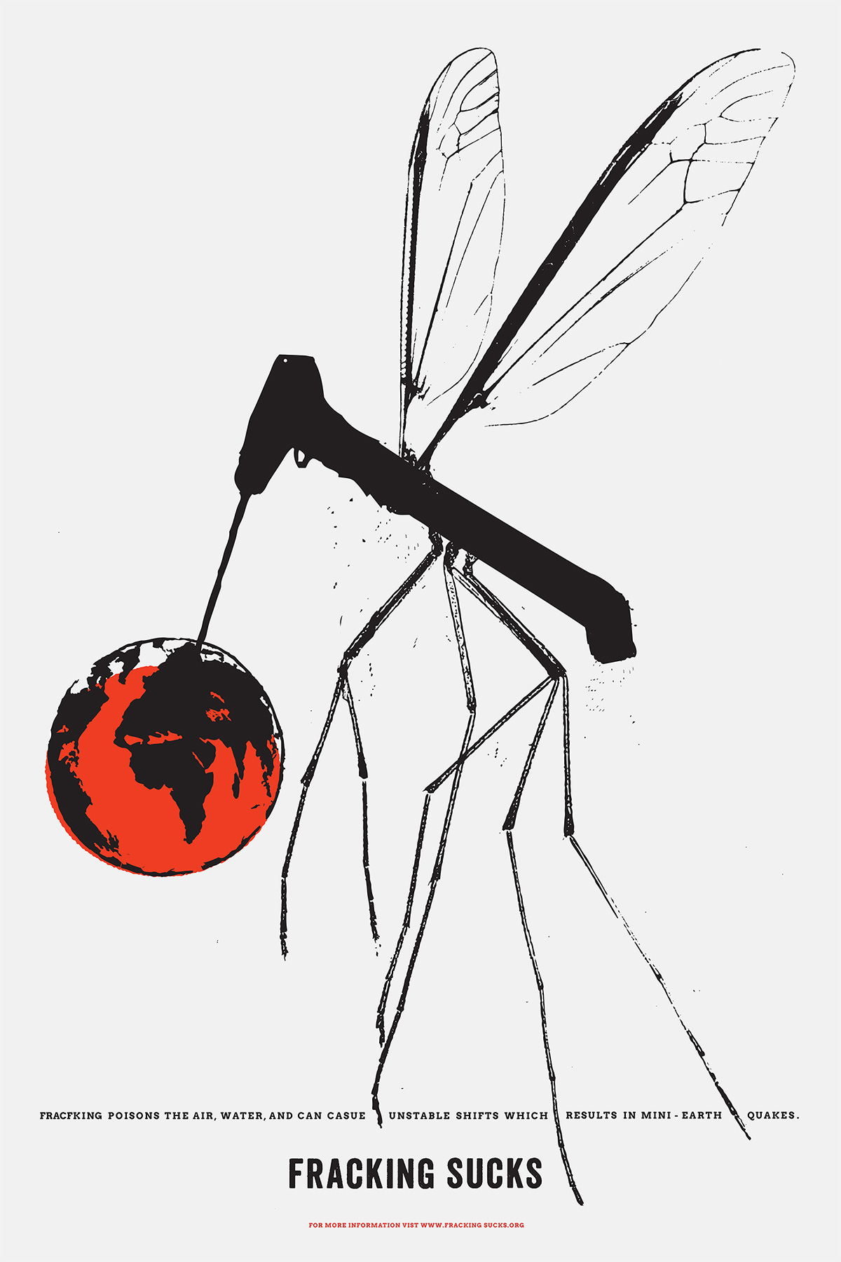
This artwork showcases a mosquito styled as a fracking rig, symbolically portraying its act of draining the vitality from Mother Earth. The visuals were meant to appear rough and playful, reminiscent of fracking itself.
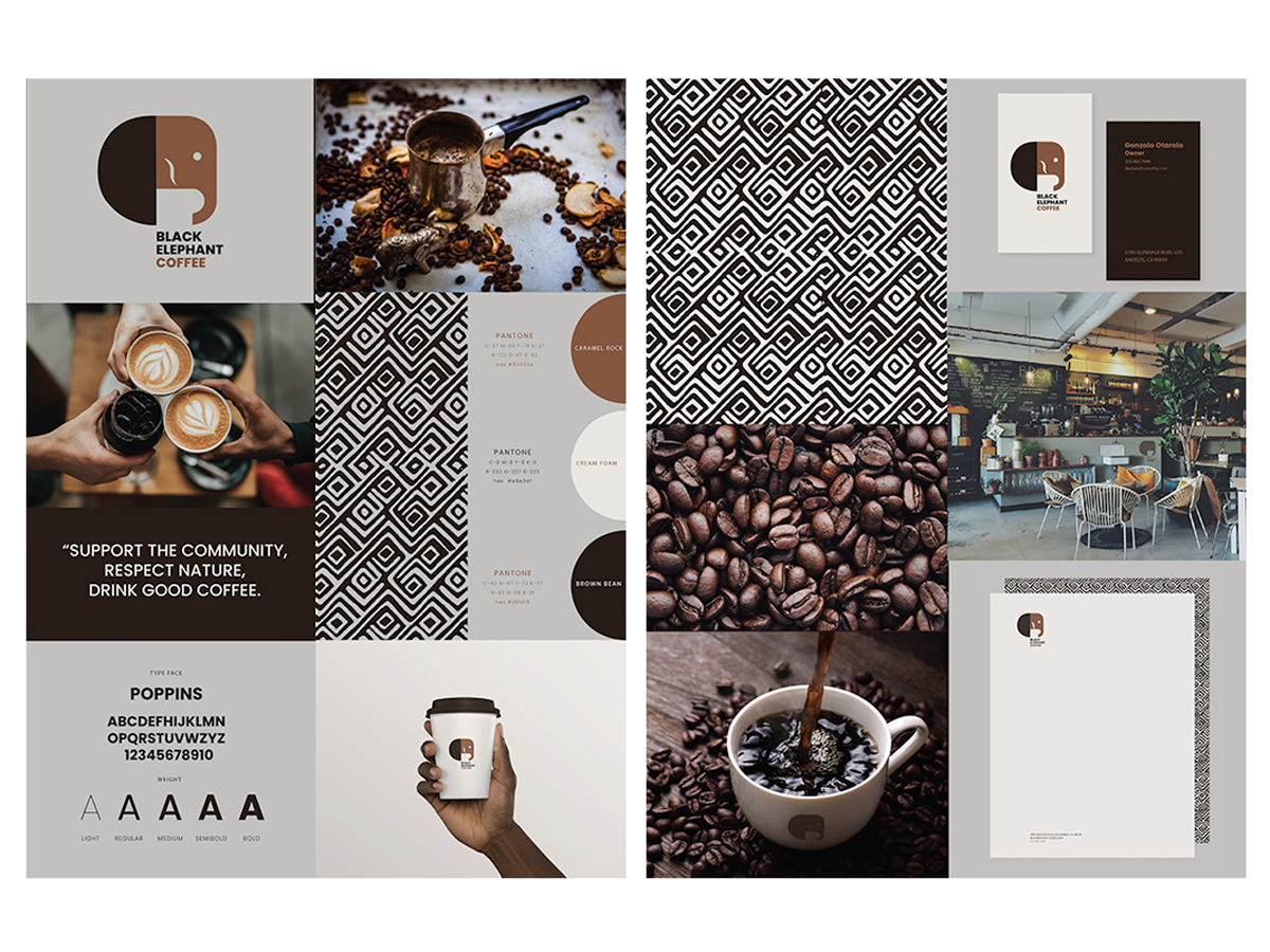
The elephant logo helps evoke a familial, local feeling for customers. To emphasize what has made them so popular, I condensed the colors and design elements to make it more captivating.
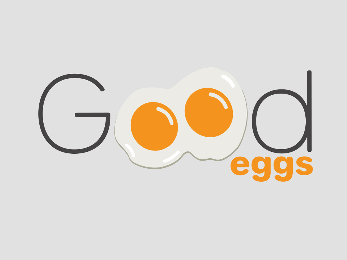
By reinventing the logo, we could add an element of charm to the brand, prompting customers to appreciate it right away. The twin eggs are a symbol of good luck, so intertwining them will help customers associate with the brand more closely.
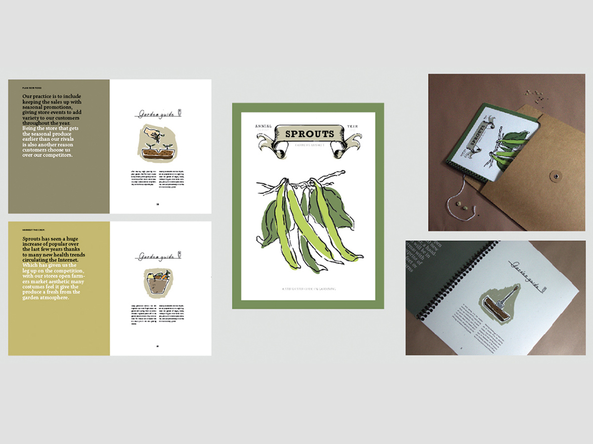
Sprouts Farmers Market desired a refreshed Annual Report design to both exhibit the expansion of the stores and feature their unique brand personality. The report needed to convey factual information in a modern, cheerful way.
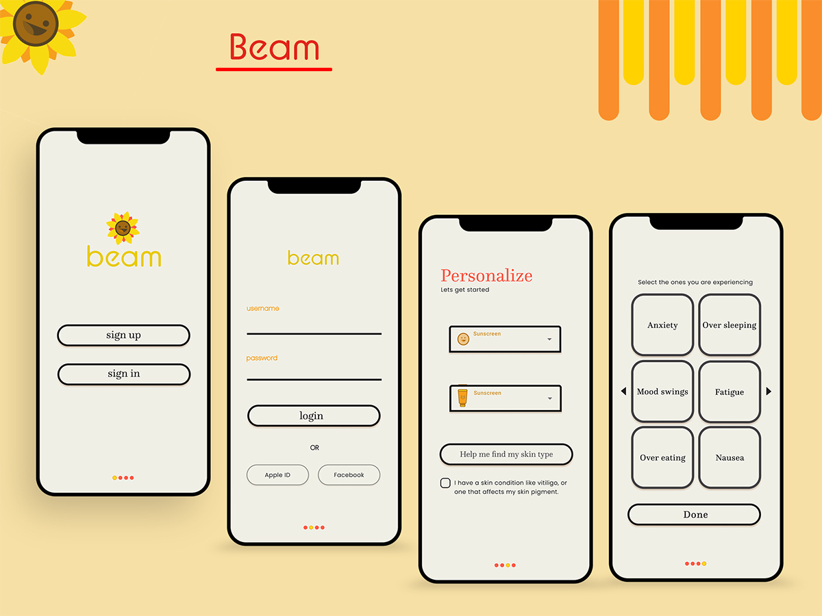
I designed each character to give off a friendly look while also be in the same language I had created throughout the app. This character can be used for advertisement or have fun animations when using the app.