

Smith Nathan
Hometown: Fort Worth, Texas
Visit Me Here: Website
About Me: From an early age, I felt inspired to create visuals. I practiced drawing and painting consistently throughout my schooling. It wasn't until high school that I began growing interest in design and what it meant to be a designer. Being a designer has taught me to be attuned to the world and a better listener. Designers have creative problem-solving skills to create for clients in the world they live and interact in. Whether it's a new pair of shoes or a catchy song, being inspired to create a version of something new is impactful to our world and allows us to express ideas visually.
Fun Fact: I collect a variety of sneakers and constantly look to make additions to my collection. There's not a particular style I gravitate towards; the sneakers range in brand, style, color, and type. I have a different pair of shoes for every day of the month.
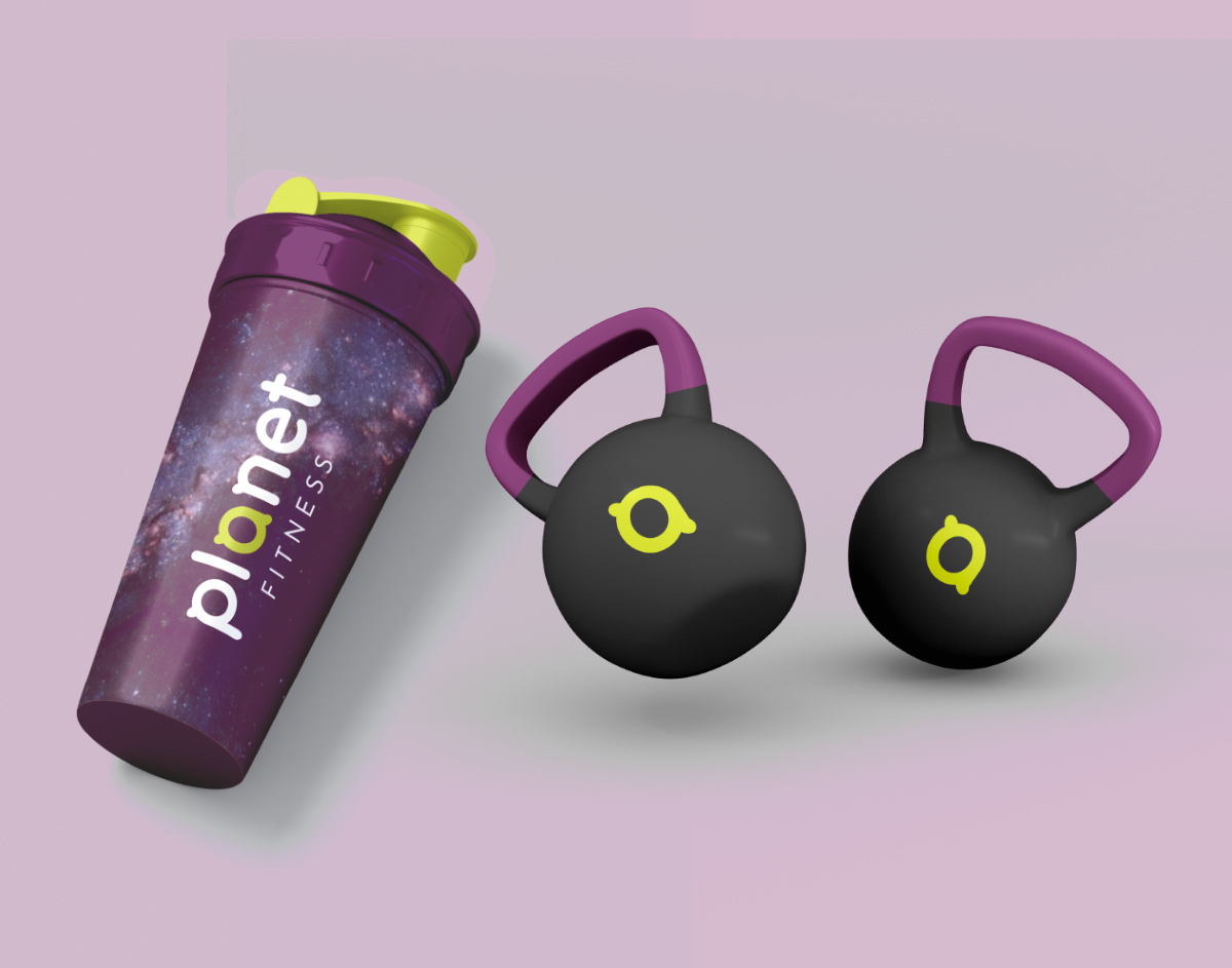
These are a few assets that are part of a rebrand for planet fitness. The shaker flask and hand weights are items that would be used regularly by people going to the gym. Using typography, color, and texture, the brand aesthetic feels clean which is important to reinforce health and safety. The nubs of the a in planet lend themselves to the designed assets and reinforce the space and planet theme as rings.
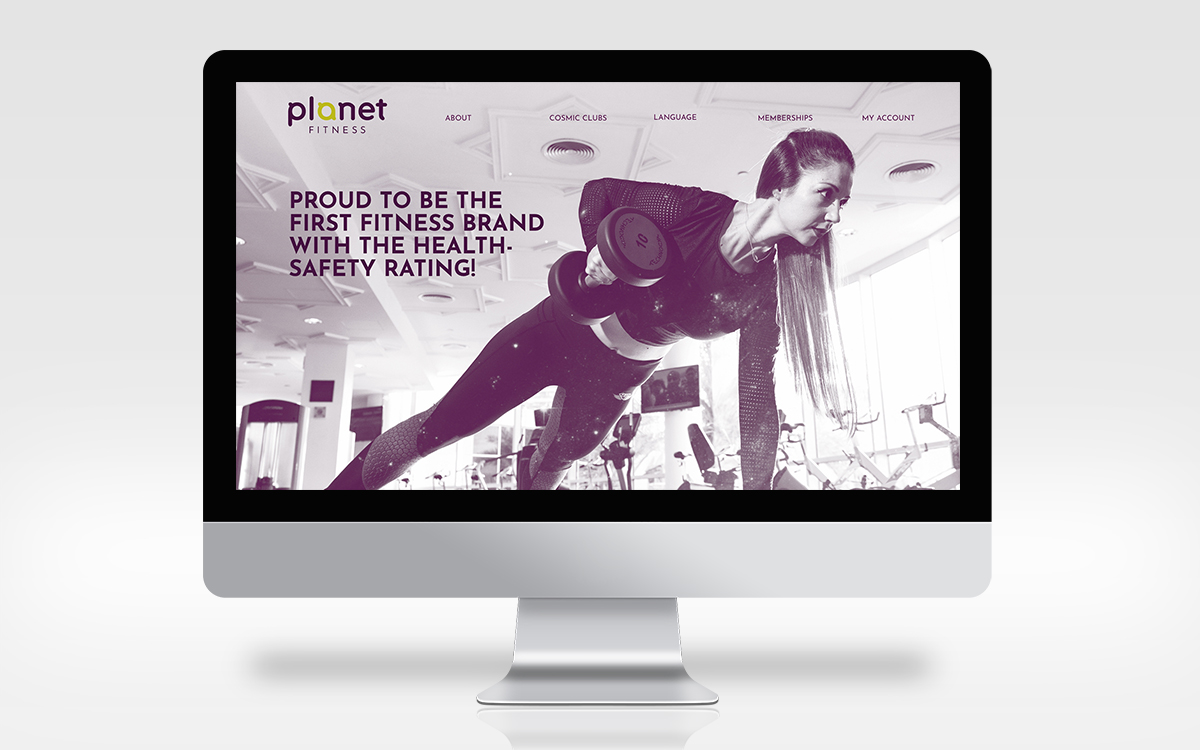
This is the homepage of the website for the planet fitness rebrand. It focuses on fitness and the gym aspect and it highlights planet fitness as the first brand with a rating from health-safety. The design features the continual use of typography, color, and texture. I thought it was important to use photography to tell the story of the brand because going to the gym is an experience.
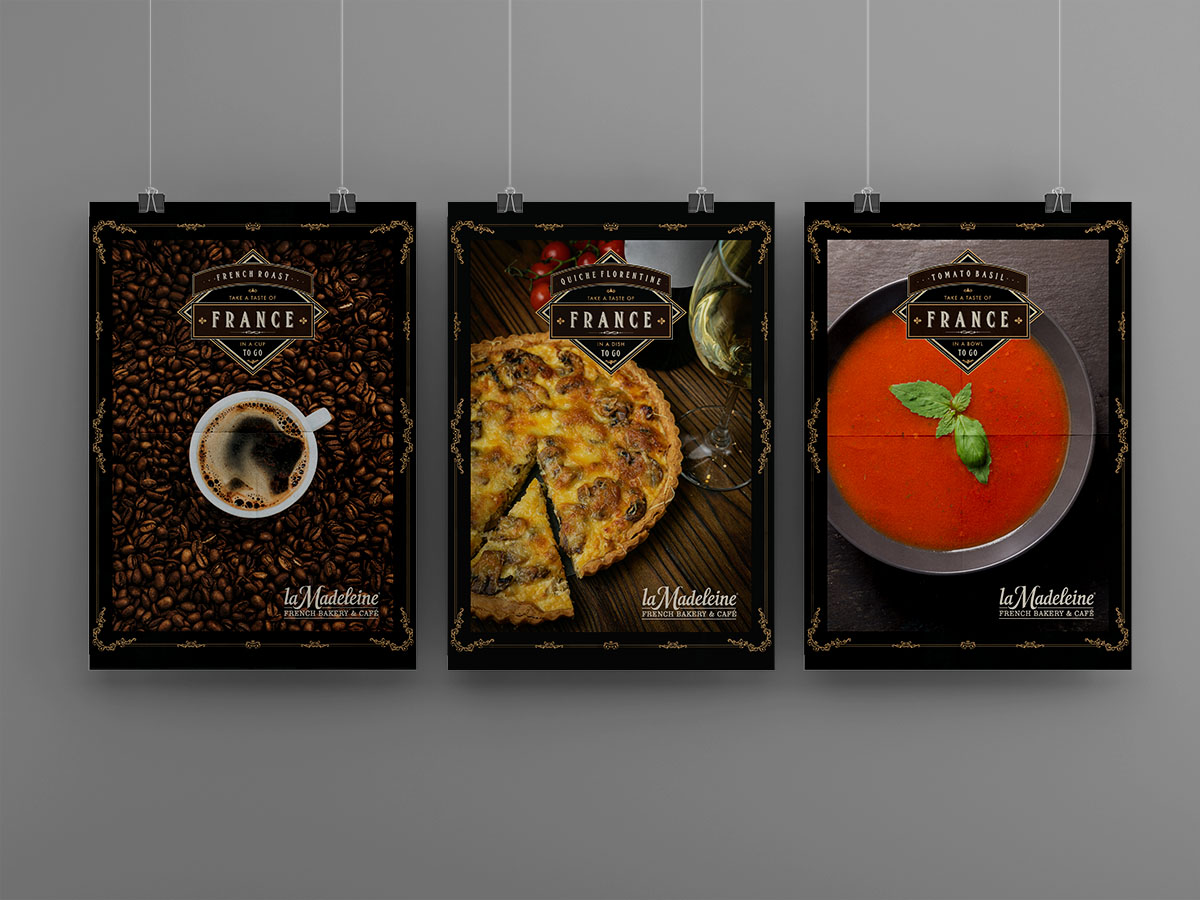
These to-go advertisements were created in response to a higher number of to-go orders when COVID-19 had started. The food items were commonly purchased items off the menu and the ornamentation fit the aesthetic La Madeleine, a french country bakery.
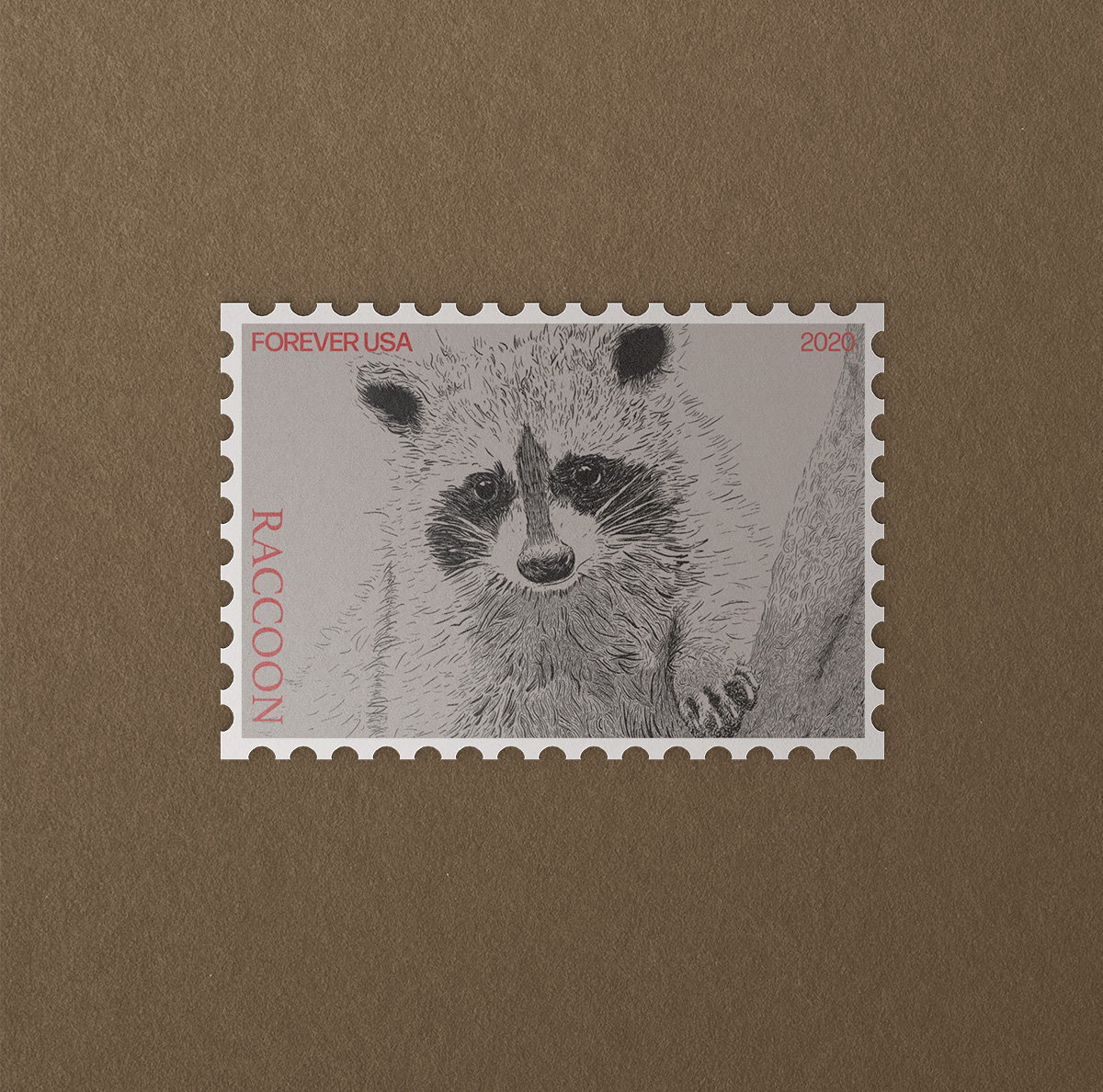
This stamp design was an exercise to practice woodcut engraving as an illustration style. The goal was to emulate a stamp using typography, illustration, and design thinking.
These are a few assets that are part of a rebrand for planet fitness. The shaker flask and hand weights are items that would be used regularly by people going to the gym. Using typography, color, and texture, the brand aesthetic feels clean which is important to reinforce health and safety. The nubs of the a in planet lend themselves to the designed assets and reinforce the space and planet theme as rings.
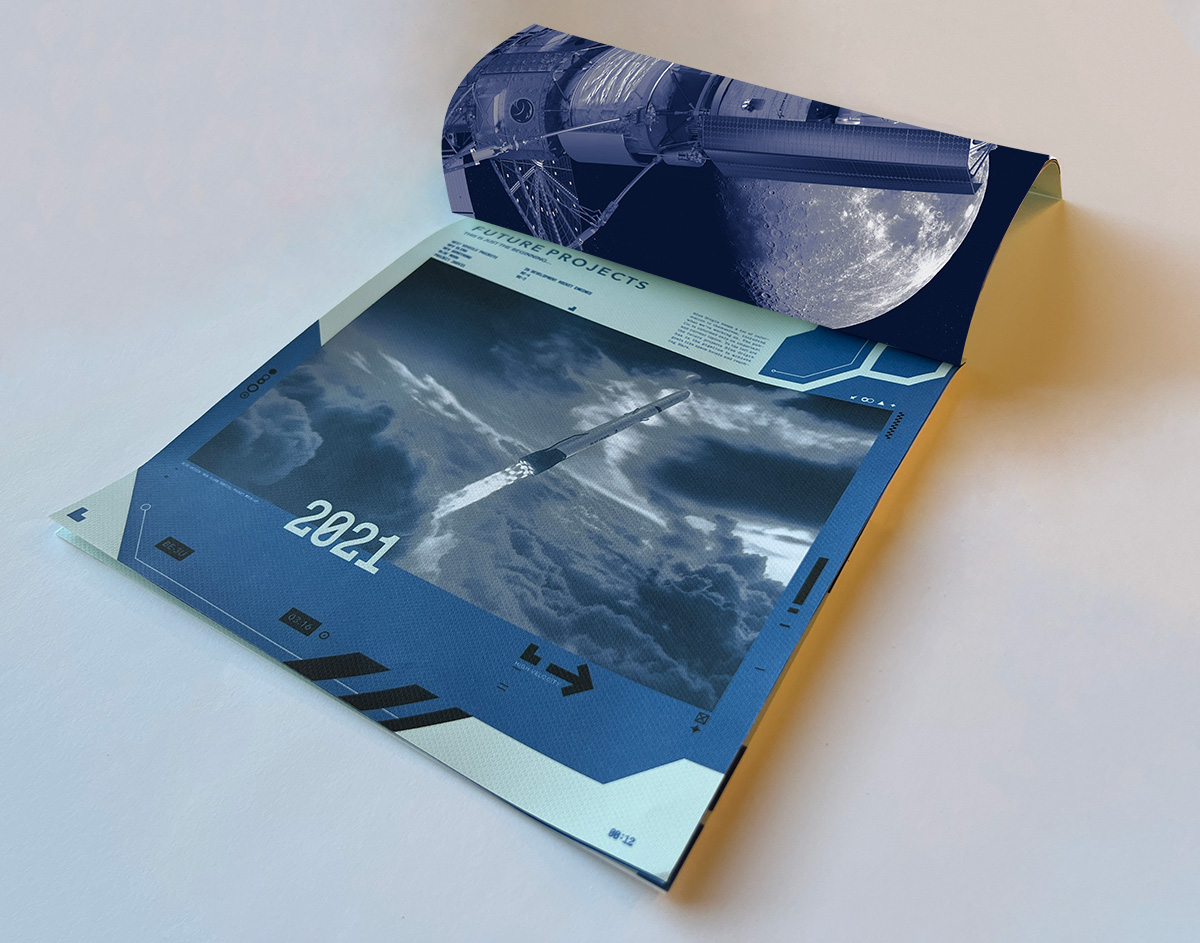
This is a brochure designed to inform, advertise, and highlight Blue Origin. This specific page comes later on in the design, but the visuals support the message about future missions Blue Origin wants to achieve.