

Clarissa Respondek
About Me: Hey y'all! I'm Clarissa Respondek, a graphic designer from Houston, Tx. I'm a B.F.A. graduate from the University of North Texas with a major in communication I was drawn to design because I love creative problem-solving, collaboration, and making an impact on how we see the world around us. My skills are centered around rebranding, packaging, and publication design.
Fun Fact: When I'm not designing, I can be found going on road trips, watching too much reality TV, or trying out a new recipe.
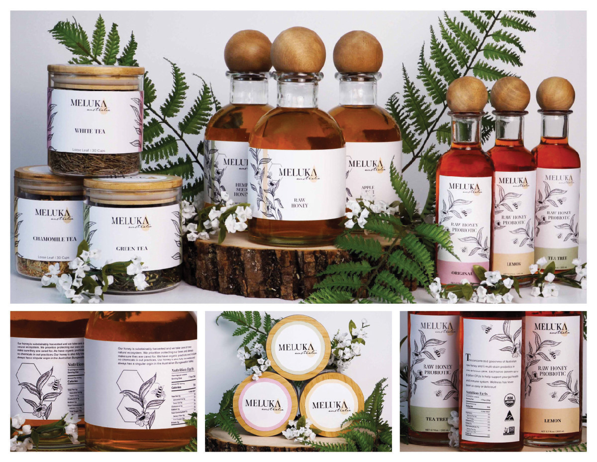
Meluka Australia is a wellness brand with products sourced locally in the beautiful and abundant Bungawalbin Valley Rain forest. This brand focuses on simple and effective ingredients and the branding needs to reflect that. My brand strategy was to make these wellness products reflect the classy and sleek elegance that can be found in high-end beauty products. I accomplished this with a clean, typographic logo and a minimalistic aesthetic, and a simple color palette that highlighted the main product, the all-natural honey.

Maddhatter's Tea House and Cafe is a breakfast, lunch, and brunch shop in San Antonio Texas. It is known for its fantastic tea, rich culture, and homey feel. In my re-branding, I opted for a logo that felt friendly and familiar. The logo captures the fun and quirky nature of the regulars and the cafe. I chose a distinct color palette that would add a playful and upbeat element to the brand. It was important that the brand felt approachable and worth being a part of.

Cerave is a skincare company that prides itself on simple ingredients that are hand selected by dermatologists. The recent success and attention they have received on social media, specifically, Tiktok, inspired this rebrand. The brand's popularity on this platform opened them up to a larger audience, now including younger individuals and men. Using this knowledge I created a rebrand that would appeal to their new demographic and would have a more approachable, less medicinal feel.
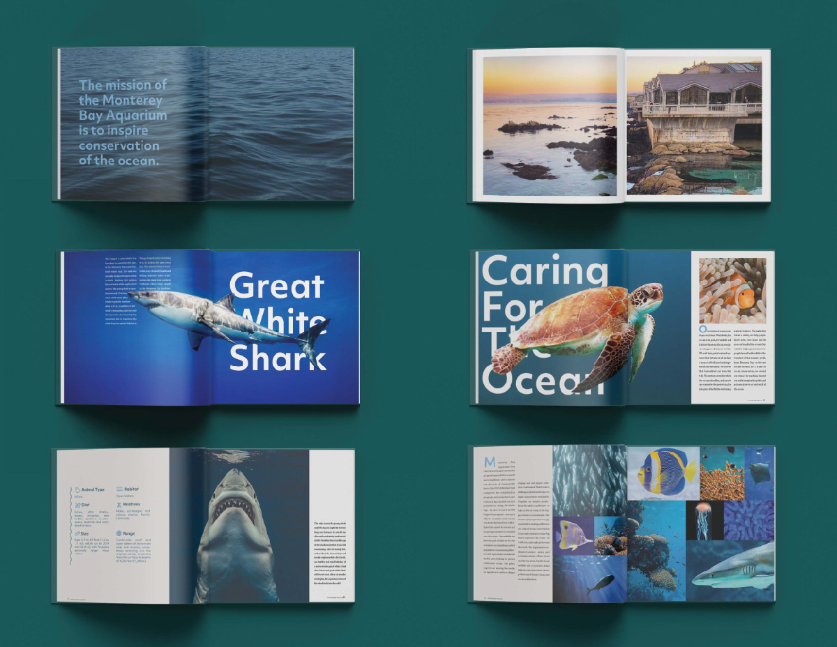
The Monterey Bay Aquarium is a non-profit aquarium located in Monterey, California. The aquarium opened in 1984 and has a rich history. The main focus of the aquarium is ocean conservation and I wanted to teach and highlight that in a book that would be fun for all ages. The book walks through the history of the aquarium and the values that it holds as a company. It then transitions into three specific conservation quests that the aquarium is known for. This includes the work they have done with sea otters, great white sharks, and kelp forests. The book is meant to educate through photography, facts, and historical anecdotes.