

Jaylyne Nguyen
About Me: Hi there! My name is Jaylyne, and I have always been an artist at heart, not only expressing myself through fine art mediums and design but through performing, music, and sometimes simply just talking.
Coming from an immigration background, I had the privilege to connect with different types of people, which helped me gain insights from diverse perspectives. That leads me to believe that being a visual designer is to be versatile and always be open to learning from others. My ultimate goal is to create purpose-driven works that can resonate intimately with other human beings.
Fun Fact: I’m an INFJ (or ENFJ depends on the season). I have the same birthday as Nicki Minaj, and I dance semi-professionally when I’m not grinding pixels away.
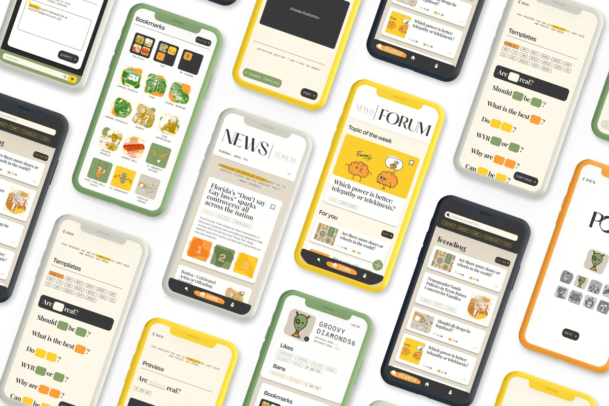
POV3 is an application designed for teens & adults who seek respectful discourses in the age of misinformation and pre-conceived bias, particularly toward political topics. By providing 3 articles from opposing perspectives for each topic, anonymous profiles, and crowd-sourcing fact-checking engine, POV3 aim to provide a neutral space that encourage critical thinking and respectful discussions.
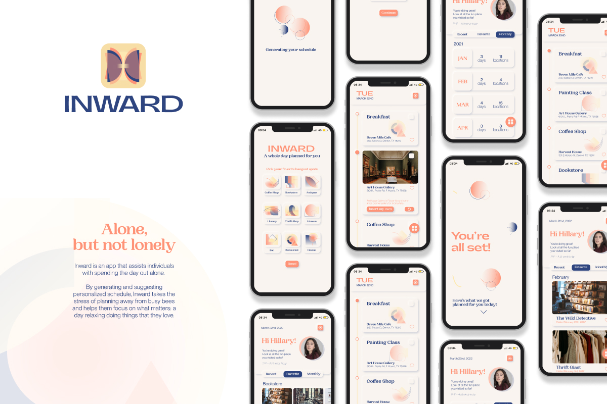
Inward is a habit tracking app that assists individuals with spending the day out alone. By generating and suggesting personalized schedule, Inward takes the stress of planning away from busy bees and helps them focus on what matters: a day relaxing doing things that they love.
The purpose is to simplify the task of searching for fun places to hangout, particularly ones that would be suitable for some “public personal time”. This app aims to encourage users to explore their towns, trying new things, and spend some time alone (because they’re just needed sometimes).
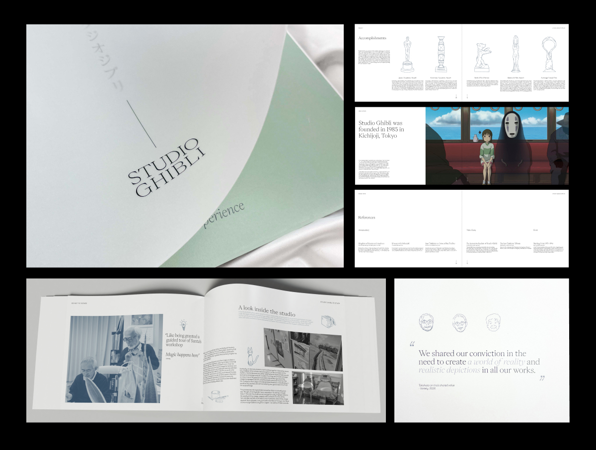
Studio Ghibli is one of the most revered animation studios in the world, and home to many distinctive and beloved animated works to have ever exist. Ghibli’s films go beyond the test of time, in a sense that regardless how old, the meaning and message behind transcend through all ages.
Utilizing elegant typography, carefully curated excerpts, complex layouts, and accompanying illustrations, “Studio Ghibli — An Immersive Experience” was born as an homage and tribute to the acclaimed studio. The publication paints a journey, from the studio’s origin to the people behind the masterpieces, and what makes them so special to the hearts of children and adults everywhere.
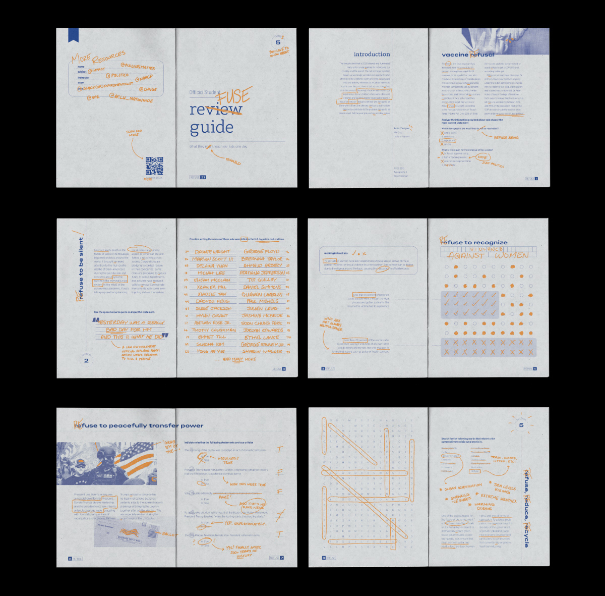
The scope of the project was to create a zine with an assigned word — Refuse— and to explore the word from different conceptual and visual angles.
With the trouble child that is 2020, the zine takes visual inspiration from review guides and practice books to subtly reflect social problems through the lens of a kid who is still in school. This highlights the issue of misinformation even in the education system in the US: What should be taught? Is there any biased filter on these information? Etc.
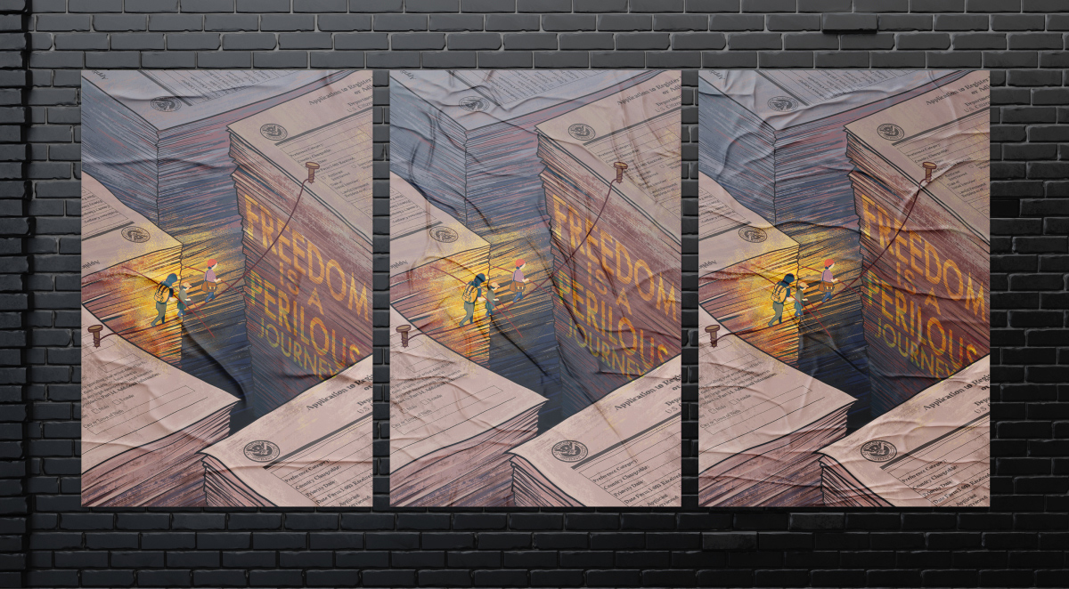
An original illustrative concept designed to symbolically condemn and highlight an issue that all immigrants are all so familiar with, particularly those that seek citizenship in the United States: the paperwork. This problem is another component that is made unnecessarily complicated in the path to citizenship and is often not reflected through public news anchors or online articles.
With the juxtaposition of scale, symbolic imagery, easy-to-understand mental associations, and dramatic lighting, this poster creates a thought-provoking and emotionally appealing composition that successfully communicates the issue to the viewer.
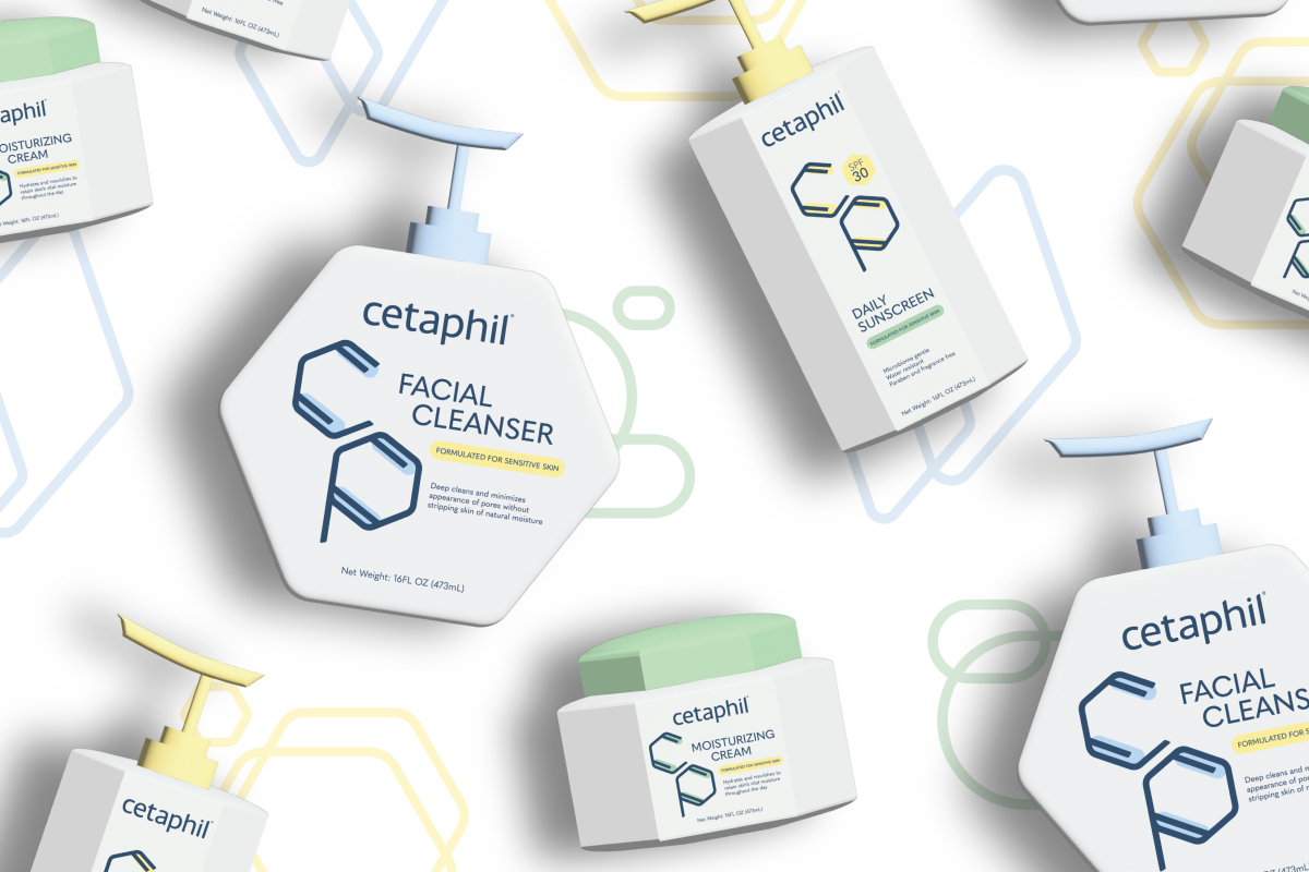
Cetaphil is a globally recognized brand with a 75-year long history of science-backed skincare products formulated to effectively treat sensitive skin. As the brand grows to be a market leader in pharmaceutical skincare, they run into brand recognition problem from competitors. The brand’s main competitor — CeraVe — utilizing the impact of Cetaphil and its signature branding, started to mimic the same visual elements to create brand confusion in consumers.
The purpose of this brand update is to differentiate and reinforce Cetaphil as a market leader, through the distinctive packaging shapes and simplistic color applications. A mindful approach to the brand evolution: adding the “sensitive” personality into the visual identity, while still maintaining the scientific quality that loyal consumers have always known them to be.