

Yejin Kim
Hometown: South Korea
Visit Me Here: Website
About Me: Hi, I'm Yejin, a graphic designer from South Korea. I usually focus on illustration and publication design with Adobe Illustrator, Photoshop, and InDesign but I'm also skilled in Adobe Premiere Pro & After Effects for motion graphics, Adobe Lightroom for editing photographs, and other design programs such as Adobe XD or Dimension. I really like expressing my imagination as a graphic designer.
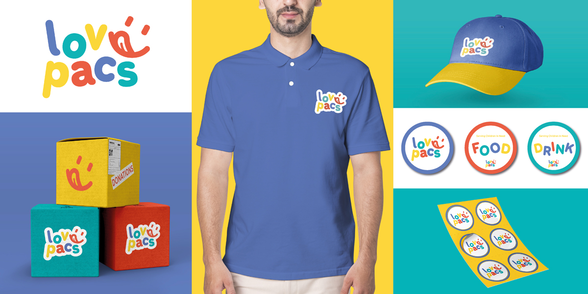
Lovepacs is a non-profit brand that serves children in the free and reduced lunch program through public schools. They provide mostly non-perishable, easy-to-open, and minimal-cooking food items for children. For this campaign, the logo has a simple, round feeling and has a cute vibe by changing the letter 'e' into a child's expression/face of eating deliciously. Also, the overall color is vivid to make it look lively, young, and enjoyable.
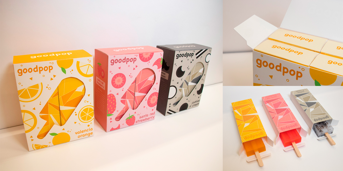
Goodpop is a popsicle company that makes its products by using 100% of its ingredients in a healthy way. This brand’s strategy is to create eco-friendly and healthy products and also have a good influence on the public by giving donations. For this project, I emphasized expressing each flavor directly by drawing patterns on the outside of the box and using a die-cut method to show the packages inside.
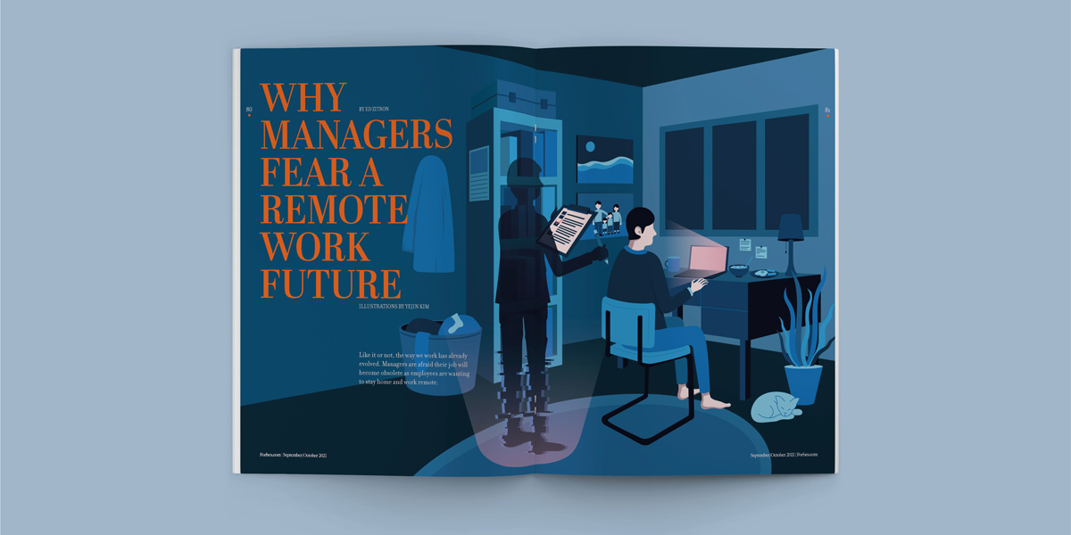
Forbes magazine project is to design a magazine with a classmate, and we combined the contents of the article titled “Why Managers Fear a Remote-Work Future” with the styles of the Forbes magazine. We created some illustrations for the first spread and made layouts on the second and third spreads to make it look like a Forbes magazine.
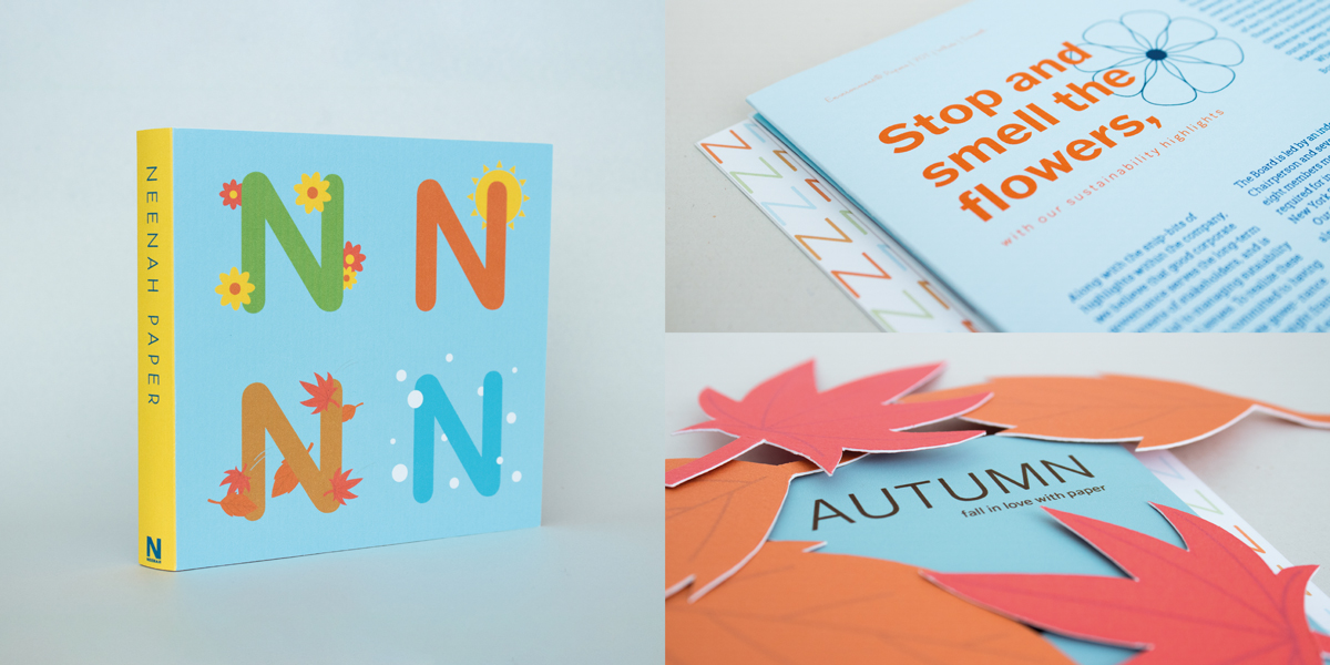
Neenah Paper is a paper company that produces quality products. The personality of this brand is fresh, clean, and always coming up with contemporary ways to show off its wide variety of specialty paper products. For this project, we tried to focus on showing some interactions by using different papers.
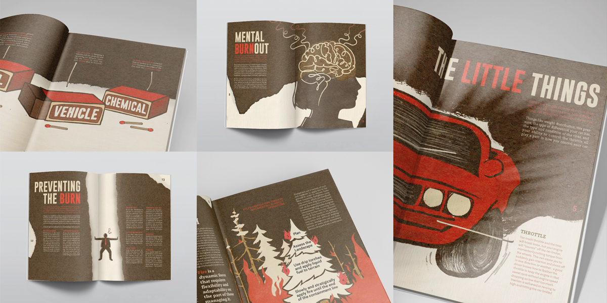
For this zine project, we chose the word “burnout,” which means extreme physical or mental fatigue or exhaustion of fuel. We researched information related to the word, and then we made spreads with different contents and illustrations regarding it. The overall concept is burned paper with fire, so we chose red, black, and brown colors and used a paper cut effect on each page.
While working as a graphic designer at Design Works, I used Adobe Illustrator and Adobe Photoshop to create advertisement posters with details based on clients’ requests. It was a good challenge for me because I had to match different designs based on concepts of various events.