Hannah Jung
Hometown: Busan, Republic of Korea
Visit Me Here: Website
About Me: Hi there, my name is Hannah Jung and I'm from South Korea. As a graphic designer, I'm passionate about creating beautiful and functional designs that can help my clients achieve their business goals. When I'm not working on design projects, you can usually find me at a cozy café enjoying an iced americano or spending time with friends. Sometimes, I also like to work alone to focus on my design ideas.
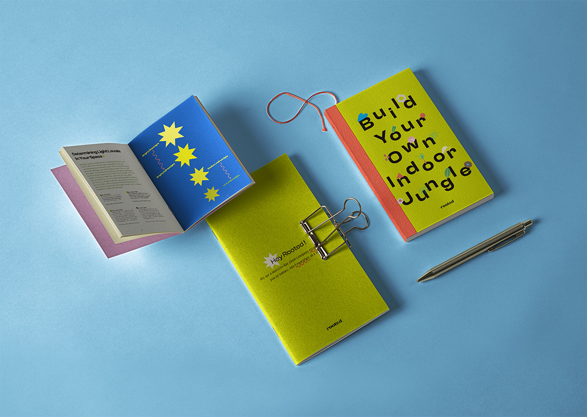
I made a small 6” x 8.5” handbook for this company. This book introduces and explains plants, and talk about the good things about growing plants.
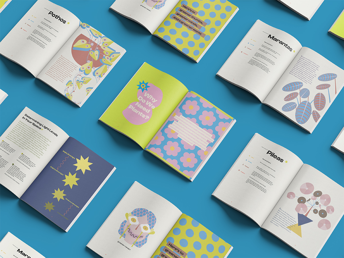
This is a spread design from rooted handbook.
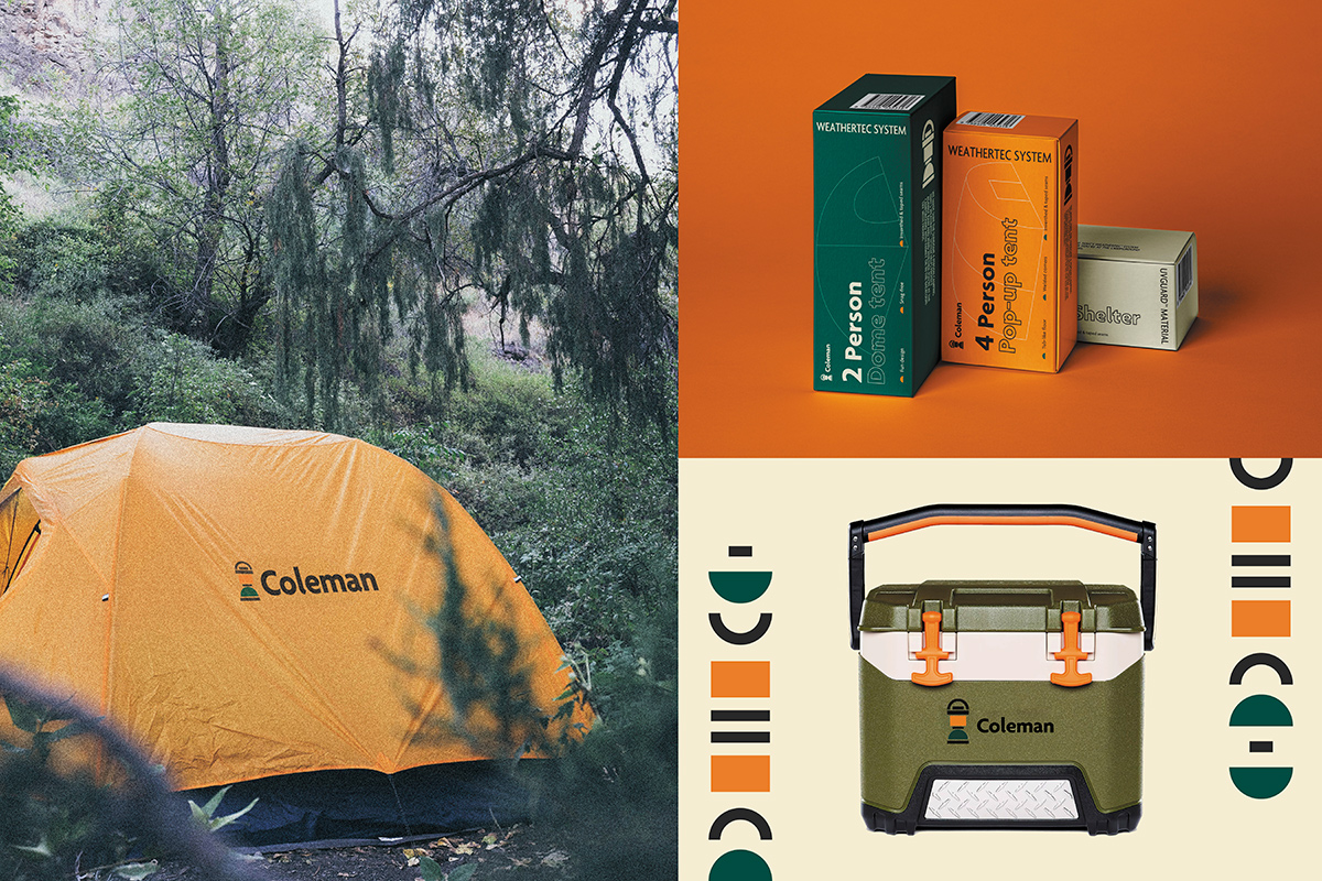
Global outdoor camping brand Coleman brand & identity. The goal of this project was to break away from the old-fashioned feel and rebuild a more refined and modern image.
Using the lantern to maintain the brand's identity, I created an evolved logo that fits the current trend by emphasizing the outdoor brand's mission and adding natural colors.
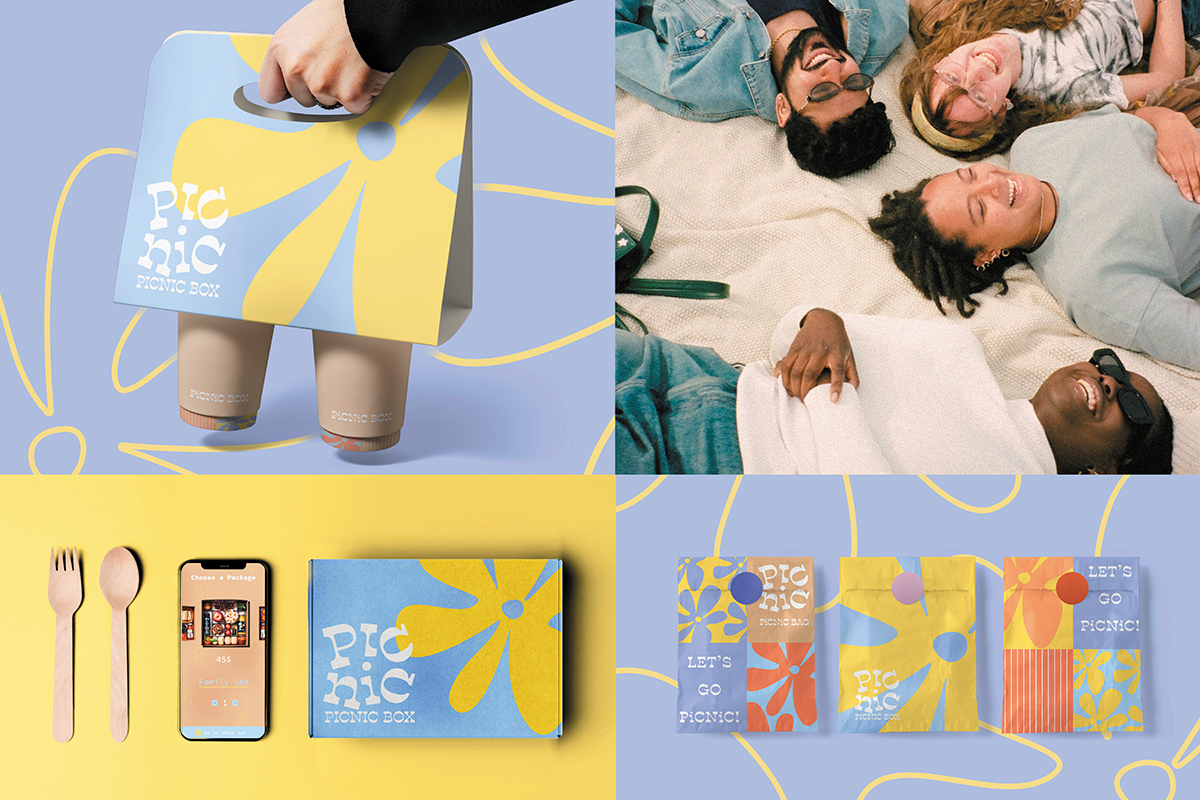
On a sunny day, we'll want to go out and have a picnic. But everyone may have been bothered to prepare food and pack them at least once. The picnic box was created out of these minor problems. You can simply order a picnic package through the mobile application and choose the type of package according to the number of people.
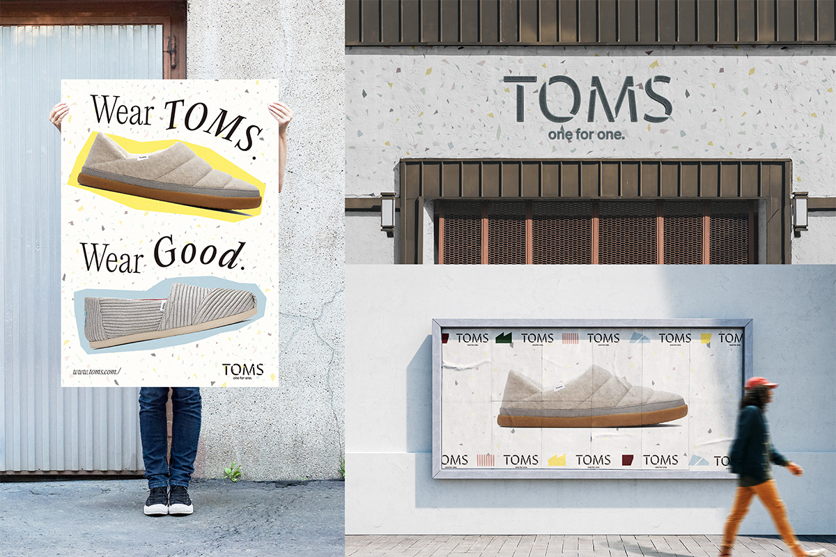
TOMS Shoes makes a difference by providing glasses and shoes to children in need. The campaign reflects the brand's humanitarian philosophy by emphasizing the 'one for one' tagline with modern stencil fonts. Inspired by the soft colors of TOMS slip-ons, a color palette was created, and patterns derived from the slip-on's shape and textile texture were used to highlight the brand's characteristics.
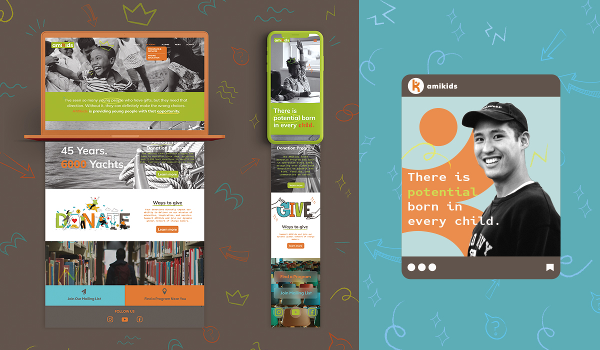
AMIkids is a non-profit organization dedicated to helping youth develop into responsible and productive citizens.
