

Callum Hamilton

Hometown: Plano, Texas
Visit Me Here: Website
About Me: I am passionate about utilizing visual language to address complex communication challenges. I enjoy experimenting with new design techniques while incorporating traditional elements into contemporary design. Throughout my studies, I have developed an appreciation for design nuance that yields the maximum impact.
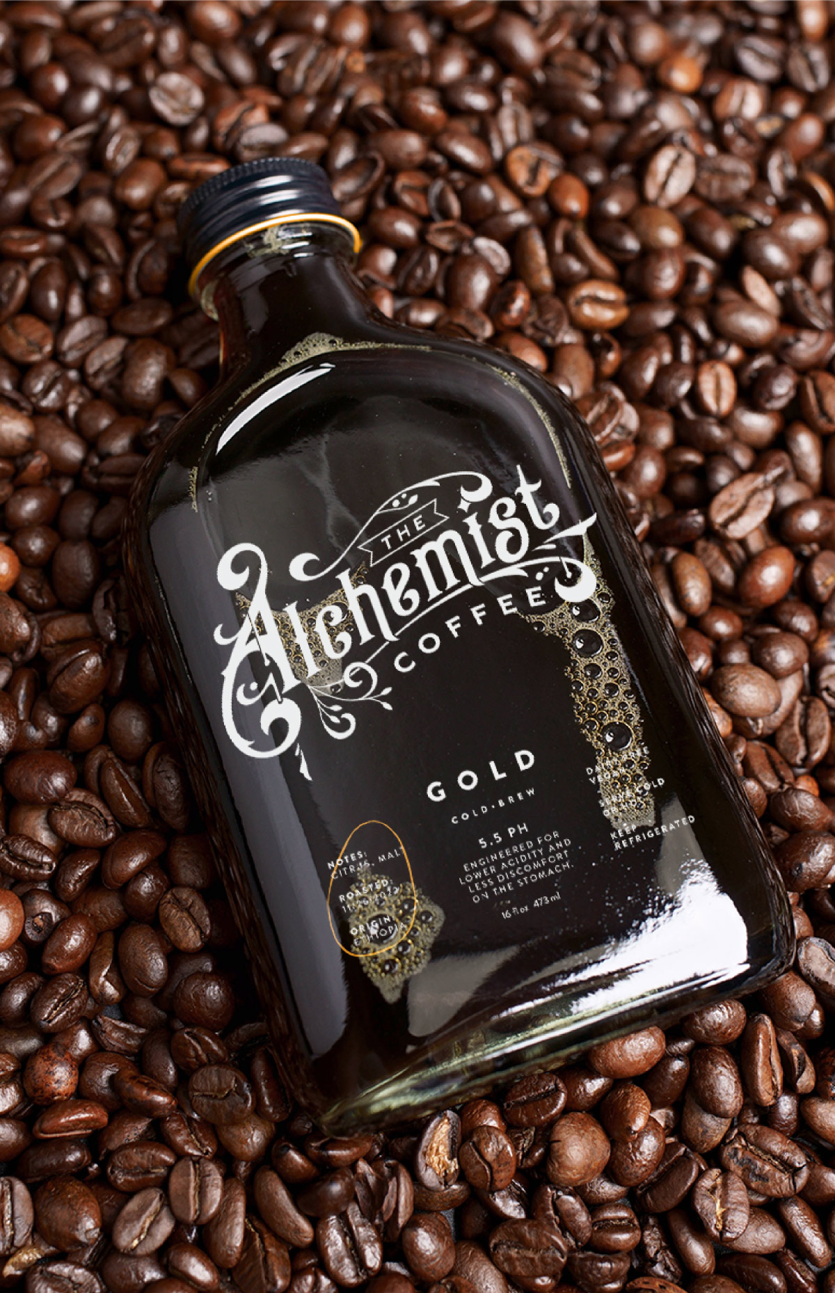
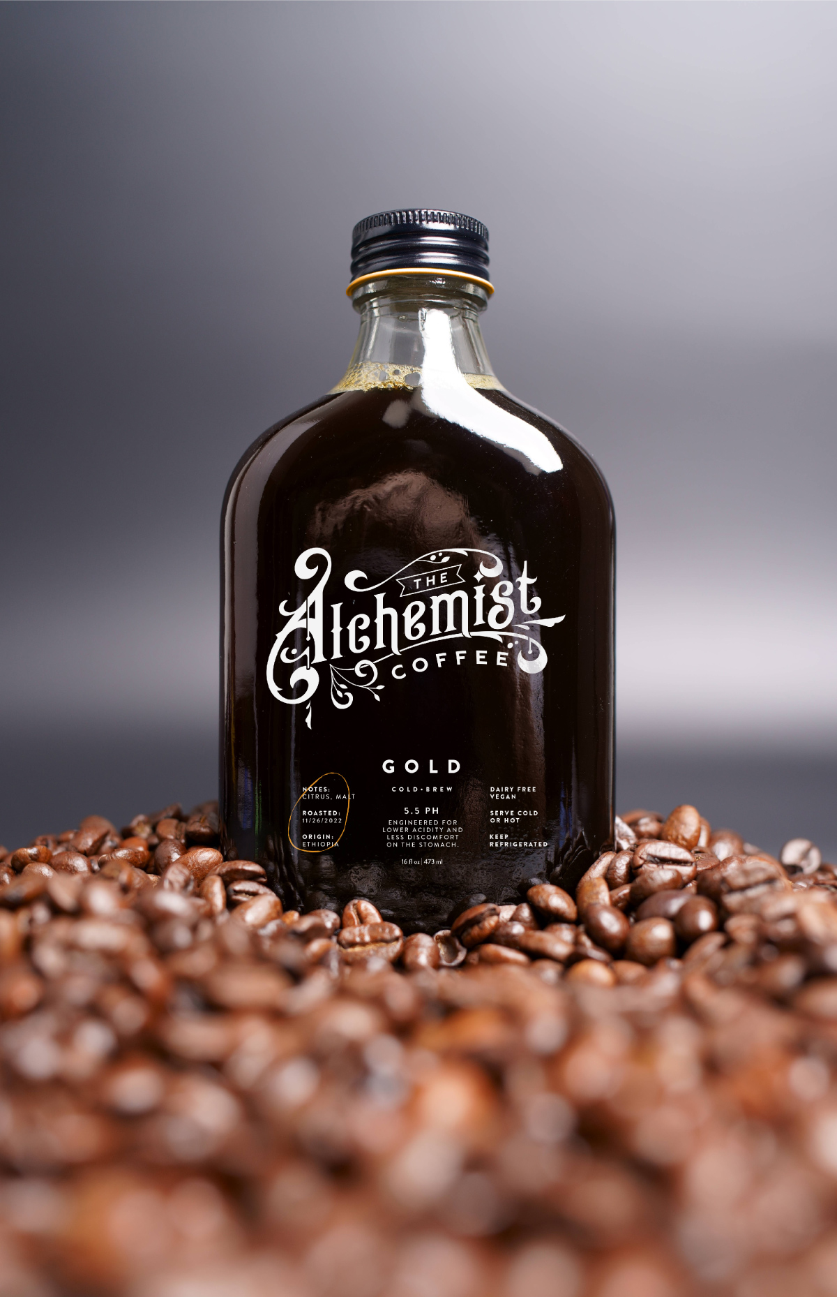
This project focused on creating the logo and packaging for a gourmet coffee brand. To define it from other cold-brew coffee brands, traditional typography, and modern design elements were used to elevate the packaging and logo design to let the consumer know this product was high quality.
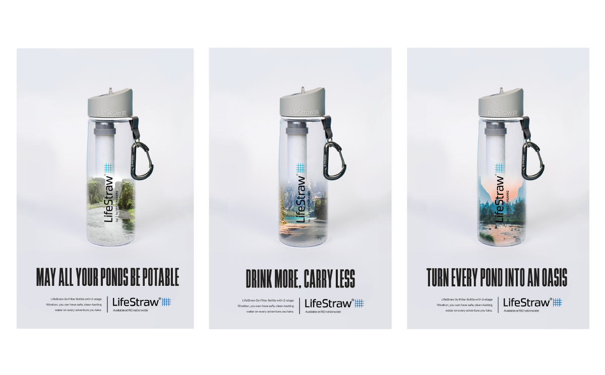
This Ad campaign was centered around bringing attention to the product’s ability to filter unsafe drinking water into potable water that the consumer can access quickly and easily.
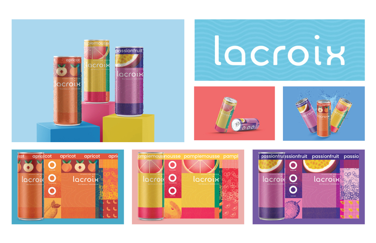
The project was to refresh a product’s packaging and implement a system that could be implmented across multiple variations of the product. The rebrand focused on LaCroix’s flavorful beverages that contain no ingredients besides water by combining the language of digital simulation and the natural elements of the fruits the beverages they are flavored after.
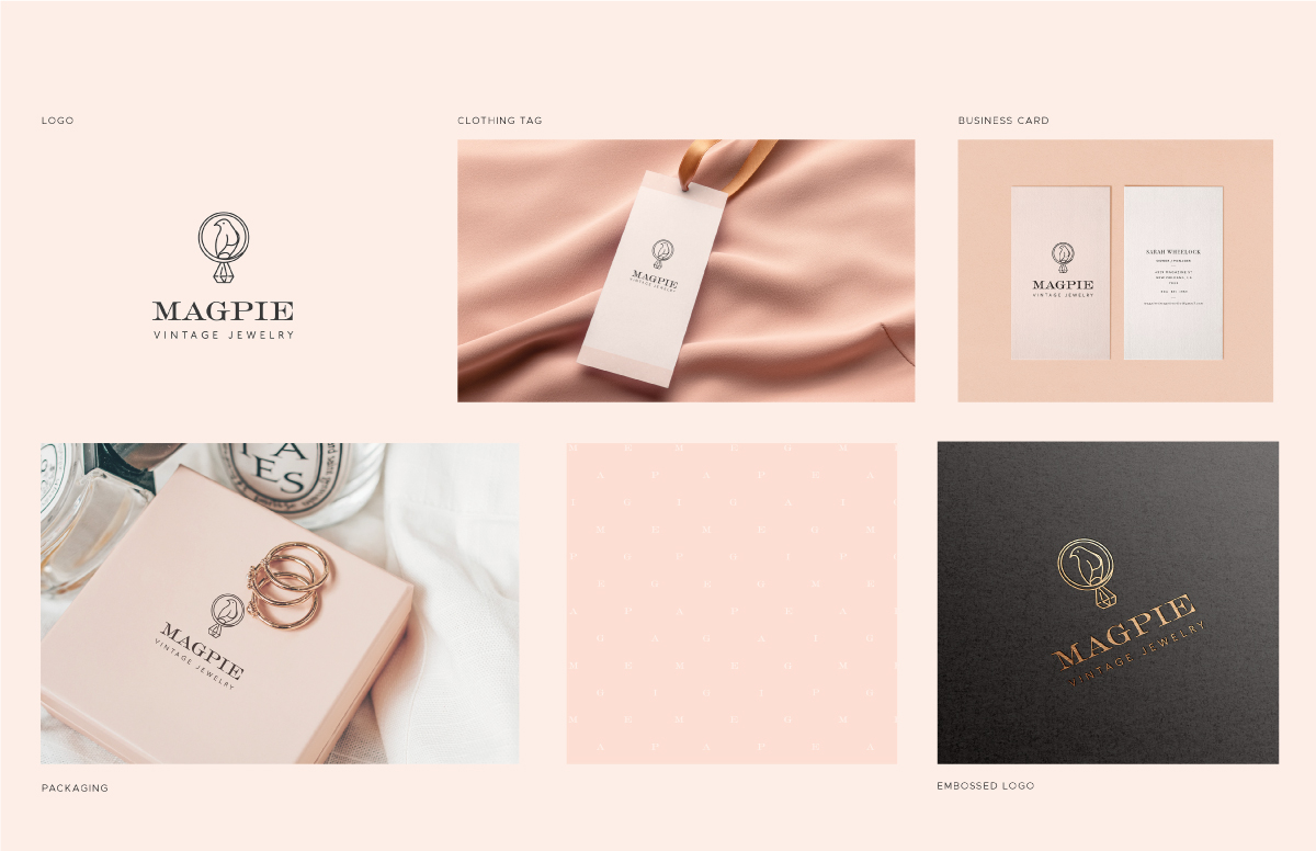
This project was to take an existing brand and redesign it so that it has a clear branding direction. By combining modern and traditional stylistic choices, this brand was refreshed and updated to appeal to modern audiences without compromising the vintage themes of the brand.
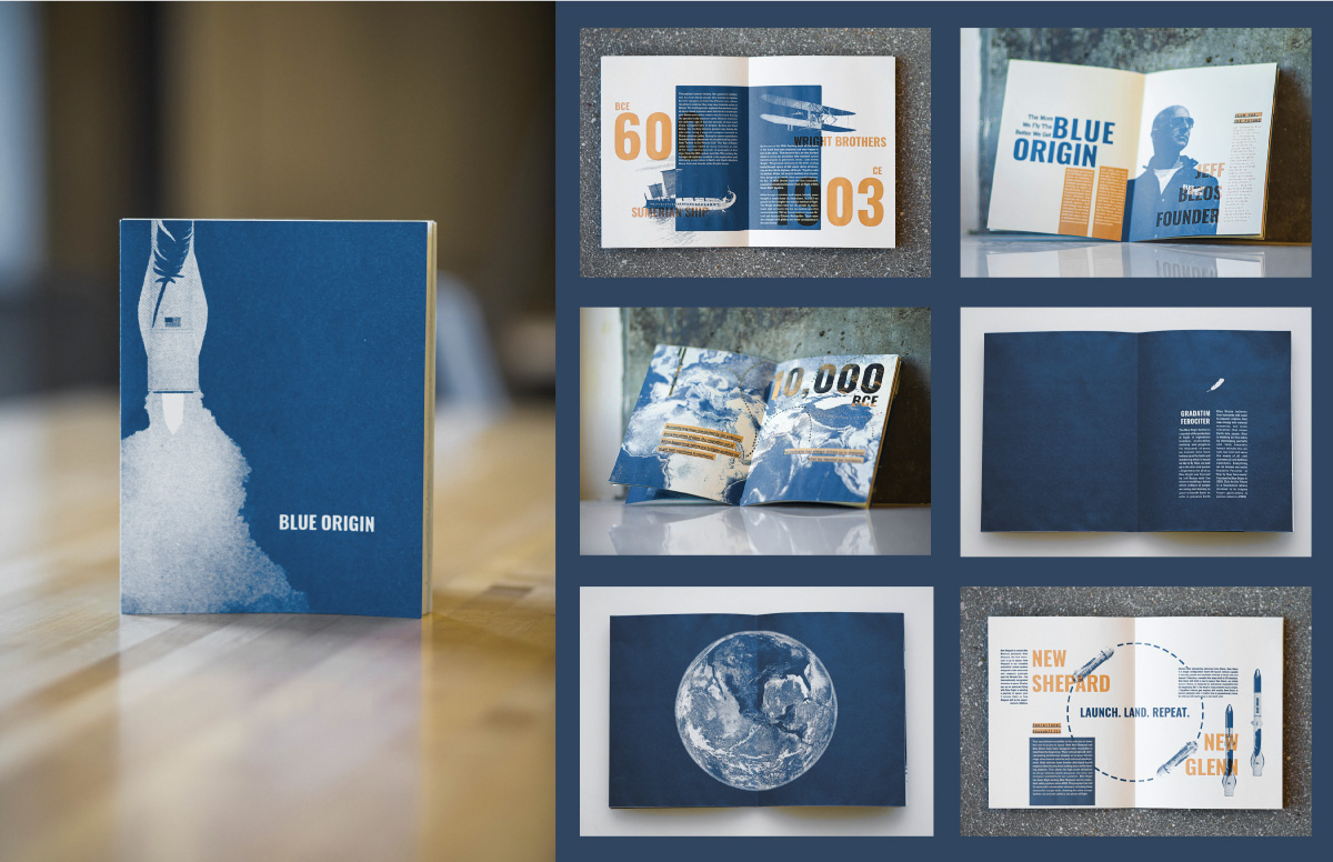
The brochure was designed to highlight the unique services that blue origin offers while noting that the brand caters to the human need for exploration and innovation.