

Isabelle Eggert
Hometown: Frisco, Texas
Visit Me Here: Website
About Me: Hello my name is Isabelle and I am a graphic designer and illustrator. My entire life I have been influenced and surrounded by art. Design is my main focus due to the many subcategories to choose form. I hope to focus on illustration and packaging, but I also love branding and animation. When I am not designing you can catch me drawing, reading, or metal smithing.
Fun Fact: One of my best skills is me watching TV. I am dedicated to watching a good show. I was able to watch seven seasons of Game of Thrones right before the final season was released.
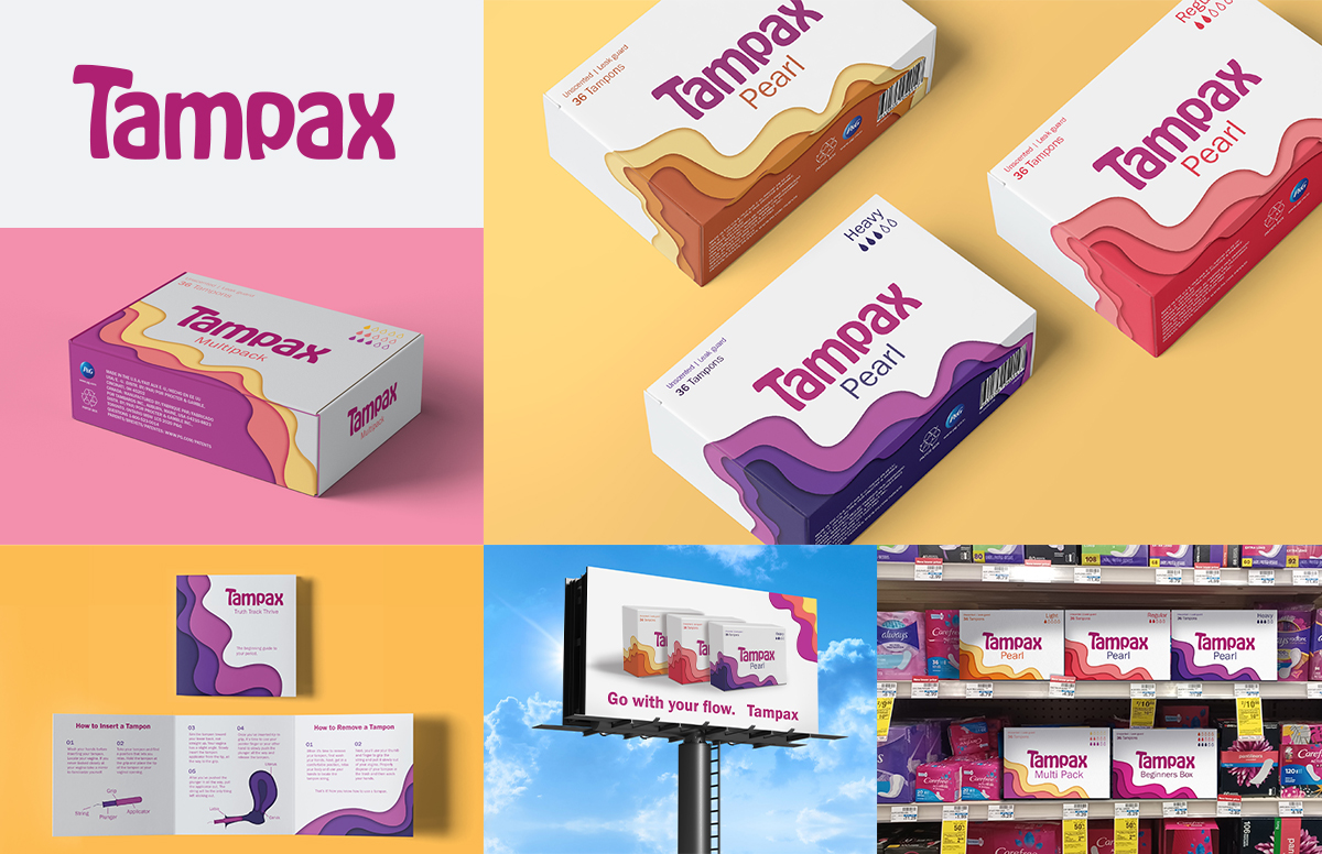
Tampax is a large corporate company that make tampon and other period products. This rebranding campaign focuses more on the new easy-to-see easy-to-read packaging. The Rebrands goal is to make a person's period the forethought not the afterthought.
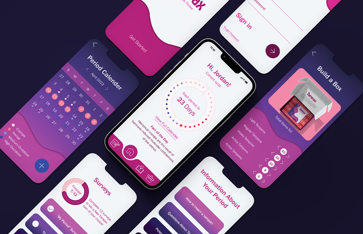
Designing an app to help track, inform, and educate about periods was an important aspect of this campaign. Having a location that is dedicated to providing accurate information is invaluable. The app also helps keep track of the person's cycle as well as a place to track ovulation and any period symptoms. The app also has a tab to "build your own box" so customers could order their own specialized box if they feel uncomfortable purchasing from stores.
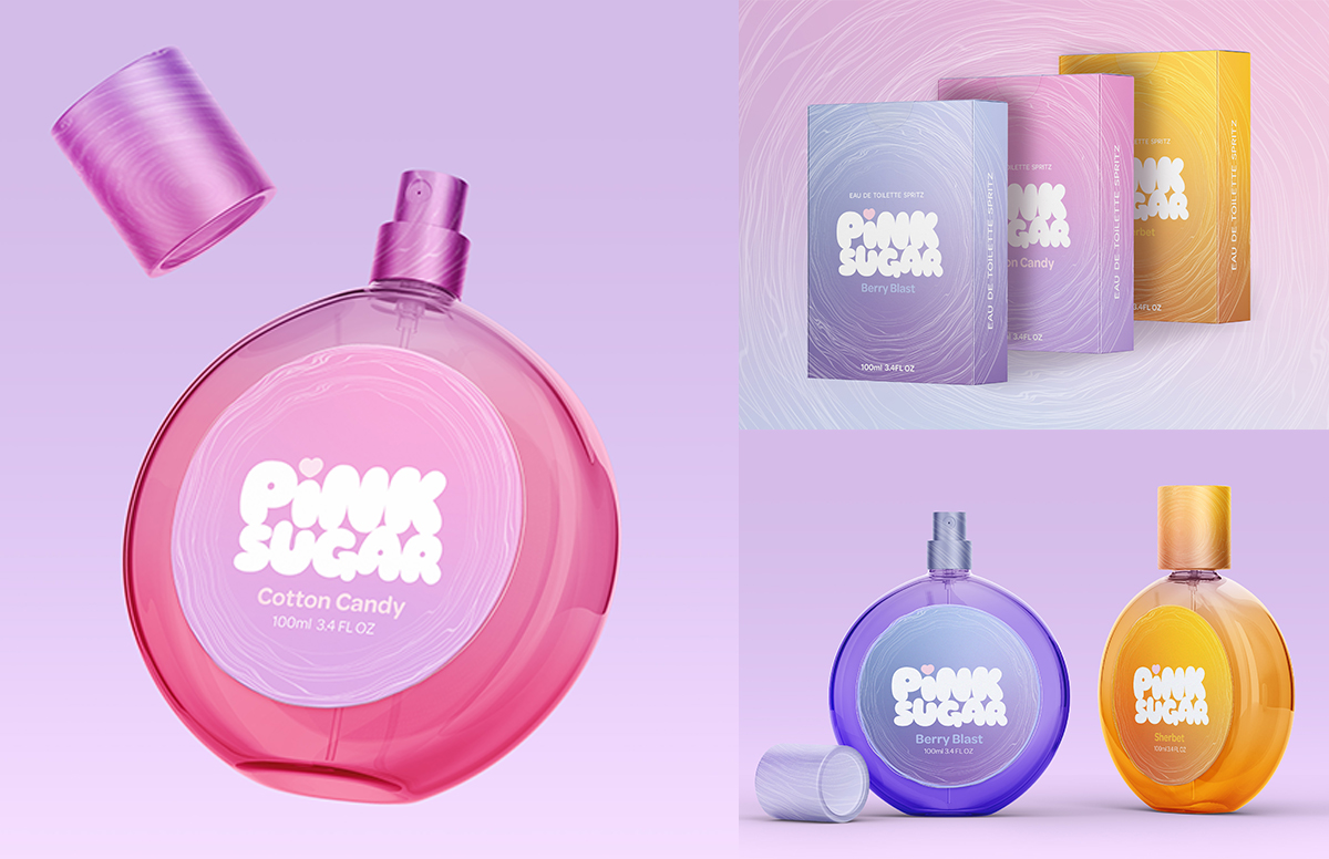
The Pink Sugar rebranding campaign seeks to introduce young teens to perfume. In this case study, the Pink Sugar brand goes from a hyperfeminine brand for older teens to a bubbly, bright brand that embraces young teens. The visual design, the motif utilizes delicate floss-like lines to mimic cotton candy floss that make the appropriate association without seeming childlike.
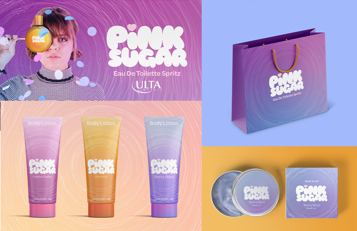
Pink Sugar does not just specialize in perfume they also lean into skincare like body scrubs and lotions. The visual design carries over to the other products. Smooth colorful gradients, rounded type and delicate candy floss illustrations are also applied to these items.
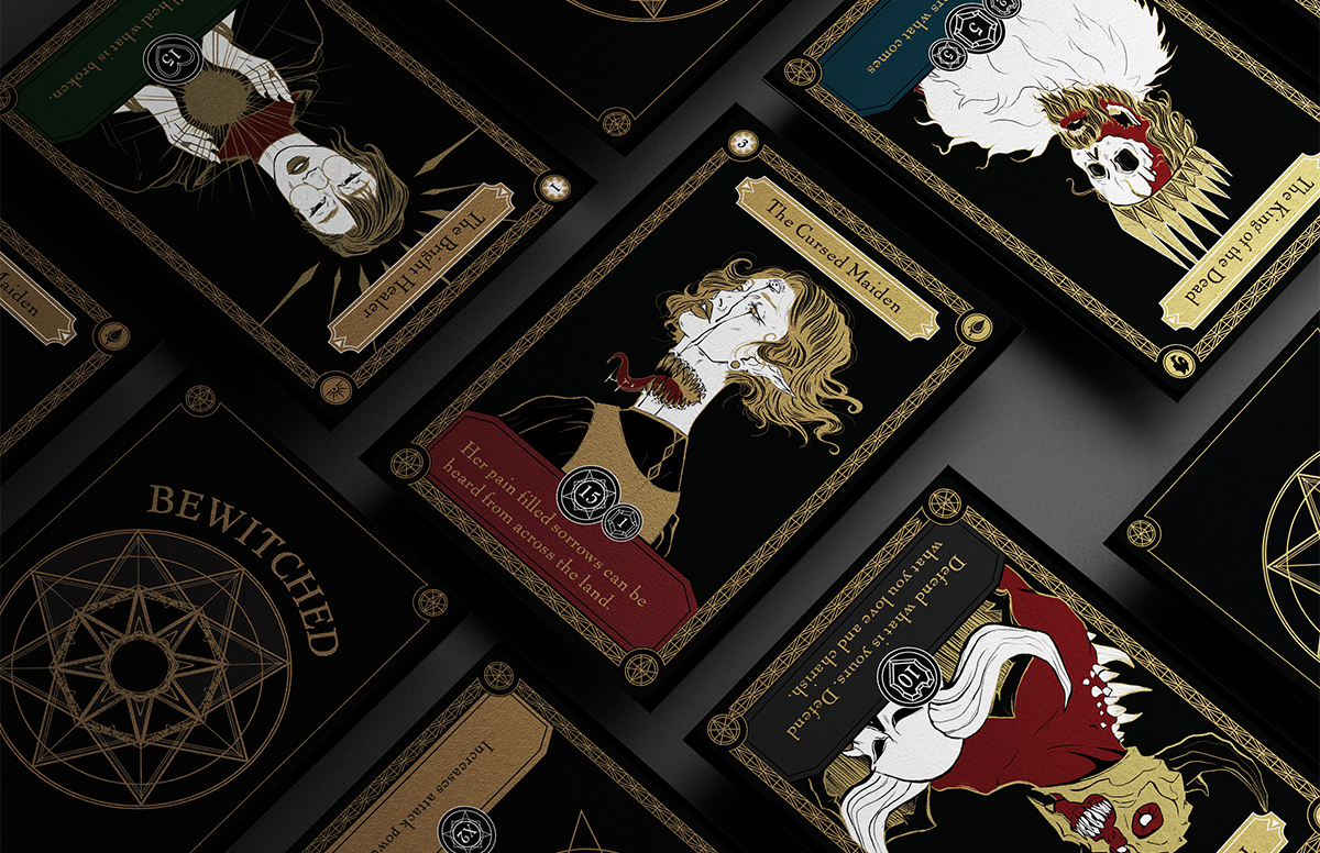
Bewitched is a beginner-friendly trading card game that takes inspiration from the Victorian period as well as classic fantasy aesthetics.
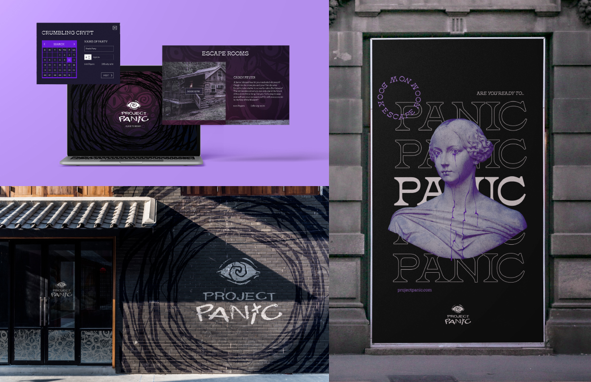
Project Panic is an escape room chain across Texas. This campaign rebrand focused on creating an experience with fun interactive ads and a website that would encourage people to go book a room and emersed themselves in the Project Panic experience.
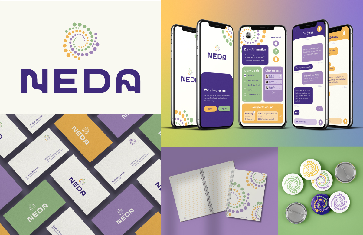
National Eating Disorder Association is a non-profit that helps connect people with Eating disorders to doctors and clinics to receive help. NEDA is also an information hub that provides detailed information about the big three eating disorders anorexia, binge-eating and bulimia. My groupmates Isabel Balabuch, Aubery Barns, and Kaitlin Catellier broke the work up and took the lead on certain assets. Isabel was in charge of the socials, billboards, water bottles, tote bags, and partnered with me on developing the app. Aubry was in charge of the website, animation, and t-shirts. Kaitlin was in charge of posters, brochures, and ID badges. I was in charge of the logo, colors, type, illustrations, journals, buttons, business cards, and the app.