

Natalie Crawford
About Me: My name is Natalie Crawford (they/them), and I am a queer graphic designer in the business of elevating the business and efforts of minority communities. From UNT I have a Bachelor of Fine Arts in Communication Design, and Art History and LGBTQ Studies minors.
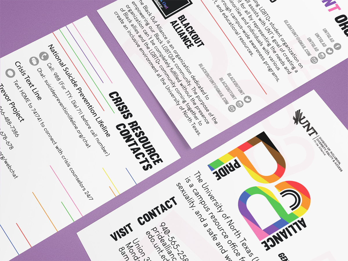
These flyers were part of the extensive work I did with the Pride Alliance at UNT over nearly 4 years. These not only include the logo I designed, but defined the brand as a whole. I have since label myself as a "Creative Advocate" in that I will continue to use my work to provide impacts for the minority communities I represent and call my own.
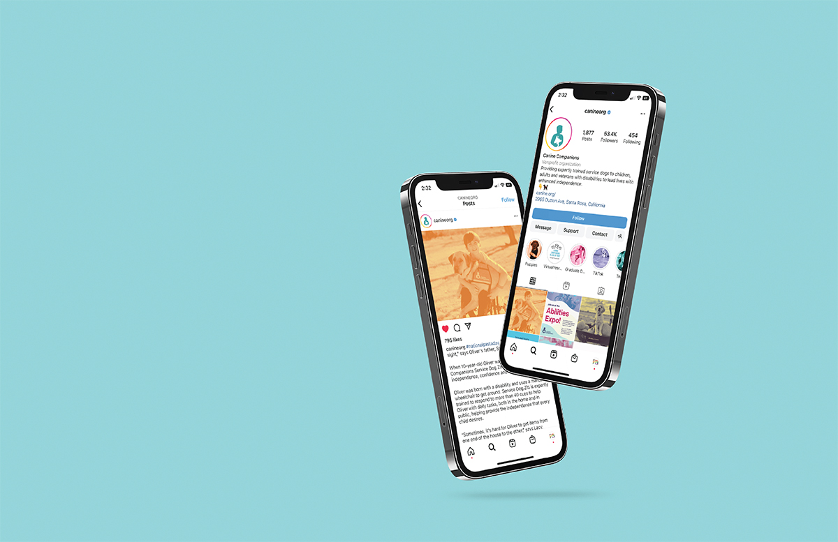
Canine Companions is a company that trains and provides service dogs to those in need. They are one of the leading companies for service dogs in the United States.I chose to focus my project rebrand for class on expanding the company's audience into social media and younger audiences, resulting in these social media images.
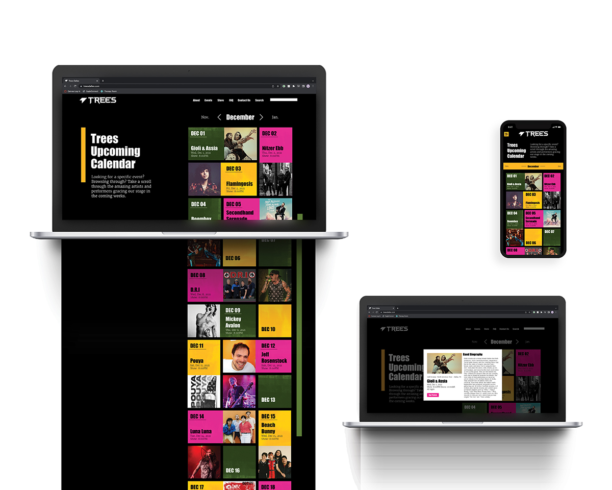
The Trees Dallas rebranding project was a project in my Interaction Design class. I was in a team with three other designers: Nima Ayagh, Hope Bernard, and Hannah Jung. We worked collaboratively to establish the overall brand and then applied it to our own sections of the website that we developed. This image features my work on the calendar pages.
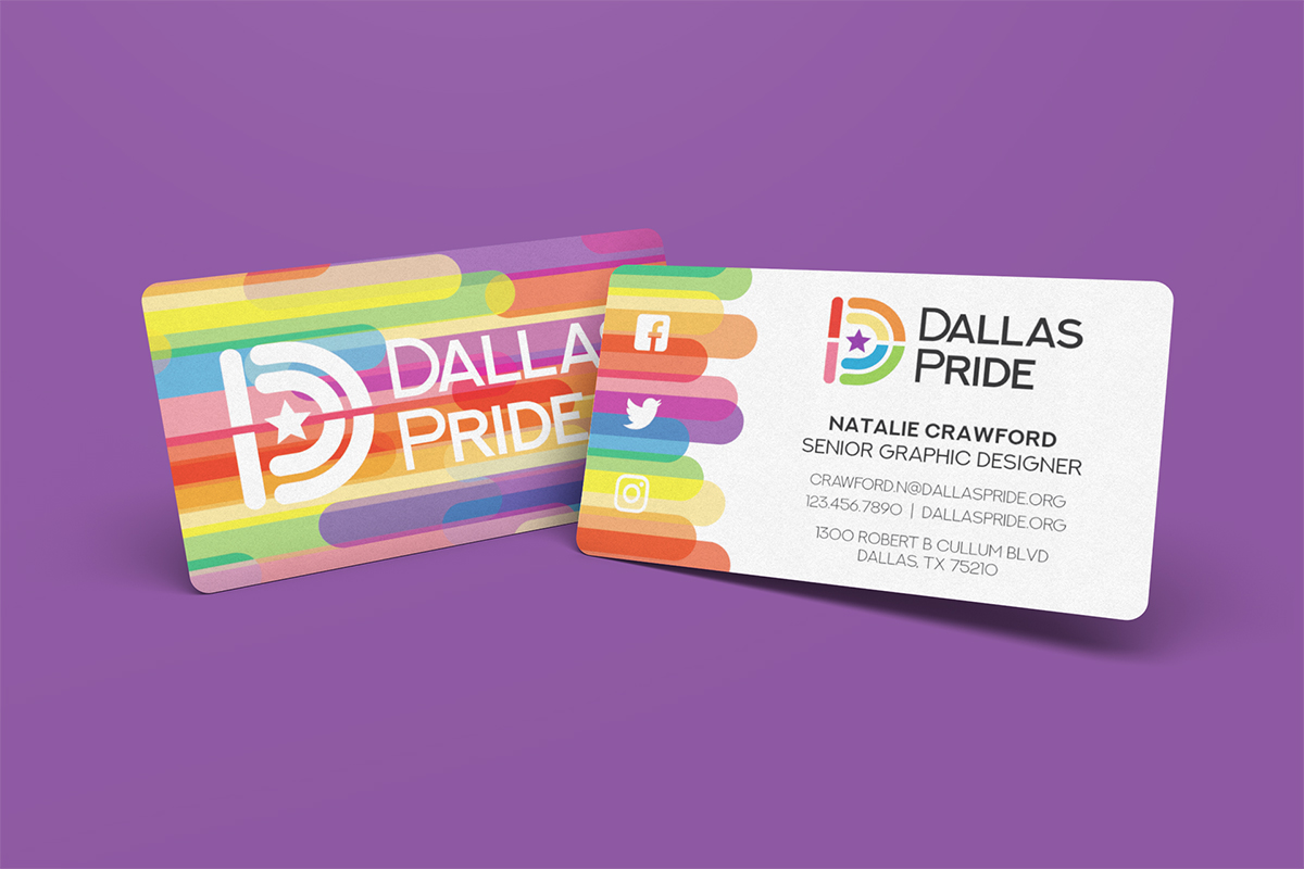
Dallas Pride is an event that takes place yearly to celebrate the LGBTQ+ rights movement and the LGBTQ+ community in and around Dallas, Texas. It is a combination of a festival and parade that takes place over the first weekend in June. In updating their branding, I wanted to create a design that embodied the festival's origins in Dallas, but also was modern, fun, and appealing to any audience.This image depicts the business cards of this design.
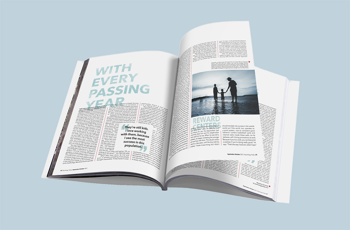
For a project, I was assigned was "When Your Child Is a Psychopath" by Barbara Bradley Hagerty. This article was originally published by The Atlantic. It contrasts a story about a family with a daughter diagnosed with psychopathy and research about a new reward-system based method for people with this condition. I developed a visual language around this idea, depicted in the mockup.
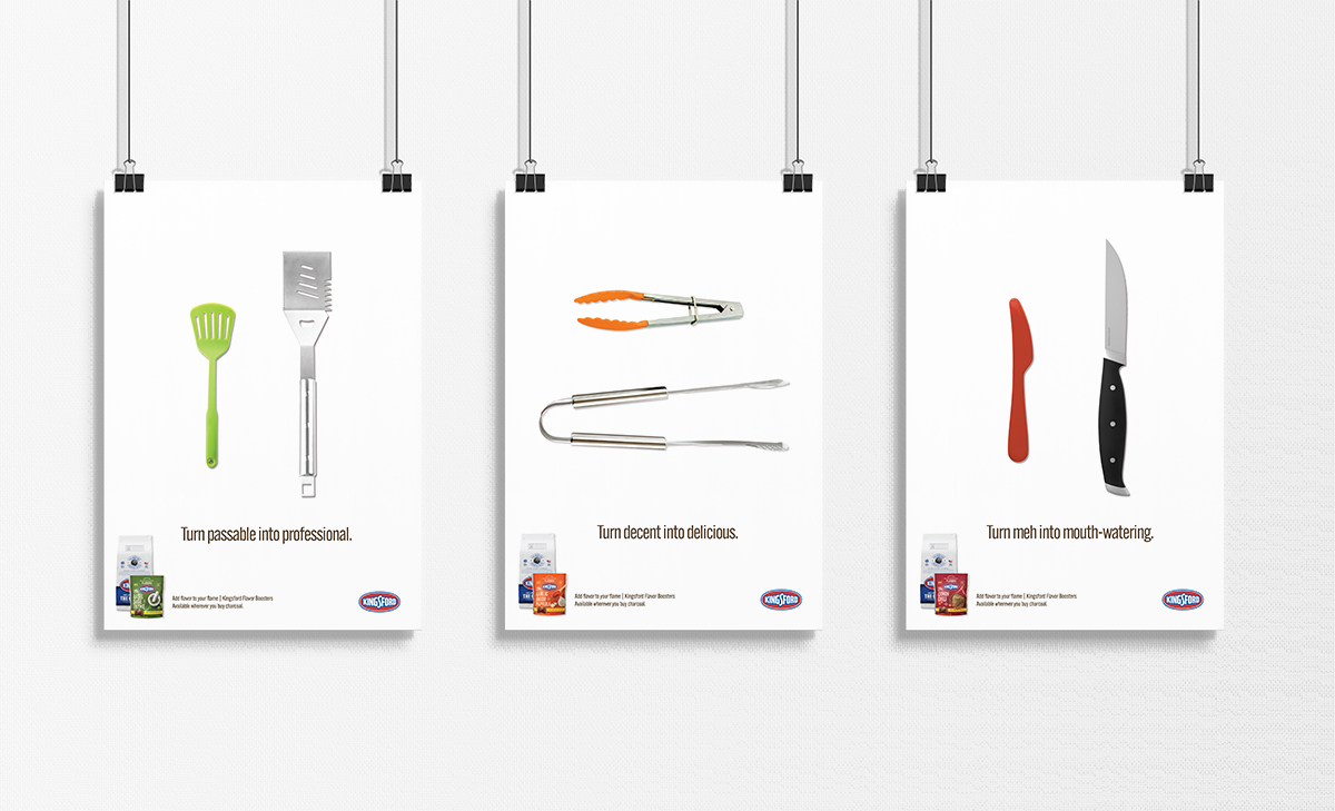
Kingsford Flavor Boosters are a charcoal additive that adds flavor to food as you cook it. This product was assigned to me in my art direction class for creating a 3 page ad campaign. In this assignment, I chose to push concept rather than displaying the product most prominently.