

Mallory Cowden
About Me: I am a Communication Designer and passionate about finding solutions that can go beyond a template. My first love is editorial design, but I also have experience with branding, packaging, illustrations, and UI/UX designs. As a designer, I strive to exceed expectations and create projects with attention to detail. I usually watch a movie or hang out with family when not designing.
Fun Fact: I work more organically in most art mediums but focus on graphical architecture work in my printmaking.
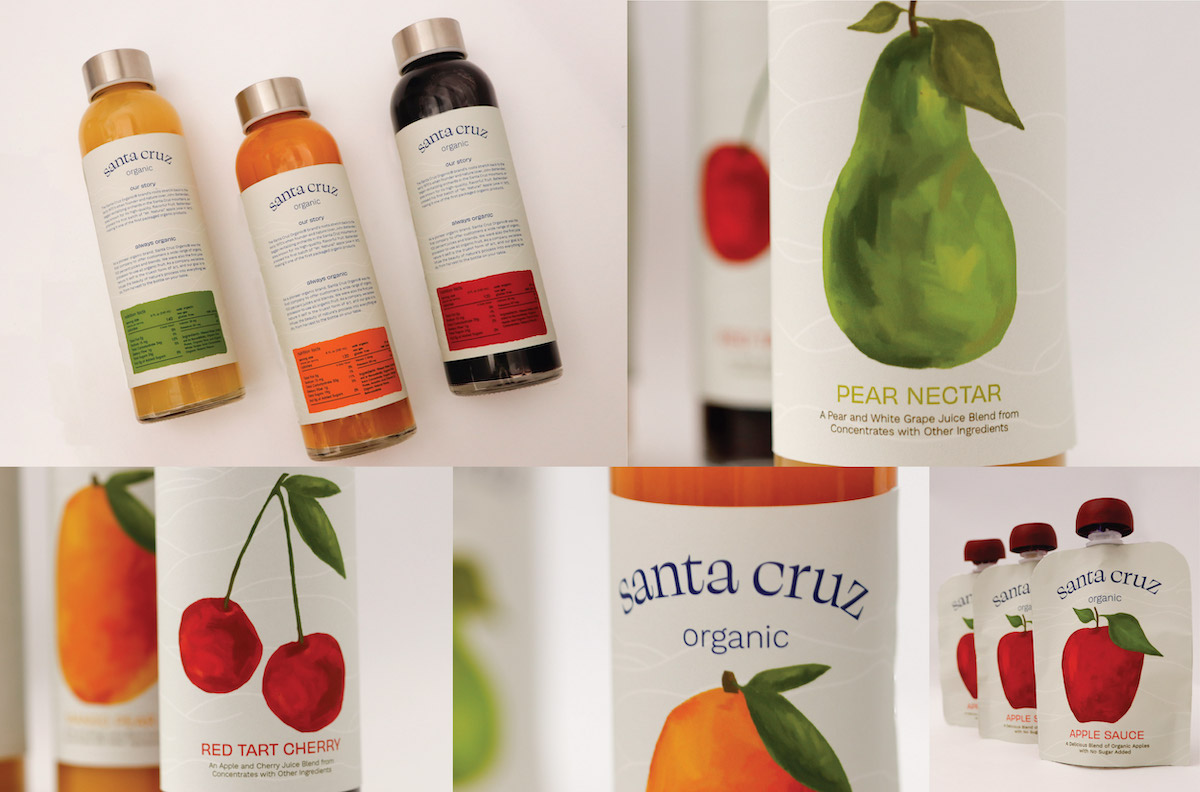
Santa Cruz is known for their fresh and organic products. The target audience is mainly middle-aged and older, so creating an inviting modern brand that can appeal to them was the main goal. A new wordmark, custom gouache illustrations, and finding new containers and packaging methods helped create a new fresh brand that felt more contemporary.
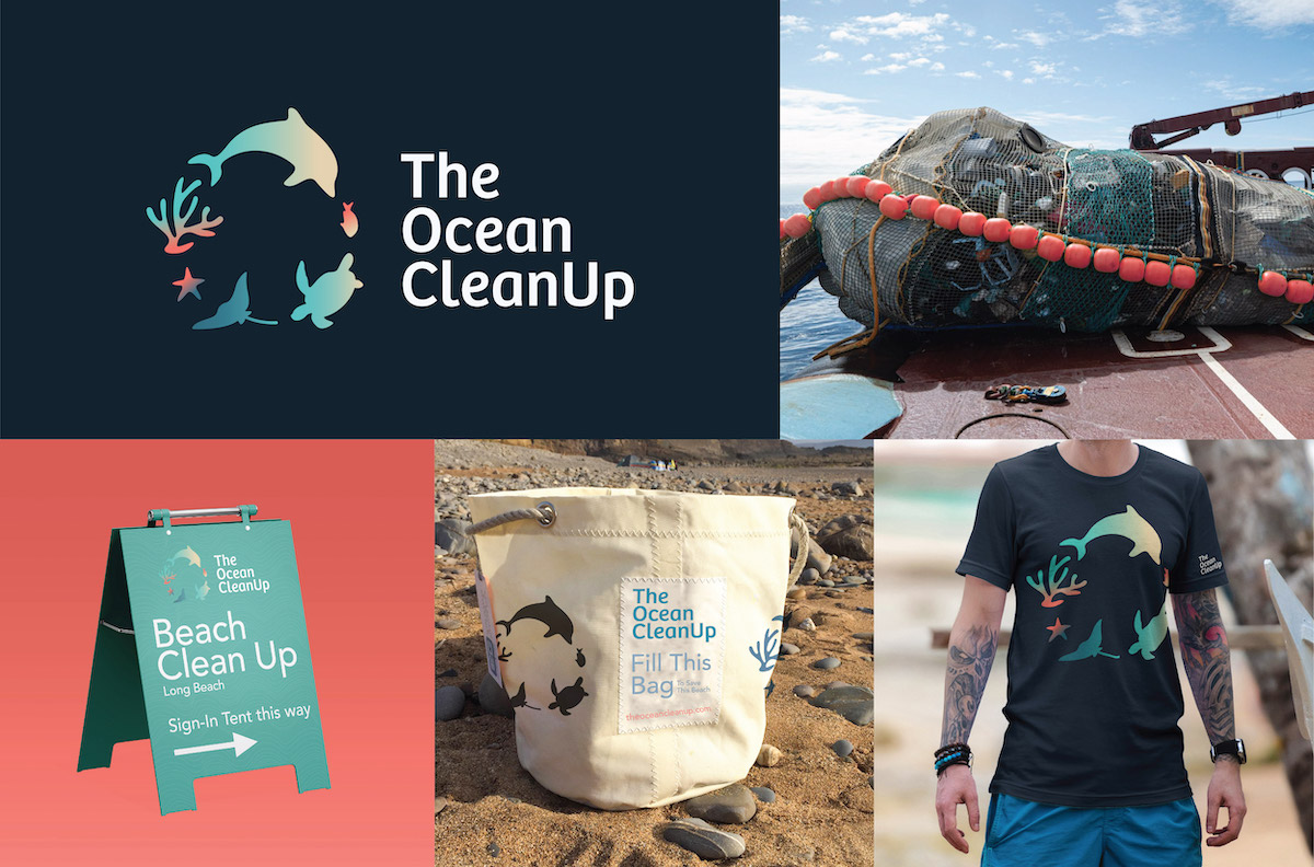
The Ocean Clean Up is a non-profit company dedicated to environmental stewardship. Their mission is to raise awareness about the impact of plastic pollution on the oceans, beaches, and wildlife. They encourage individuals and communities to take action to reduce plastic use and support ocean conservation.
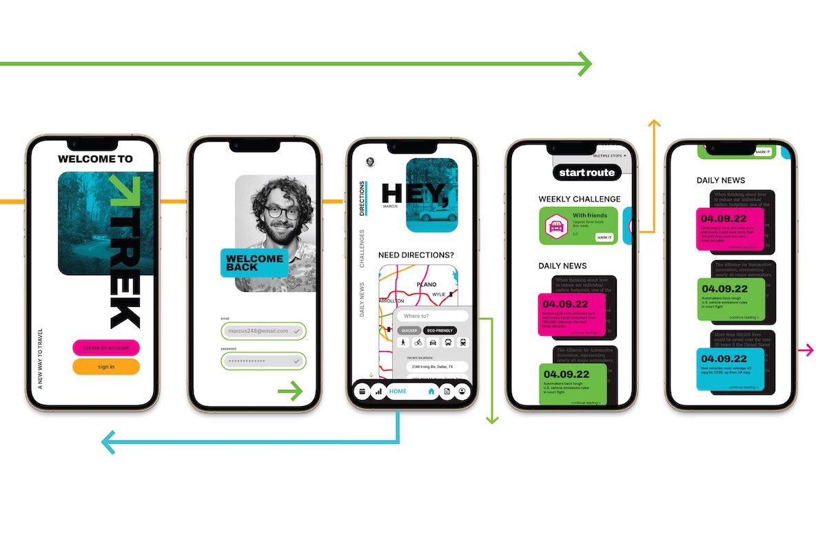
Trek is a travel map app that provides environmentally friendly routes for one's commute. This collaborative project was created from the ground up with the idea of creating a caused-based design. Through research and ideation, our group decided to create a travel app that addresses emissions. The app also allows you to plan the best travel method(s) for national or international trips. The subway language inspired my team by giving this app a fresh and appealing voice.
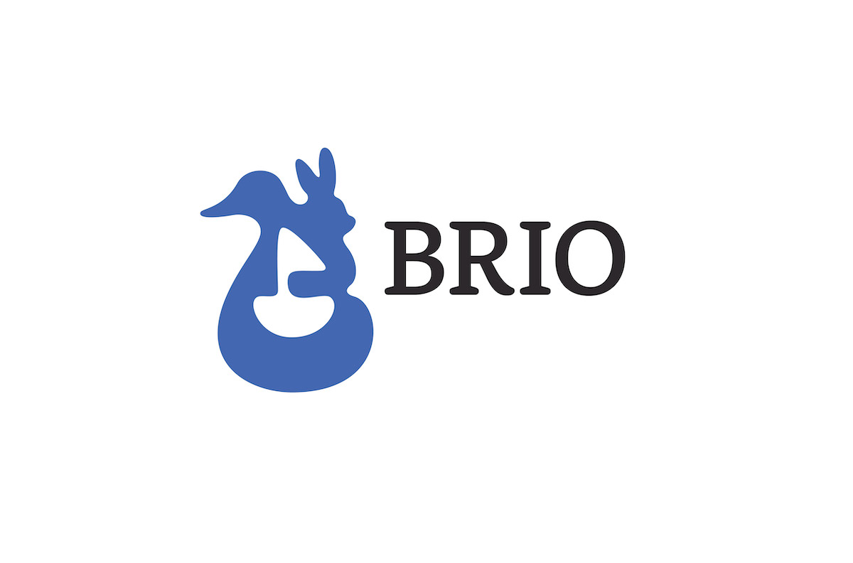
Brio is a well-known brand for children's wooden toy sets. Being over 130 years old, they pride themselves on their roots and quality wooden toys. Brio has a simplistic wordmark logo, so this design was imagined to reflect more of their branding and make them stand out. The creation of highlighting three toys brings in a nod to the different sets that they offer and gives the brand a friendly appeal.
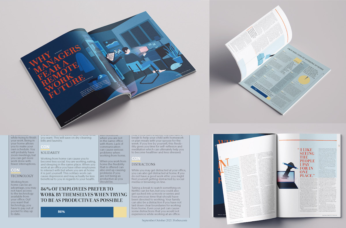
Forbes is a magazine geared towards business orientate and financial professionals. This article addresses the fear managers had when remote work was becoming the norm in 2020/2021. This project involved creating a three-spread feature article that matched the language of the publication. The layout was designed with limits of sizing, margins, and word count; while the infographic was designed based on other researched information related to the article.
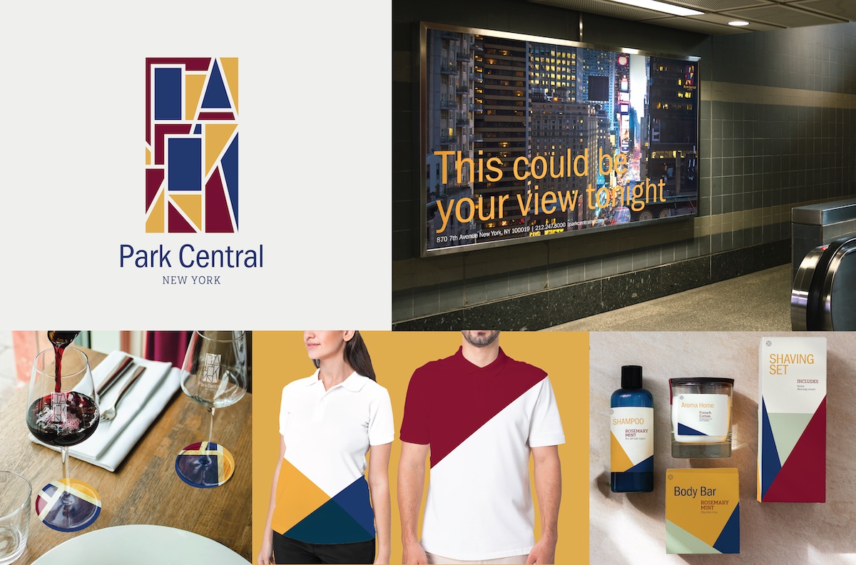
Park Central Hotel is located in the heart of Manhattan, New York, just blocks away from Park Central. Their current branding is standard and modern. This project showcased its art deco roots while keeping it modern and sophisticated. The logo speaks to a mosaic language with the hidden word "park." The angular shapes can be seen used throughout the branding.
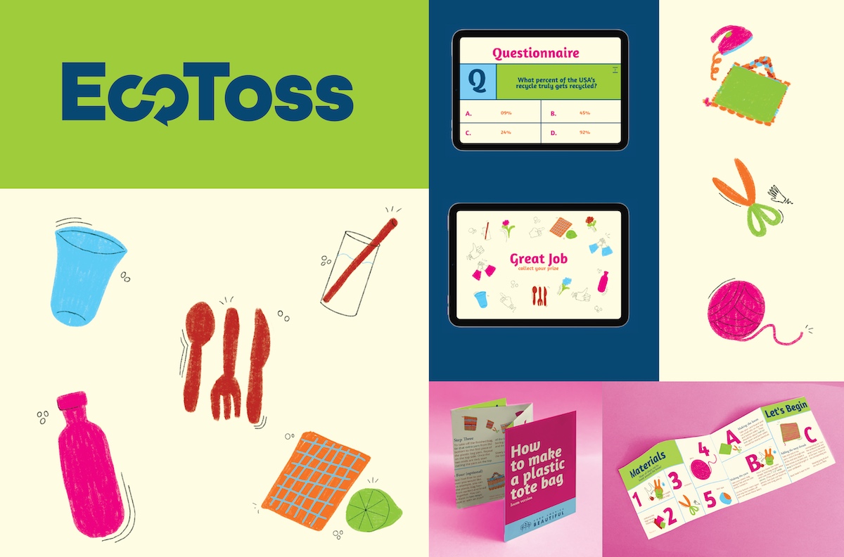
EcoToss was designed around the parameters of needing to be a cause-based project. My team focused on the issue of single-use plastics and how to change generational behaviors. Keep America Beautiful would sponsor this hypothetical project. We planned this event booth that would be at a variety of markets and events. Designing fun and eye-catching language was another important element, as we did not want it to become too serious.