

Macey Cowden
About Me: I am a graphic designer and love to learn and experience design in new ways, whether mixing different mediums or trying out new design programs. When I am not designing, you can find me tinkering away with a new sculpture or even trying a new hobby.
Fun Fact: I like entomology and think bugs are so fascinating! I like to collect any dead ones I find to put them in a shadow box to display.
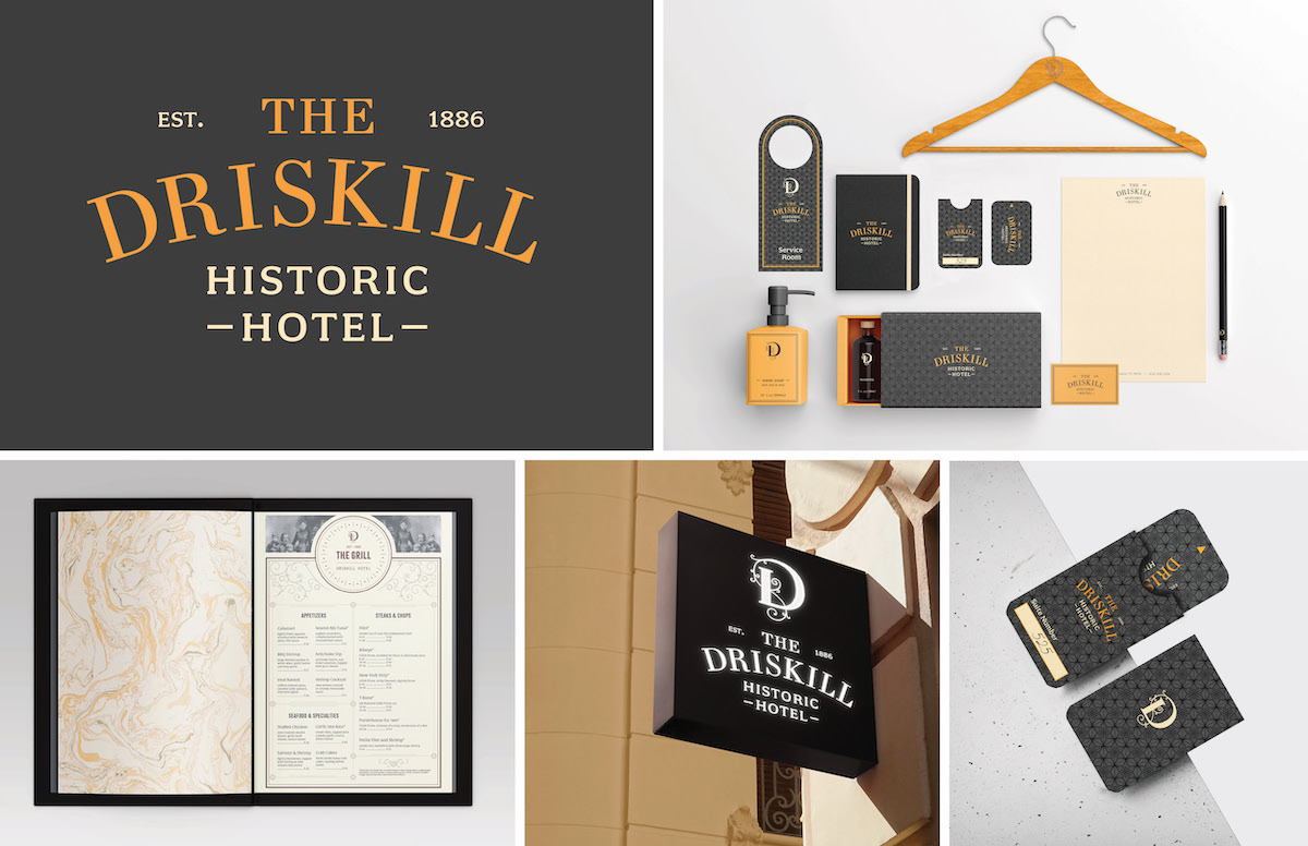
The Driskill is a historic hotel that was established in 1886. The hotel is located within the heart of Austin's city life. This redesign brings an updated approach that would appeal to the range of people that stay at The Driskill.
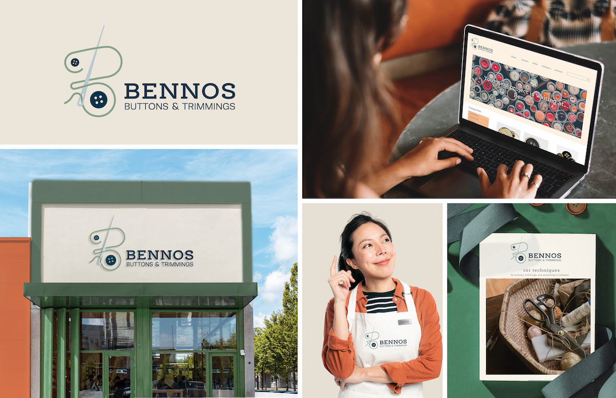
The goal of this project was to create a new identity for Benno's Buttons. The retail boutique offers a broad range of specialty buttons and trimmings. Benno's has continued to grow with an international clientele via the internet. This leads to the need for an updated brand identity to freshen its visual appeal and be memorable for an expanding client base.
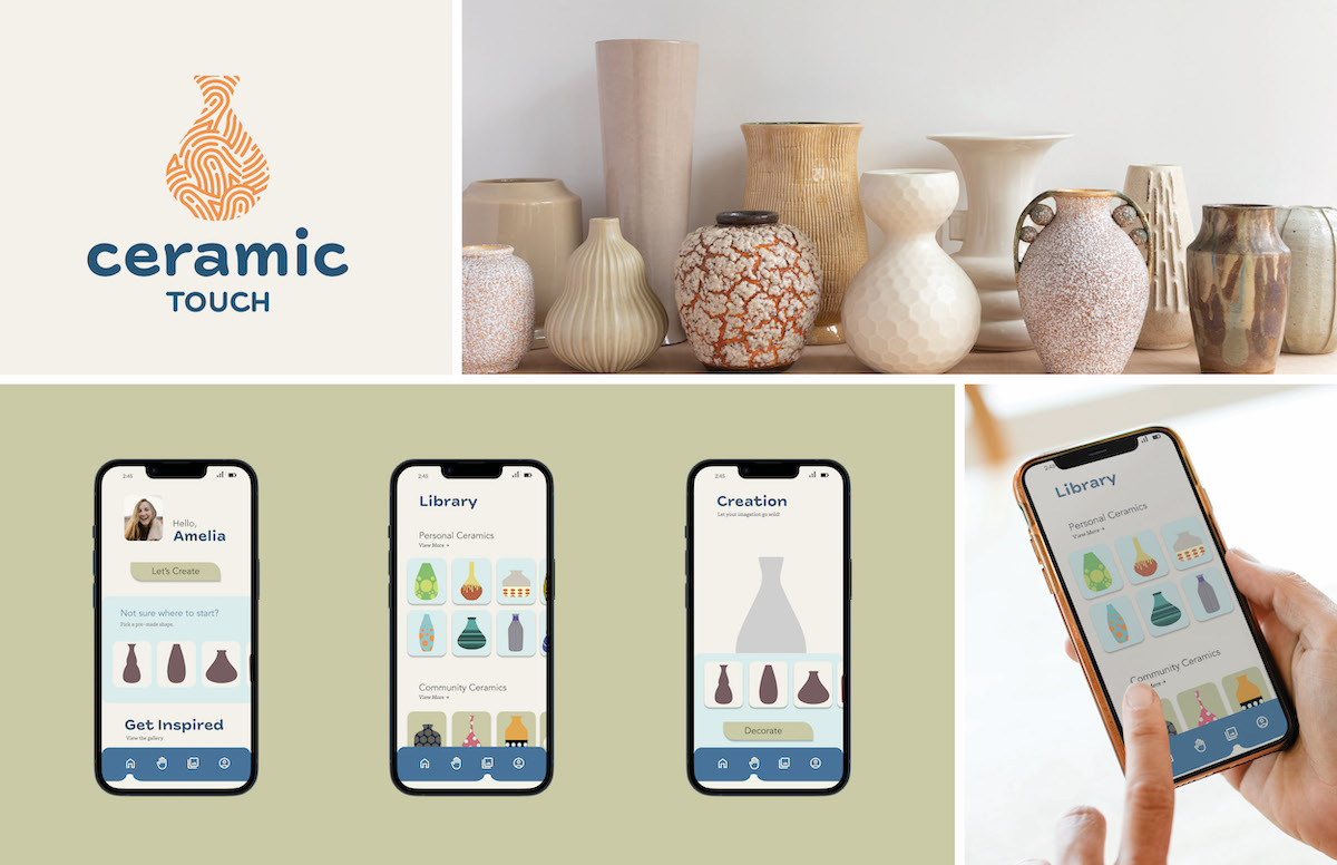
This was a passion project. The goal was to turn an idea into something that could be reality. I love pottery and wanted a way for it to be accessible to everyone. I decided an app was the best way as it allows anyone with the app to create, customize, and receive personalized pottery.
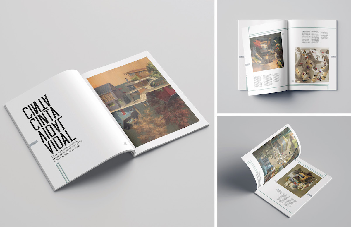
Cinta Vidal is a contemporary artist that creates paintings and murals. The layout and design mimic the mirroring that can be seen in Cinta Vidal's paintings. The simple use of color allowed the paintings to become the focal point, while the line motif helped carry the viewer through the spreads.
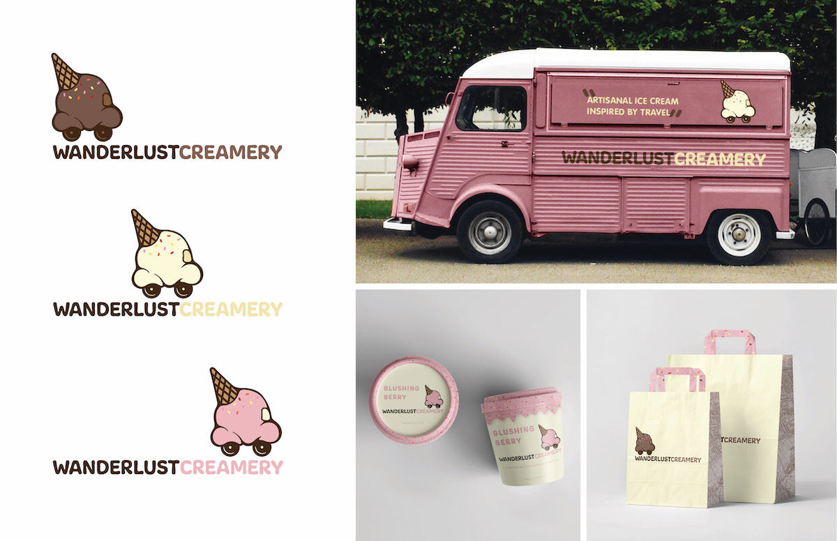
Wanderlust Creamery's goal is to show their love of travel through unique ice cream flavors. The redesign used tasty colors and drippy elements to continue the playfulness of the brand. The overall design ties in the brands love of having fun with ice cream.
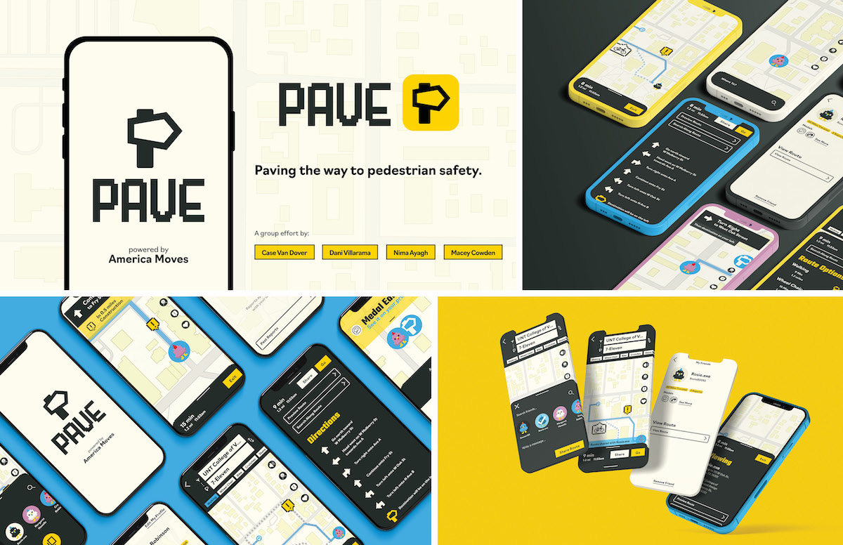
Pave is a navigation app that seeks to help improve the walkability within the United States and hopefully influence future infrastructure. The goal of this app is to focus on keeping pedestrians safe with real-time updates of obstacles and routes.
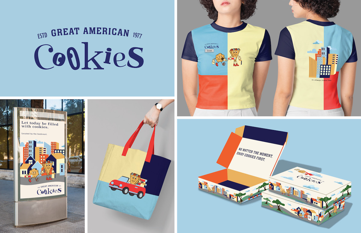
Great American Cookies is a large cookie company found across the United States. This rebranding focused on bringing the playfulness of the brand by using colorblocking, fun illustrations, and a cookie mascot.