

Kaylen Carson
About Me: I am a graphic designer committed to solving problems in new and unexpected ways. I never shy away from a challenge and continue to gain ground in unknown territory with confidence and excitement. I have experience in advertising, art direction, branding, publication and packaging. My favorite part of the design process is the research & building of a strong brand story. I enjoy creating around strong questions about who and why. When I am not crushing the design game, you can find me kayaking, mountain biking, or prancing around vintage stores listening to Bluegrass music.
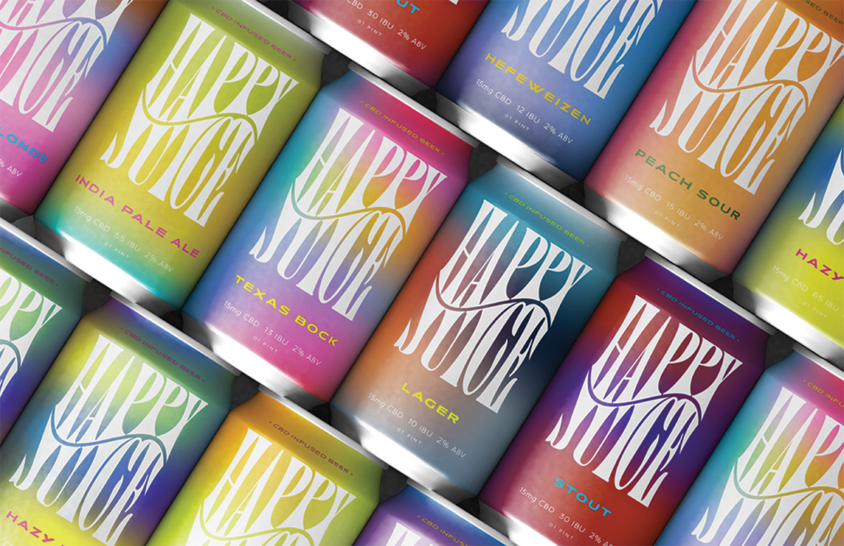
Do you like to have a drink after a long day? Have you ever experienced negative effects after consuming alcohol? Have you ever experienced social anxiety? If you answered yes to any of those questions, let me introduce you to Happy Juice. It is a low-alcohol CBD-infused beer for people who want to enjoy their favorite wind-down beverage without impairment or health risks. I believe drinking a CBD-infused beer has many benefits: it will decrease anxiety while increasing dopamine levels, protect the liver and promote cell turnover. It has been known to decrease blood-alcohol levels. Though there is a decrease in the ABV, this will not decrease the robust flavor you expect. Relax without the risk. Drink Happy Juice.
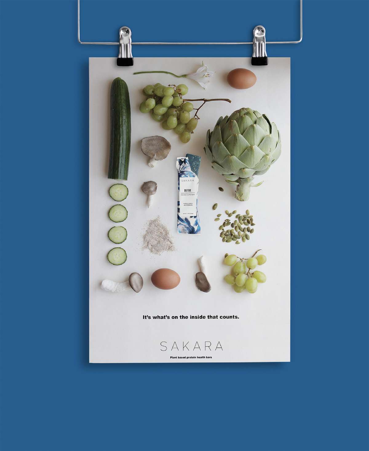
You look at yourself in the mirror and see things you want to change. You buy beauty bars to fix the complexion you can’t stand, energy bars to get you through the workout that hopefully will make your legs more toned, and detox bars praying it will help you drop the last few pounds. The one thing that Sakara wants to remind its customers is that what’s on the inside counts, and we are not just talking about our ingredients. Sakara is a plant-based health food company looking to spread the message that food is medicine.
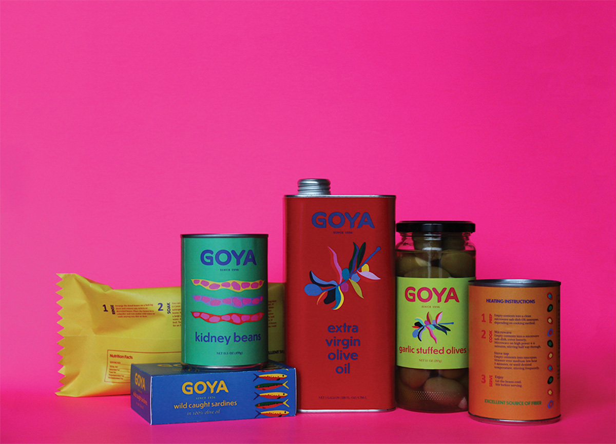
Throughout the GOYA re-brand and package design project, I aimed to keep the integrity of the well-established and revered GOYA brand while celebrating its rich history and Hispanic influence. When re-imagining the brand mark, it was critical that I did not make too big of a leap away from the current recognizable logo. I decided to stay with the bold logotype style and make some modern adjustments. The end result pays homage to the GOYA brand and will still be easily recognized by GOYA consumers when sitting on a shelf. Through a celebration of color, a face-lift to the type and branding, and modern illustration and design, I believe the new GOYA branding stands out from its competitors and is a wonderful way for GOYA to continue its legacy.
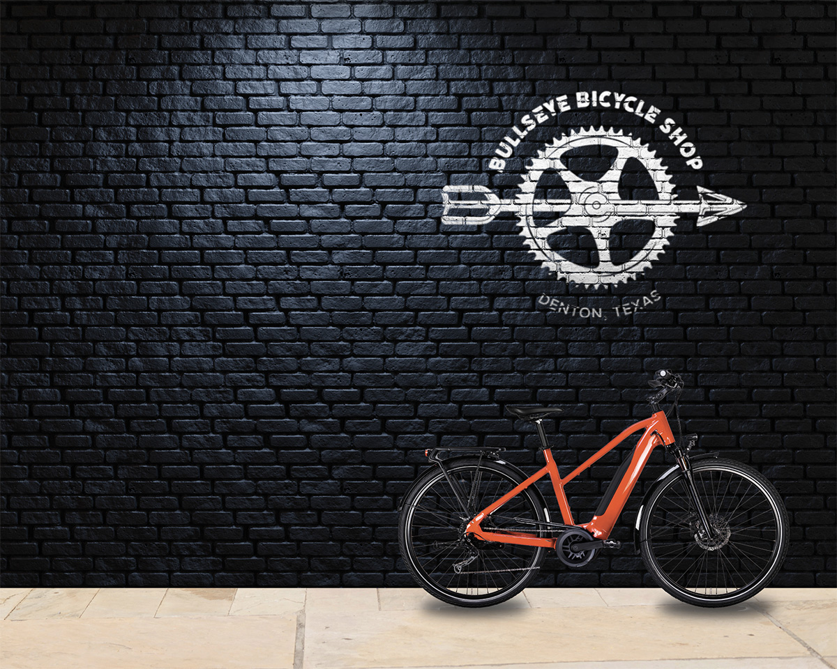
Mountain biking is a major source of stress relief for me, and having used Bullseye Bike Shop before, I thought it would be a blast to re-imagine their mark! Their current mark was outdated and not serving its purpose well. It was intricate and ornate and wasn’t easily read. The location has no true signage and garners new business through local drive-bys. So, having a mark that is not easy to read at quick glance is a problem. The use of this fresh new mark will allow Bullseye to have a convincing and profitable local presence, as well as increase visibility with clear and readable signage.
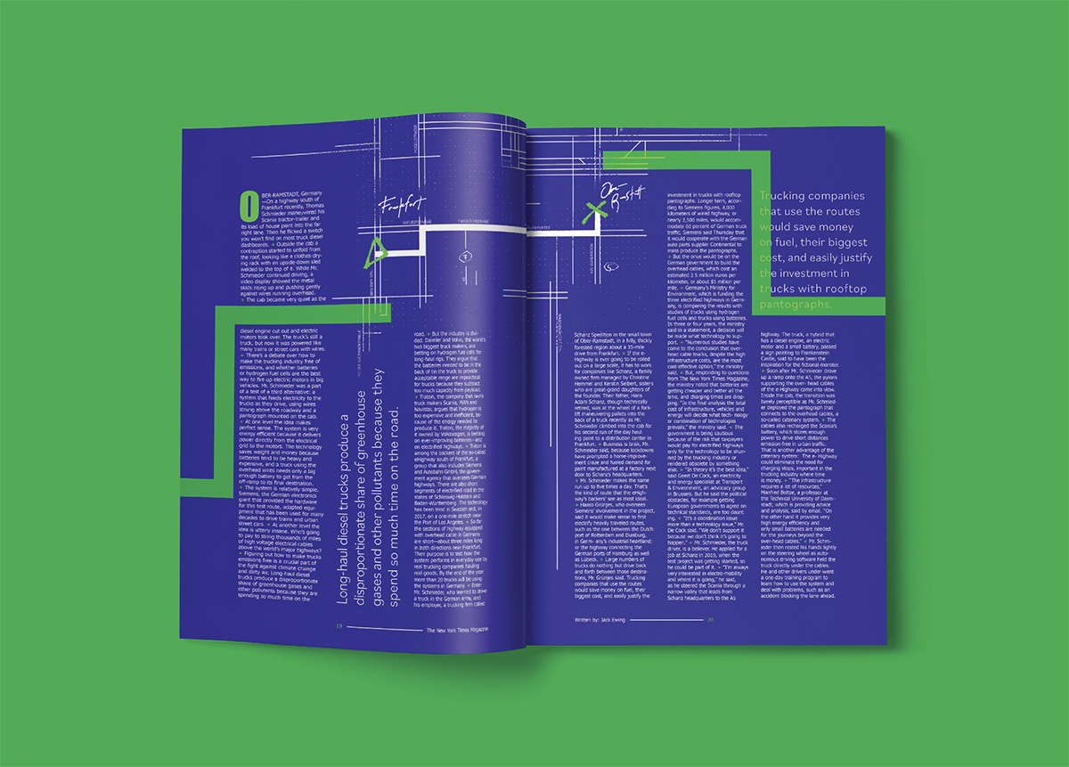
The project was to create three editorial spreads for an assigned article. We were in groups of two for the creation of this project. My role was concept, type and layout. My partner, Marly, focused on the illustrations. However, I did a few illustrations for the final spread. I thoroughly enjoyed my role in this project. I feel like my strengths were upheld, as well as felt challenged throughout this project.