

Isabel Balabuch
About Me: I am a graphic designer with a penchant for irreverent and whimsical things. I believe that life should never be taken too seriously, and this philosophy inspires me to create work that I hope will bring a smile to someone's face. My fruit bowl of influences includes Tim Burton's artwork, the song "Hallelujah Junction — 1st Movement, 1975, The French Room," very specific episodes of Saturday Night Live, and my dear friends and family. When I'm not designing, you can find me reading up on anything from philosophy to screenwriting, sharing a laugh with my loved ones, and pacing around in circles. Thank you for taking a peek at my work. I hope it added some sparkle to your day–and if not, I hope something else does!
Fun Fact: I just ordered $25 worth of Warheads candy on Amazon.
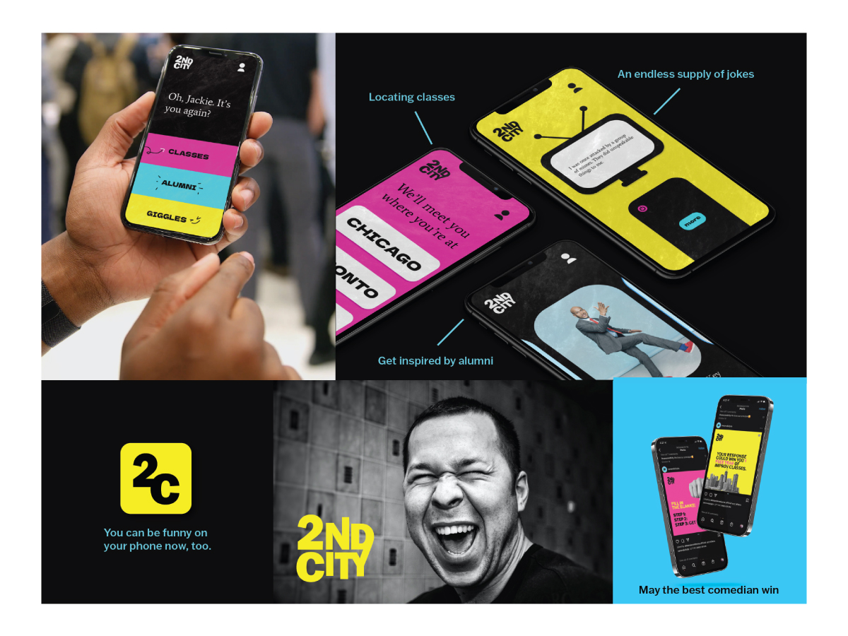
The Second City is a renowned comedy center with locations in Chicago, Toronto, and Hollywood. Its alumni include Amy Poehler, Tina Fey, Steve Carrell, and other household names. The question I posed before beginning this project was: how do you take a comedy mecca and make its brand identity as cool as its reputation? As a portion of the answer to this question, I developed a mobile app to help aspiring comedians locate classes, tap through jokes, and explore the careers of Second City alumni.
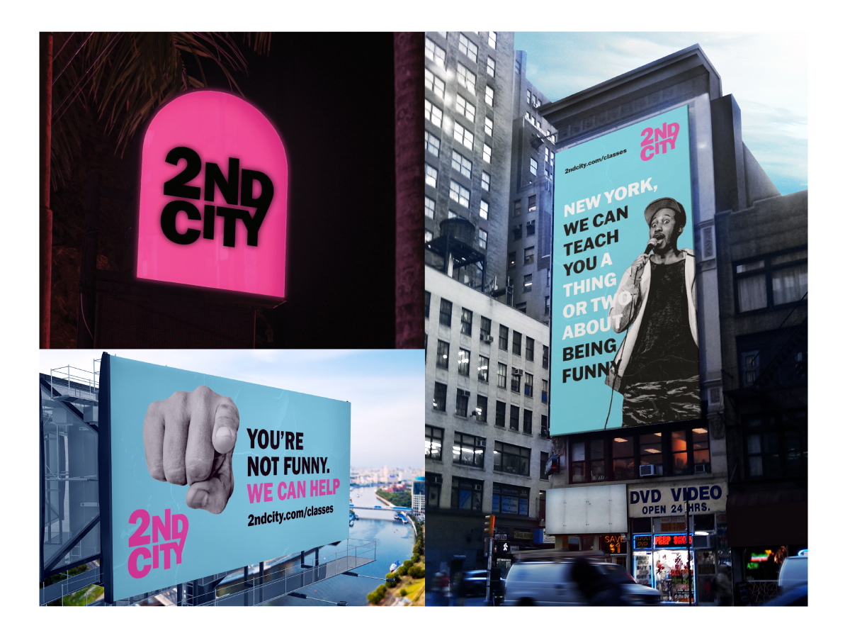
There are three photos present in a grid. The first is a bright pink sign with the Second City logo. The second one is a billboard in the center of New York City that reads, 'New York, we can teach you a thing or two about being funny.' The last image is another billboard that says, 'You're not funny. We can help.' Both billboards direct the viewer to the Second City website.

Dirty Hit is a British independent record label based in London. To redesign their logo, I thought through clever ways to convey the meaning of a dirty hit. This is my solution.
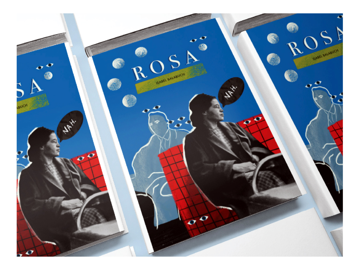
A cover for a fictitious book about the life of civil rights hero Rosa Parks.
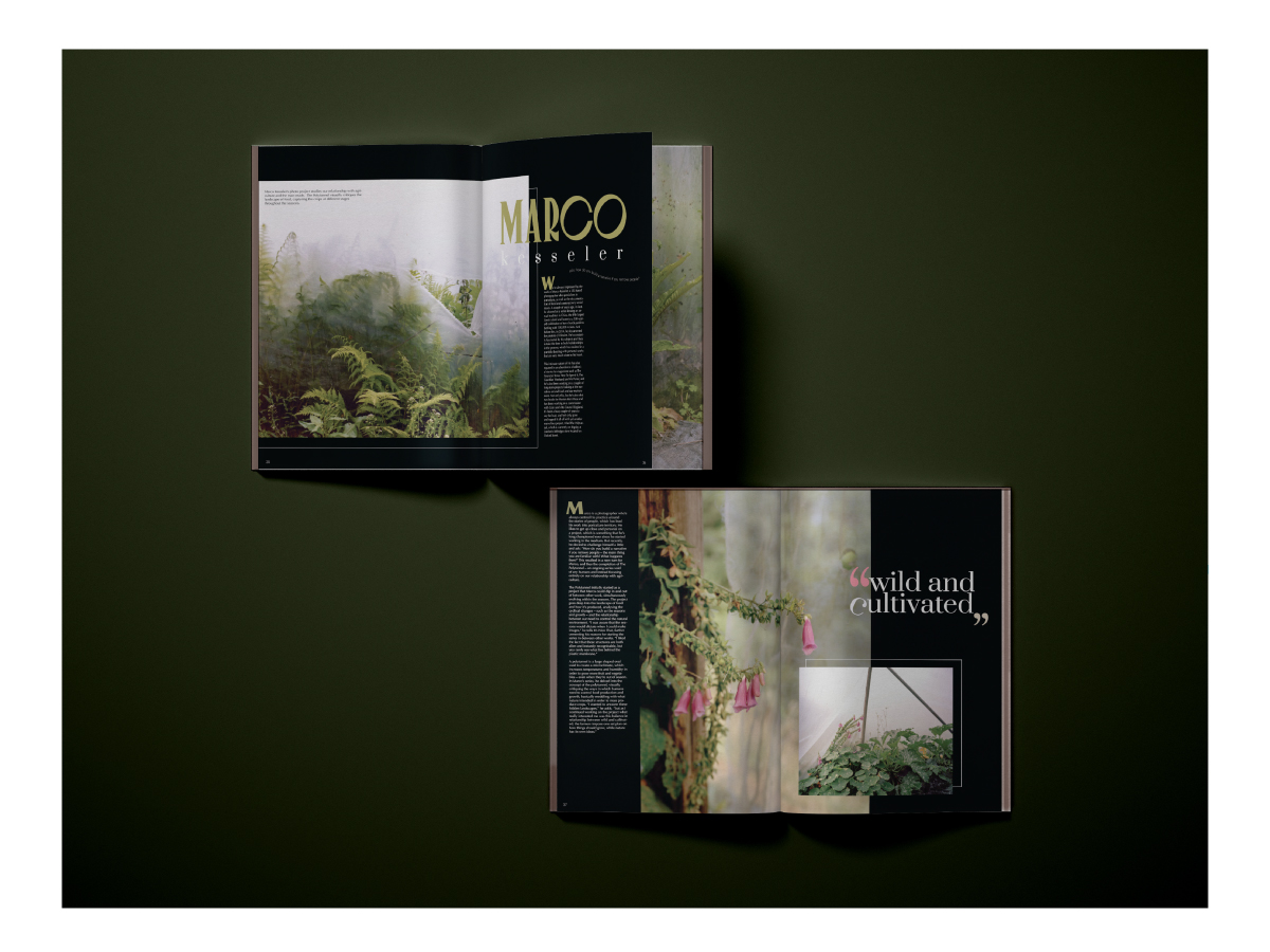
A set of maagzine spreads designed for an It's Nice That article about photographer Marco Kesseler's collection, The Polytunnel.