Ruthie Yared

What is your design aesthetic? My design aesthetic combines modern, Scandinavian, and contemporary design. I love the clean lines, natural materials, smooth surfaces, and geometric shapes of modern design. I also love that Scandinavian-style design offers visually appealing aspects like clean lines and minimalism. Contemporary designs also display minimalistic elements while highlighting grays, beiges, and shades of white, which is absolutely 100% my aesthetic.
What interior design sector are you most interested in pursuing in your career? I think college has broadened my range within the last few years. In the beginning, I was solely focused on residential and residential only. However, my years working on commercial projects opened me up to something new. They made me more aware of the flexibility that comes with residential vs commercial or hospitality, etc. After experiencing what it's like to work on different projects in different design industries, I no longer have a specific attachment to one type of design. The idea of custom home design still excites me beyond belief, probably because my love for interior design stemmed from residential design. I have always dreamed of designing my home someday. With commercial interiors, there are so many different routes you can take in terms of design and style. In contrast, homes are normally built for a client with very specific wants and needs, which can sometimes limit your creative direction. Currently, I am open to all sectors.
Visit Me Here: LinkTree

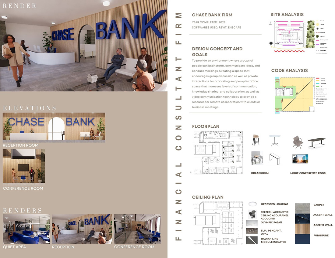
Slide 1: Chase Bank is a financial consultant firm. Renders and elevations are represented on the left. Project info, site analysis, code analysis, and design concept are on the top right. The floor plan, ceiling plan, materials, and FFE equipment are on the bottom right.

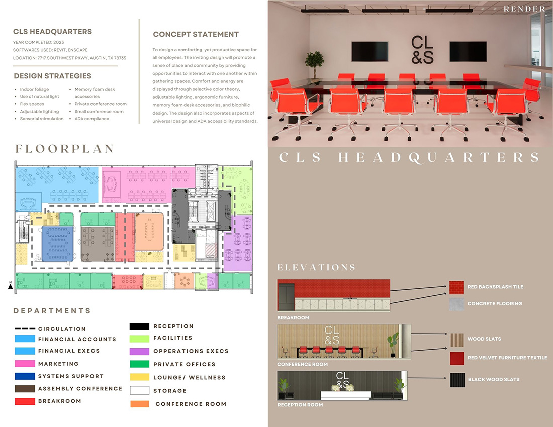
Slide 2: Campus, life, and style headquarters. The project info, concept statement, and design strategies are on the top left. In the middle is the floor plan, and on the bottom left are departments for each room within the space. On the top right is a render, and on the bottom right are elevations

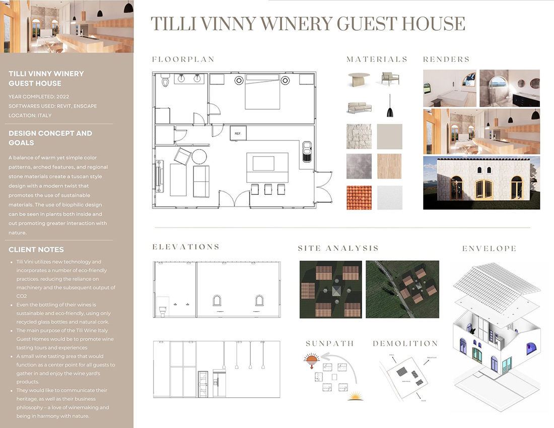
Slide 3: Tilli Vinny Winery's guest house. The project information, design concept and goals, and client notes are displayed on the left side. The floor plan, materials, furniture, and renders are on the top right. Elevations, a site analysis, and an envelope are on the bottom right.
