


Lynden Clark
Hometown: DFW, Texas | Visit Me Here: Website
About: Hi, I’m Lynden. I’m a DFW-based designer at UNT with an expected graduation date of May 2024. I specialize in packaging and brand identity. I enjoy design in the food industry because it lets me express the flavor and personality of a specific restaurant experience. In my free time you can find me with friends and family, or taking a jog around the park. My life experiences propel my design decisions.
Fun Fact: I love cats and plan on becoming a crazy cat lady.
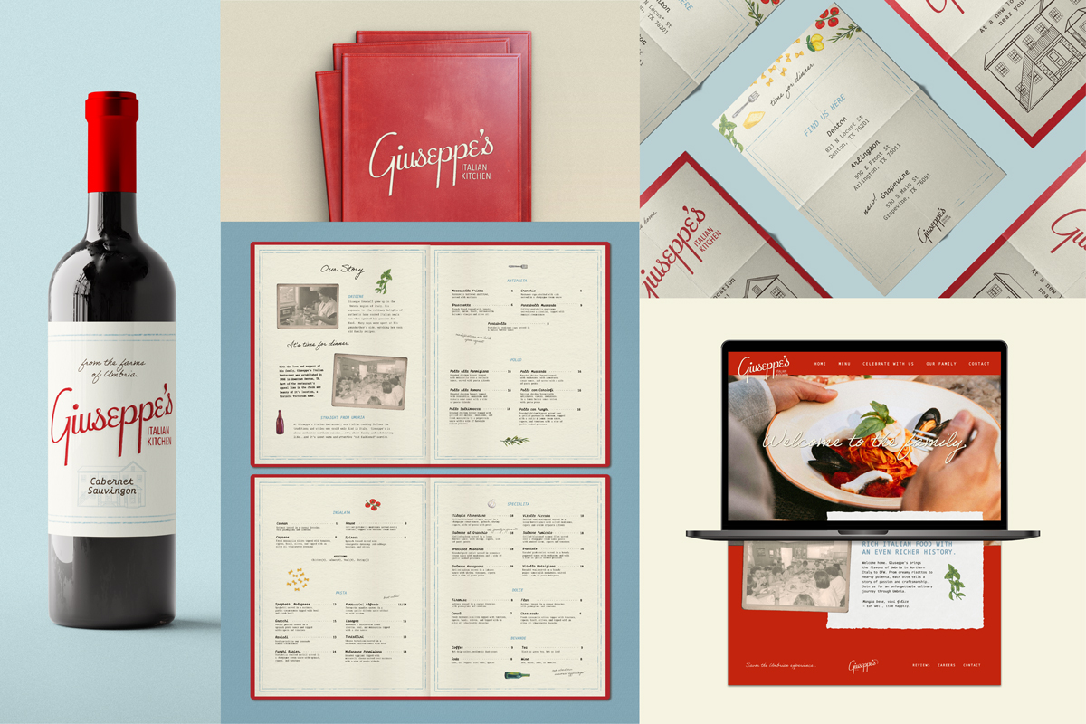
Giuseppe’s Italian Kitchen is an authentic Northern Italian restaurant in Denton, TX. This branding campaign was inspired by the bold flavors of Umbria and the family’s rich history. It utilizes unique illustrations and a custom logo-face to capture the culture of this dining experience.
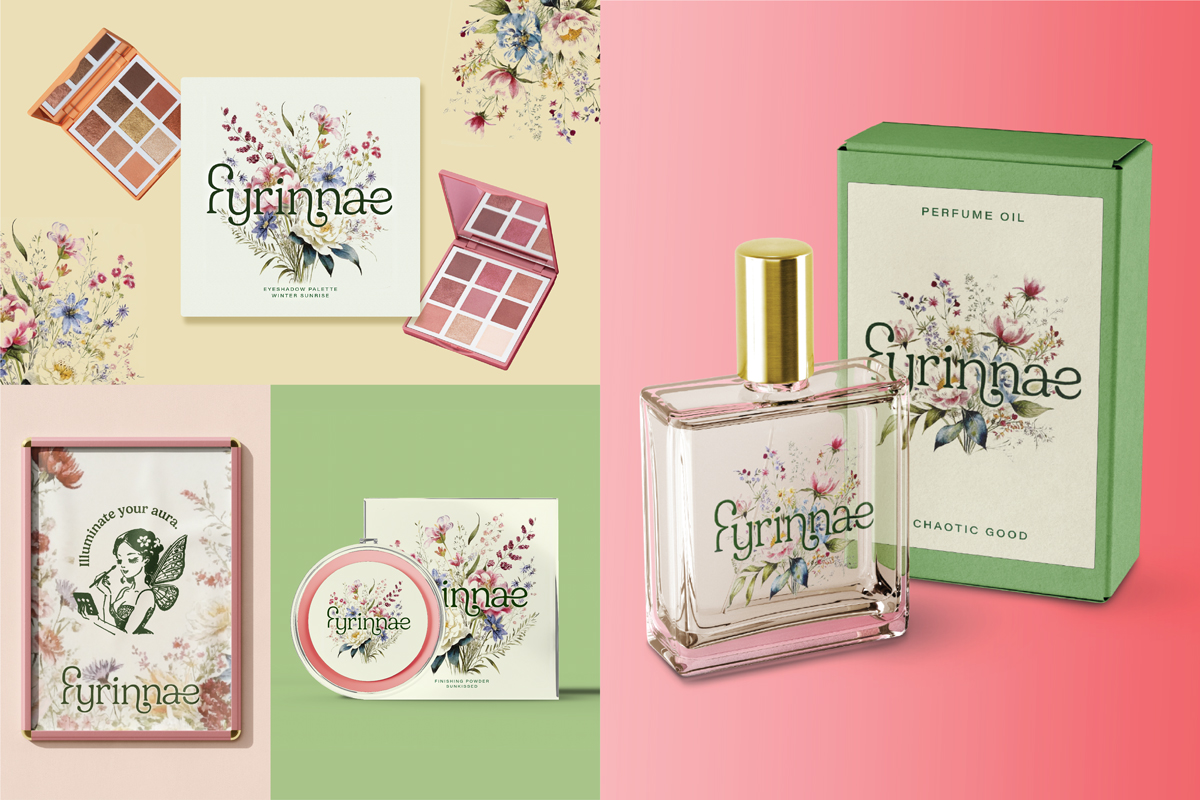
Fyrinnae is an indie cosmetics brand selling eyeshadow, powders, and perfumes. The direction for this design was motivated by targeting a specific target, the ultra-feminine. Through the use of dainty florals and a pastel palette, this identity now has a better chance of attracting this market.

This concept project prompted me to design a handcrafted syrup brand. Cosecha, meaning harvest in Spanish, is a company that prides themselves on their high-quality and ethically sourced ingredients. This design aimed to create a bottle that consumers would be happy to display in their kitchens and bars.
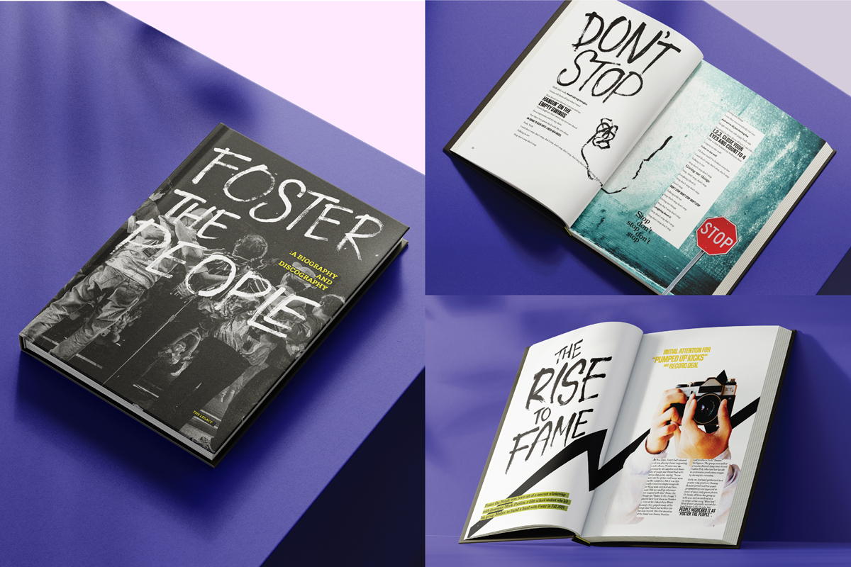
This discography for Foster the People’s album, Torches, was designed for fans to experience the lyrics of their songs in a visual medium. Due to the nature of FTP’s music, each song has its unique application to evoke the feeling that listeners would feel while listening to one song versus another. As a result, the pages were expressive and experimental, which should gain favor in the eyes of an alternative audience.
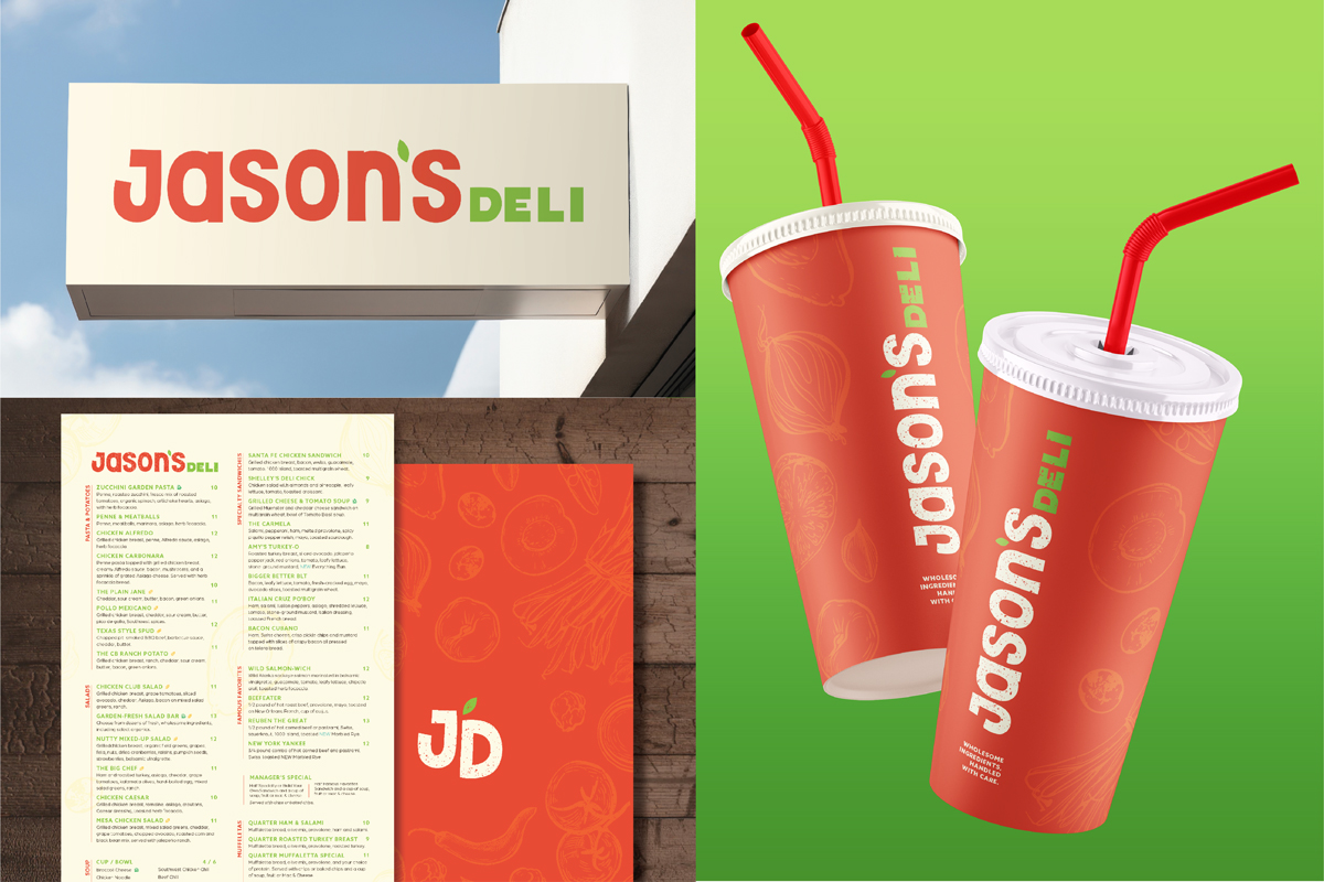
This project focused on re-targeting the branding of Jason’s Deli to better suit the food products that they are already promoting. As a family-focused, health-conscious company, the strategy was to best present these qualities to customers. Through the use of color, typography, and texture, the new branding was made to amplify these characteristics.