Chad Makerson Michael
B.F.A., 2005, Communication Design: Graphic Design
Proprietor and Designer, Chad Michael Studio
Website: Chad Michael Studio
Instagram: Chad Michael Studio
LinkedIn: Chad Makerson Michael
Tell us a bit about yourself.
My name is Chad Makerson Michael. I've been a brand and package designer professionally for 12 years. Established in 2014, my design studio caters primarily to the spirits industry.
Was there ever a moment in a critique or class that made you think you should just give up your art dreams, and if so, how did you get past that? Did that provide a lesson for your career?
This moment came during the mid-point portfolio review, a pivotal moment in all UNT student's academic journeys, whereby the faculty assess the submissions from sophomore year, selecting students to advance into junior and senior years. As I eagerly awaited the results, self-doubt crept in, regretting not delving deeper into my creative concepts. Looking back, it was surface-level thinking. Upon opening the letter, my fears were confirmed with the word "failed." However, this setback ignited a resilient commitment to a lifelong pursuit of creativity and wholehearted dedication to my craft. It was a "put up or shut up" moment.
Over the years, my unwavering devotion manifested in the quality of my work and in striving to exceed expectations with my clients. The failure during my first mid-point proved to be a transformative catalyst. Since I've grown to welcome failure, inspiring me to explore ventures outside of the design studio, where I've encountered both successes and setbacks. Embracing failure as a stepping stone is crucial, knowing that true growth arises from resolute determination and passion intertwined.
It seems valuable to note that at my senior portfolio review, I received Top Portfolio at the DSVC Student Show [Dallas Show of Visual Communicators], which paved the way for my career in New York, which then led me to open the doors to my own studio in 2014.
 What is the idea's origin for your business; what is the backstory?
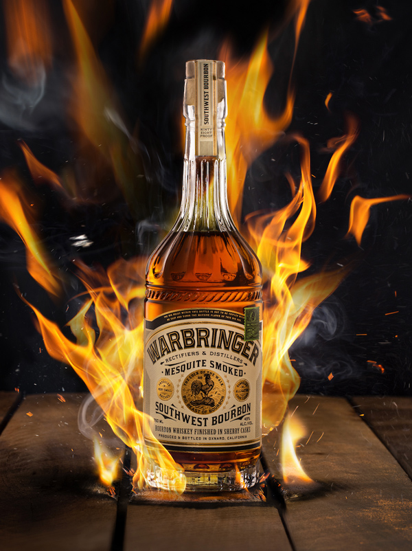
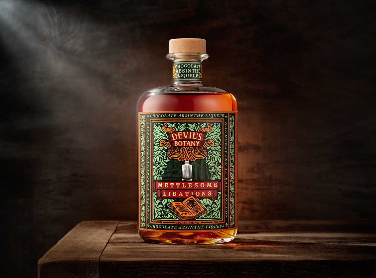
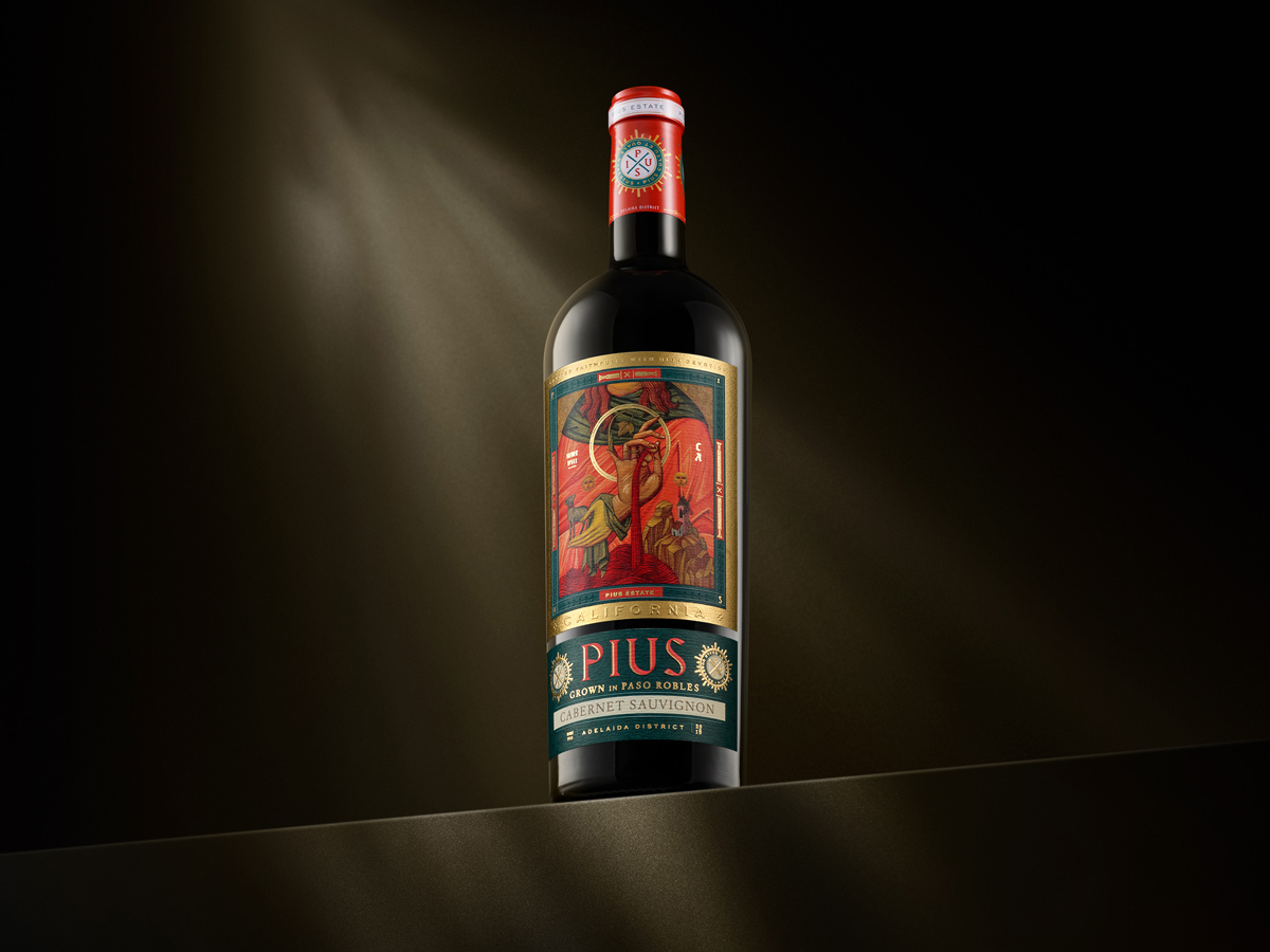
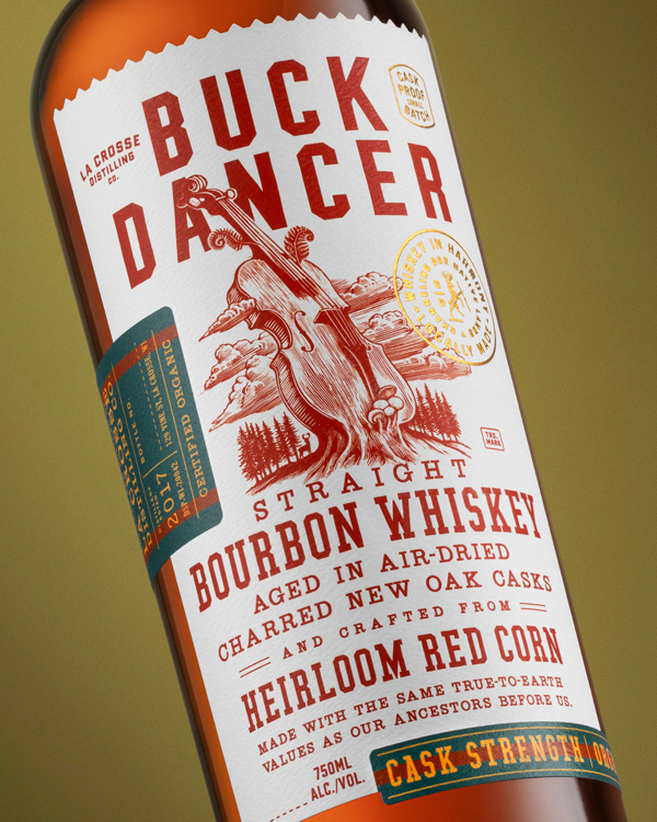
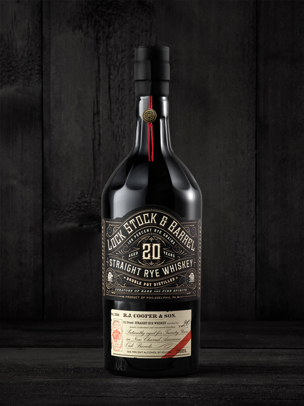
I established my studio in 2014 with a very specific vision of designing the branding and packaging for "products of indulgence." Over the years, these have included mainly wine, beer, and spirits, but I've branched off into playing card decks, perfumes, and cannabis products. These products give people a temporary escape from their reality in some form, whether a simple escape from the mundane or a tool they can use to fuel their fires of celebration. There is something about a good spirit shared in good company and being able to develop and design a centerpiece of someone else's revelry that is quite rewarding. Finding a niche in any business category, especially when one's innate passions charge it, will often tip the scales in favor of success.
What is the best advice you’ve ever received about working in an art- or design-related field?
Pair patience with persistence. This is not advice from a single person but more an amalgamation of lessons I've learned over the years of running my own business. When a design is not working, be patient and keep going. The solution will come, but it may take time. When a client responds negatively to a presented direction, do not respond in kind but wait. Let time pass as your brain chemistry will change and provide you with a more level-headed response. If you're unsure about an approach, just keep going until you are. The feeling will inevitably hit you in the gut. Your brain is subconsciously working more behind the scenes than you are aware.
 How does your brand or reputation diverge from the industry standard?
Over the last nine years, I've received many reasons why clients have approached my studio to help bring their brand to life. The resounding feedback is that my passion shows through my work. I believe a design is either made or broken on the details. The small conceptual gems peppered throughout a brand and package design push my work above industry standards. It takes one concept and extends its arms and legs as long as possible in every direction. Every design decision should surpass mere aesthetics and have a reason for that decision. The cut of a label shape, the foil selection, the facets on a glass bottle, the direction the typography plays on the label, etc. All decisions should have a reason which will inherently make the design feel much more cohesive. The story, personality, and the feeling a consumer experiences when picking up the product will be more impactful. I do not like to land a brand on simplicity. "Simple" does not stand out in a very crowded industry. A design can be simple, but is it doing it uniquely? Is it the first to present that look on a shelf? If yes, "simple" can be successful, but there is a difference between simple and conceptually simple.