John Paul Nguyen
Hometown: Cleburne, Texas
Visit Me Here: Website | LinkedIn | Twitter
About: John Paul Nguyen is a graduating senior at the University of North Texas specializing in Communication Design with a focus on Graphic Design and a minor in Art History. He has a strong interest in branding, art direction, and publication design, with a keen interest in the sports design industry. He has always been a passionate and driven individual, eager to bring his creativity and innovative ideas to the table. Actively seeking opportunities to grow and make a difference in the world of design, he combines technical proficiency with a deep understanding of user-centric design to create captivating visuals that effectively communicate messages and ideas.
Fun Fact: John Paul loves cats.
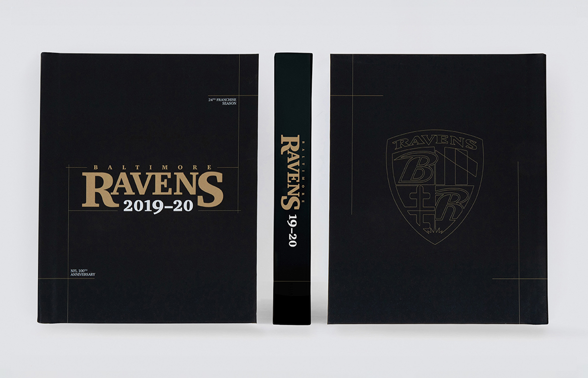
The goal of this project was to create an informative publication recapping the Baltimore Ravens 2019-2020 season. After researching the team and the industry, I set out to design a more upscale, collectible publication for serious Baltimore Ravens fans.
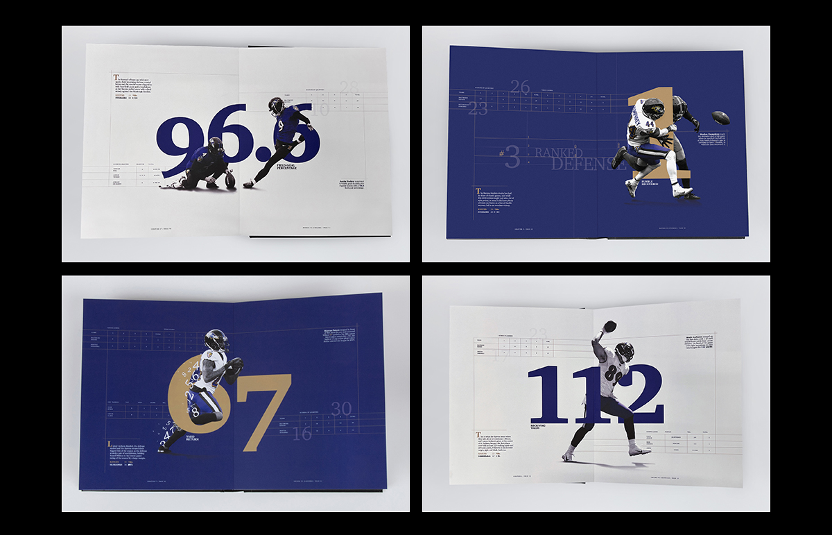
The results were to set out sophisticated typography, dramatic scale shifts, and fine linear details combined with dynamic sports photography to create an elevated publication.
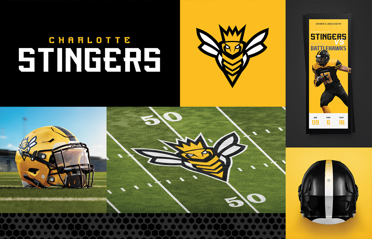
The Charlotte Stingers introduces a new XFL team, seamlessly integrating it into the city's sports landscape. The logo, branding, and collateral aim to create a compelling presence.
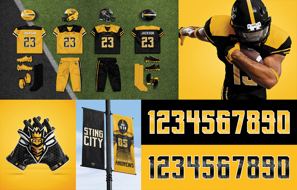
Design choices include a stinger bee-inspired color scheme and hexagonal patterns, resonating with the Queen City and the team's mascot. Its versatility ensures effective implementation across platforms, establishing a competitive franchise.
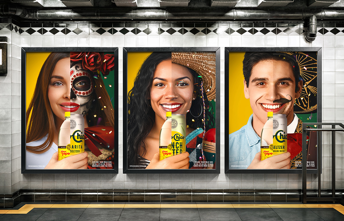
Crafting a visually compelling consumer advertising campaign for Topo Chico Hard Seltzer, I aimed to encapsulate the brand's essence. Inspired by their iconic mineral water taste dating back to 1895 in Mexico, the goal was to generate excitement and interest, driving sales for the new hard seltzer line. Each ad provided striking visuals with a captivating headline, strategically embracing the brand and fostering a positive cultural exchange.
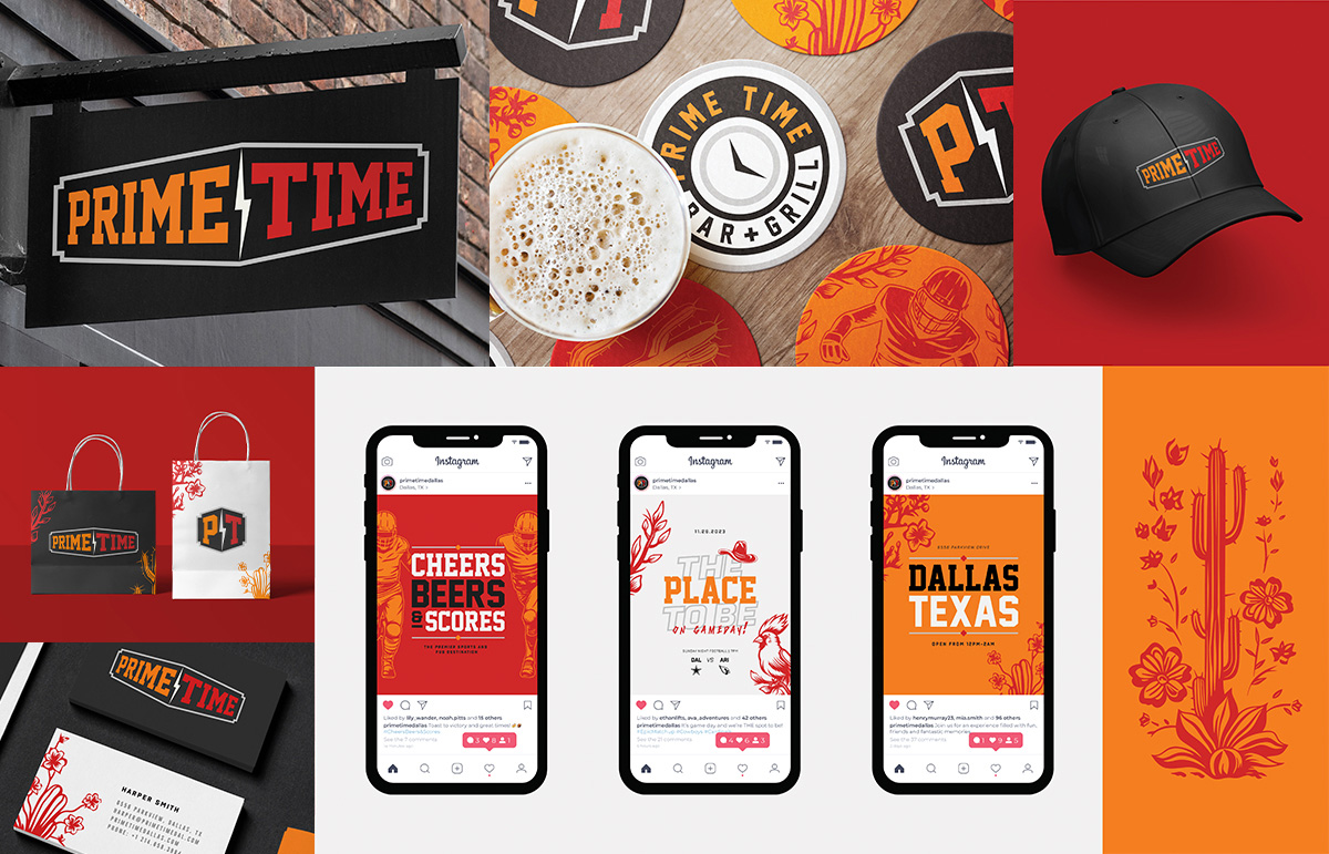
PRIME TIME is a sports bar and grill creation located in Dallas, Texas. It is a local landmark known for its friendly staff, lively atmosphere, and a strong base of regular patrons. The branding incorporates vibrant contrasting colors and typography to evoke sports culture, complemented by an array of illustrations, creating a welcoming environment. Here, patrons can enjoy their favorite sports, delicious food, and a diverse range of entertainment.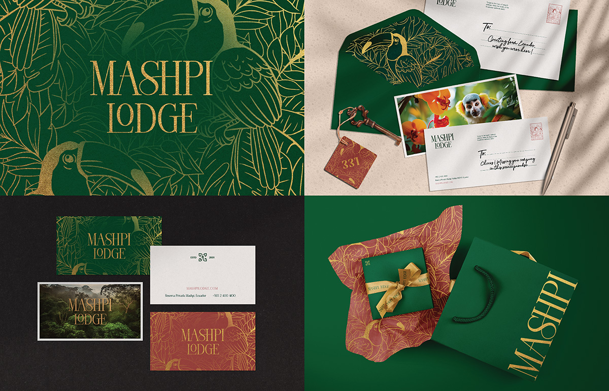
Mashpi Lodge is a luxurious eco-friendly resort in the Ecuadorian Andes, surrounded by lush cloud forests. Immersive nature experiences, contemporary design, and sustainable practices for eco-conscious travelers. Through the rebrand, I repositioned Mashpi Lodge as a premier destination that seamlessly integrates luxury with ecological consciousness, infusing a modern and sophisticated aesthetic to align with the evolving preferences of the audience.
